In today's fast-paced world, most people don't have the time or patience to read through lengthy support documents, no matter how informative they may be.
These traditional documents may be packed with useful information, but the text-heavy format tends to turn off readers, causing them to disengage and abandon the document altogether. On the other side, lengthy videos that force customers to scrub through video to find what they need? Not helpful.
This is a big problem, as these documents are essential for guiding users on how to use a product or service effectively. That's where interactive walkthroughs come in.
The Problem with Traditional Support Docs
Traditional support documents, such as user manuals, how to guides guides, and tutorials are often long, tedious, and uninspiring. Users who are already struggling with a problem or who need guidance on how to use a product can quickly become frustrated by the dull, overwhelming nature of traditional support documents.
Even if they eventually locate the information they need, it can be a daunting task to sort through text, jargon, screenshots, or video to guide them through a step-by-step tutorial. As a result, many users abandon the support document altogether and turn to other sources for answers (i.e. Quora, Reddit, forums).

This is a significant problem, as it can lead to a decline in customer satisfaction, recurring support issues, and even negative brand reputation.
Fortunately, there are alternatives solutions that can amplify and drive engagement, directly within your support documents and knowledge bases. And that's an interactive walkthrough!
What Are Interactive Walkthroughs?
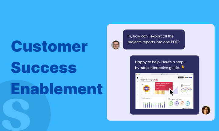
Interactive walkthroughs are a modern, engaging approach to add engagement and simplicity to existing support documentation. These embeddable, interactive guides help users step-by-step in a fun and interactive way.
The user is led through each step of the process, with detailed explanations and a clear path forward. They can also stop at each step in the process (without scrubbing through video or playing/pausing) and carry out the action described in the walkthrough.
Ultimately, an interactive walkthrough can be highly effective in engaging and retaining the user's attention, making support documentation more accessible and effective.
Benefits of Using Interactive Walkthrough Software
One of the key benefits of interactive walkthroughs is that they can be customized to suit the needs of different users. For example, a walkthrough aimed at beginners might include more detailed explanations and slower pacing, while a more advanced walkthrough might skip over some of the basics and focus on more complex features. This flexibility can make interactive walkthroughs more effective than traditional support documentation, which often takes a one-size-fits-all approach.
Another advantage of interactive walkthroughs is that they can be more engaging than traditional documentation. Interactivity and in-guide branding captures the user's attention and makes the learning process more enjoyable. This can be especially important for complex or technical products, which might otherwise be difficult to understand. By presenting the information in a more engaging way, interactive walkthroughs can help users to learn more quickly and effectively.

Interactive walkthroughs can also be more efficient than traditional support documentation. Because they guide users through each step of the process, users are less likely to get lost or confused. This can reduce the number of support requests and improve customer satisfaction. Additionally, because interactive walkthroughs are often self-paced, users can learn at their own speed, without feeling rushed or overwhelmed.
Efficient and Cost-Effective
Another benefit of using interactive walkthroughs is that they can be created relatively quickly, and once created, can be shared easily online. This makes them an efficient and cost-effective way to provide support documentation. Rather than spending time and resources creating and distributing traditional support documents, interactive walkthroughs can be created once and shared with a wide audience.
Interactive walkthroughs can also be updated easily, which is particularly useful for software or websites that are frequently updated. Rather than having to create new support documents every time the software or website is updated, the interactive walkthrough can simply be updated to reflect the changes.
How to Create an Interactive Guide for Your Product
Step 1: Identify What Needs to Be Covered
The first step in creating an interactive guide is to identify what needs to be covered. This involves understanding the user's needs, pain points, and goals. Determine what users are looking for and why they are turning to support documentation. This will help you create content that is purposeful, relevant, and resonates with the user.
Step 2: Choose the Right Tool
There are many interactive walkthrough software tools available, so choose one that meets your needs, budget, and capabilities. Look for software that is user-friendly, flexible, and provides a range of customization options.
We built Supademo so that anyone could create and share interactive guides in less than five minutes. With our tool, you don't need to code or know how to design to create walkthroughs that can be shared anywhere.
Step 3: Create Your Content
To create an interactive demo, turn on the Supademo extension and simply walk through the feature or product you'd like to showcase. Supademo will automatically capture your steps and annotate each click with relevant text to save you time.
Ultimately, you want to make sure that your content is clear, concise, and easy to understand. Avoid industry jargon, and break down complex topics into simple, easy-to-follow steps.
Step 4: Test, Test, Test
Before you release your interactive guide to the public, it's crucial to test it thoroughly. Run through it multiple times, checking for any errors, inconsistencies, or user experience issues.
Try sharing it as a link amongst colleagues or embed it in your favorite tools like Notion, Coda, or Webflow. Make sure it works across different platforms and devices so that all users can access and use the guide successfully.
Here's an example interactive walkthrough that checks off all of these boxes:
Common Mistakes to Avoid
1. Assuming Too Much Knowledge
Don't assume that the user has pre-existing knowledge of the subject matter. Provide clear explanations, define key terms, and include relevant background information to ensure the user understands the context and relevance of the content.
2. Overcomplicating the Process
Avoid overcomplicating the process, particularly when developing content for novices or people unfamiliar with the subject matter. Keep the process streamlined and easy to follow, avoiding unnecessary steps or jargon that can be confusing or overwhelming for the user.
3. Neglecting Mobile Optimization
With the increase in mobile usage, it's crucial to ensure your interactive walkthroughs are optimized for mobile devices. Mobile optimization allows users to access and engage with the guide regardless of their location or device, creating a seamless user experience.
Conclusion
Interactive walkthroughs are a modern, engaging approach to creating support documentation that can help transform dull and uninspiring materials into enjoyable resources. By following best practices, avoiding common mistakes, and utilizing the right software, you can create interactive walkthroughs that provide users with the understanding they need to use your products or services effectively.


