Overview
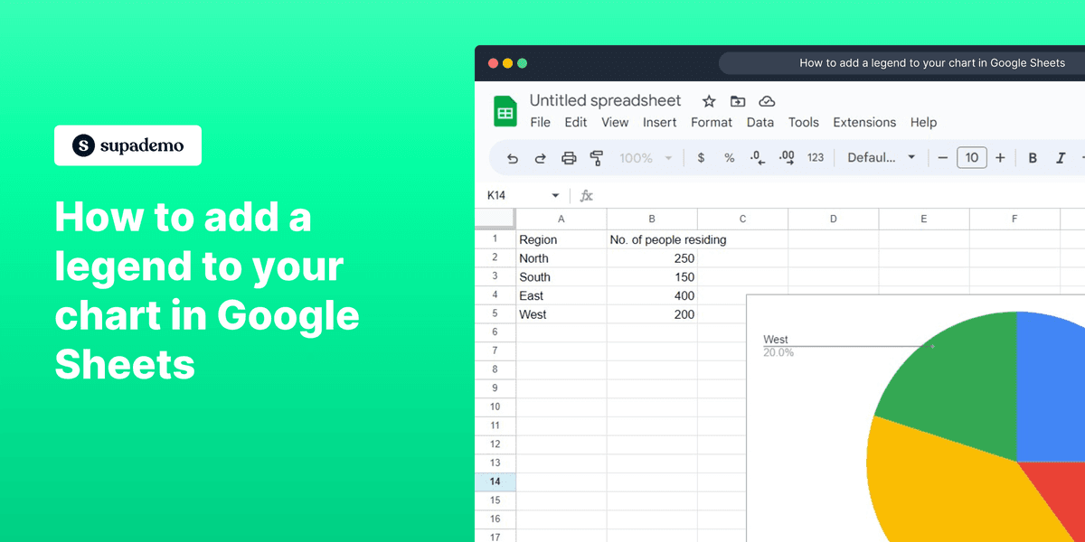
To add a legend to your chart in Google Sheets, open the Chart editor by double-clicking the chart, click on "Customize," select "Legend," choose the desired position from the dropdown menu, optionally format the legend text (e.g., bold or italics) and adjust the font size, and your chart will now have a clear legend.
Who is Google Sheets best suited for?
Google Sheets is best suited for a wide range of professionals, including Data Analysts, Project Managers, and Sales Teams. For example, Data Analysts can use Google Sheets for analyzing datasets and creating visualizations, Project Managers can leverage it for tracking project progress and managing timelines, and Sales Teams can use it for managing sales pipelines and generating reports, all benefiting from Google Sheets’ collaborative features and powerful data processing capabilities.
Step by step interactive walkthrough
Steps to How to add a legend to your chart in Google Sheets
1) Navigate to your google sheet.
2) Double click your chart to open the Chart editor.
3) Chart Editor will be opened on the right side of your screen. Click on "Customize"
4) Click on "Legend"
5) Click on Position Dropdown.
6) Select your desired legend location.
7) Optionally make your legend text bold or italics.
8) Optionally change the font size.
9) Now your chart has a clear legend!
Common FAQs on Google Sheets
How do I use conditional formatting in Google Sheets?
To use conditional formatting, select the cells you want to format. Click on “Format” in the top menu and choose “Conditional formatting.” In the Conditional format rules panel that appears on the right, set your formatting criteria (e.g., text contains, date is before, etc.). Choose the formatting style (e.g., text color, cell background color) and click “Done.” The cells that meet your criteria will be automatically formatted based on your rules.
How do I import data from another Google Sheet?
To import data from another Google Sheet, use the IMPORTRANGE function. In the cell where you want the data to appear, type =IMPORTRANGE("spreadsheet_url", "range_string"). Replace spreadsheet_url with the URL of the Google Sheet you’re importing from, and range_string with the range of cells you want to import (e.g., "Sheet1!A1"). The first time you use this function, you’ll need to grant permission for the sheets to access each other.
How can I create a pivot table in Google Sheets?
To create a pivot table, select the data range you want to analyze. Click on “Data” in the top menu and choose “Pivot table.” In the Pivot table editor that appears on the right, choose the data range and click “Create.” You can then add rows, columns, values, and filters to your pivot table by dragging and dropping fields into the respective areas in the Pivot table editor. This allows you to summarize and analyze your data in various ways.
Create your own step-by-step demo
Scale up your training and product adoption with beautiful AI-powered interactive demos and guides. Create your first Supademo in seconds for free.
Frequently Asked Questions about how to add a legend to your chart in google sheets
Commonly asked questions about this topic.
Can I work with my team on Google Sheets charts in real-time?
How do I teach my team to add legends to their charts?
How can add a legend work?
What's the best way to document chart legend procedures?
How often should I update legends on my existing charts?
Which tools integrate with Google Sheets for chart customization?
What plan do I need on Google Sheets for full legend to your chart features?

Justin James
Growth Intern
Justin is a growth intern focused on content generation and marketing. He's passionate about making an impact across various startup roles.