Overview
Elevate your chart presentation in Google Sheets by seamlessly adding a legend to enhance clarity and understanding. Optimize user experience and simplify data interpretation by incorporating relevant labels that provide key insights. This guide offers a step-by-step process for effortlessly integrating a legend into your charts, ensuring enhanced efficiency and clear communication within the Google Sheets platform.
1. Start by double-clicking your desired chart.
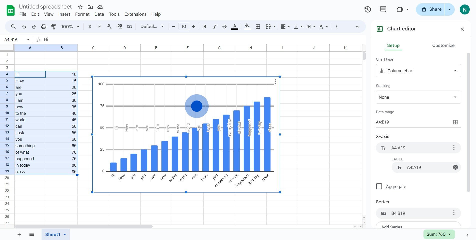
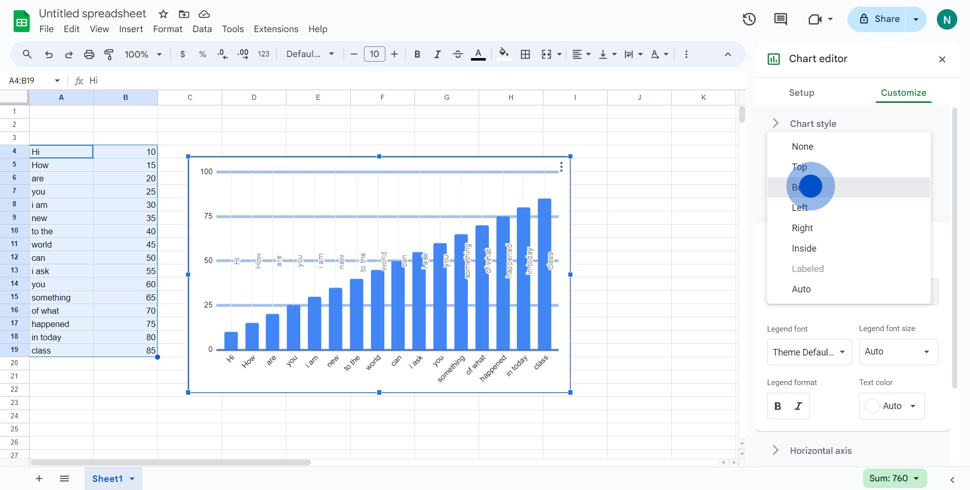
2. Next, seek out and click the 'Customize' option.

3. Now, locate and select the 'Legend' section.

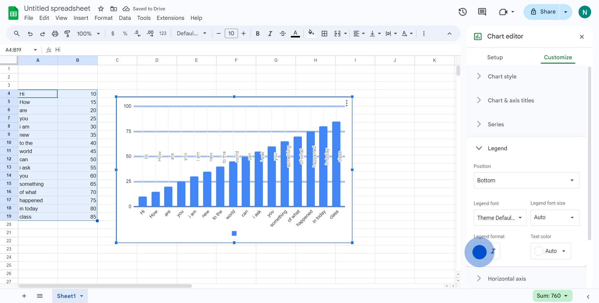
4. Find the option labeled 'Auto' and click on it.
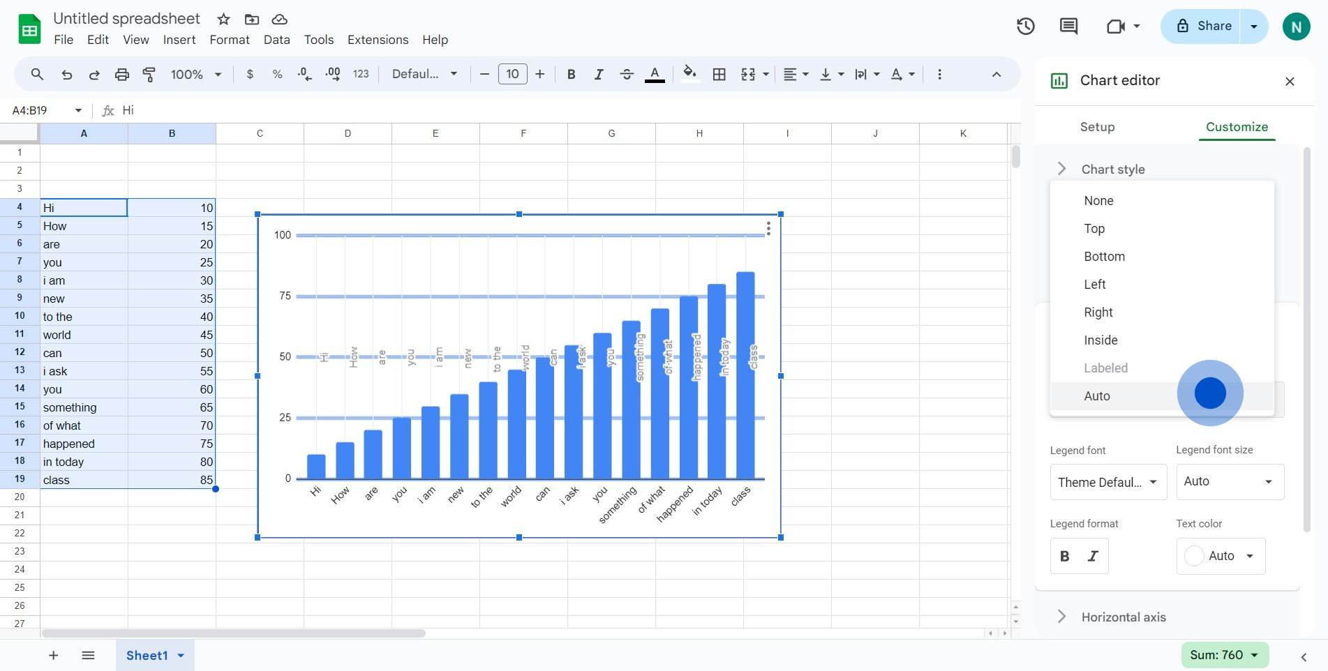
5. From the dropdown, choose and click 'Bottom'.
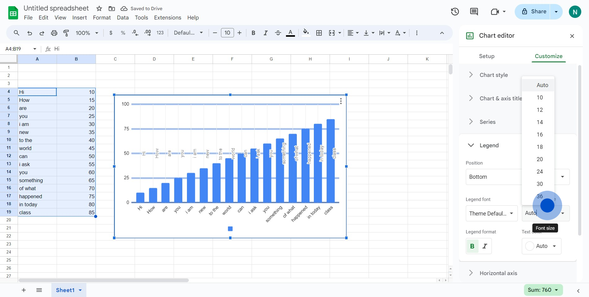
6. Wish to highlight your text? Click here to bold the letters.
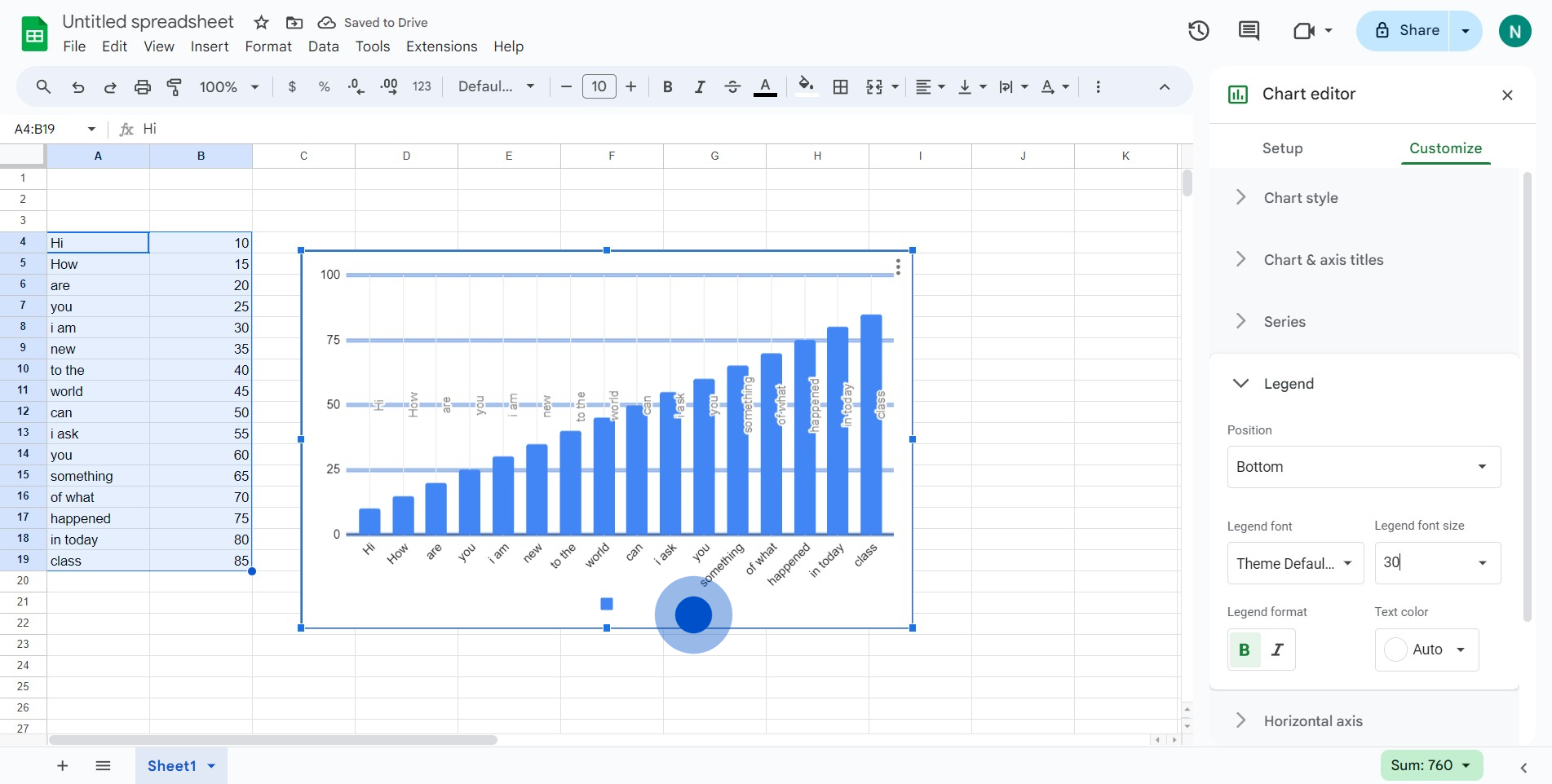
7. To adjust font size, select the designated area here.
8. You did it! Your chart now has a legend.
Create your own step-by-step demo
Scale up your training and product adoption with beautiful AI-powered interactive demos and guides. Create your first Supademo in seconds for free.
Nithil Shanmugam
Nithil is a startup-obsessed operator focused on growth, sales and marketing. He's passionate about wearing different hats across startups to deliver real value.