

Overview
Streamline your data visualization in Google Sheets by mastering the art of creating charts and adding axes. Enhance your spreadsheet clarity and analytical insights by following this guide's seamless process. Organize information effectively, improve data interpretation, and elevate your overall user experience within the Google Sheets platform. Empower yourself with efficient chart creation and axis addition to optimize your data presentation and analysis.
1. Initiate by selecting the desired elements.
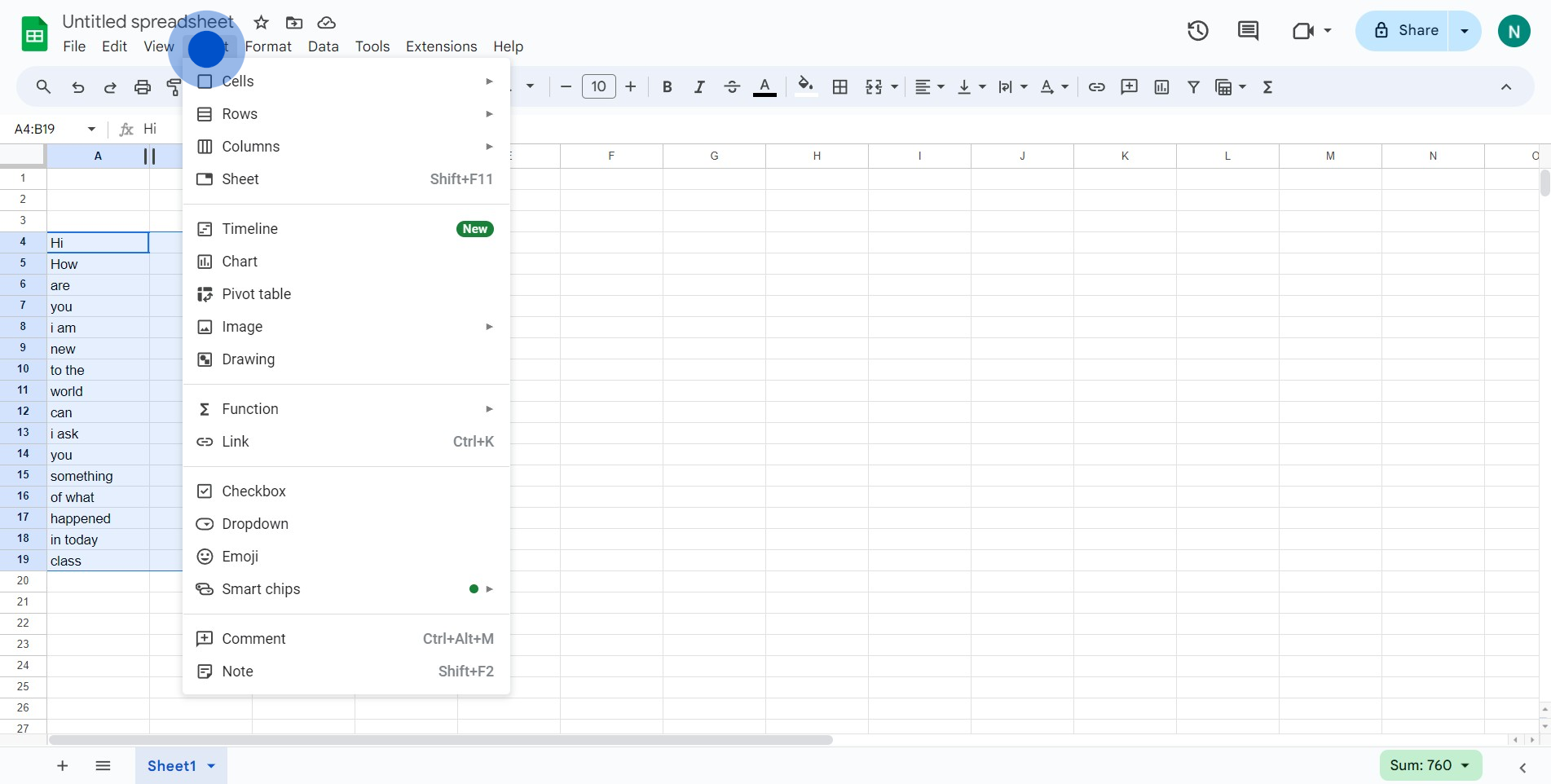
2. Follow up by clicking on the 'Insert' option.
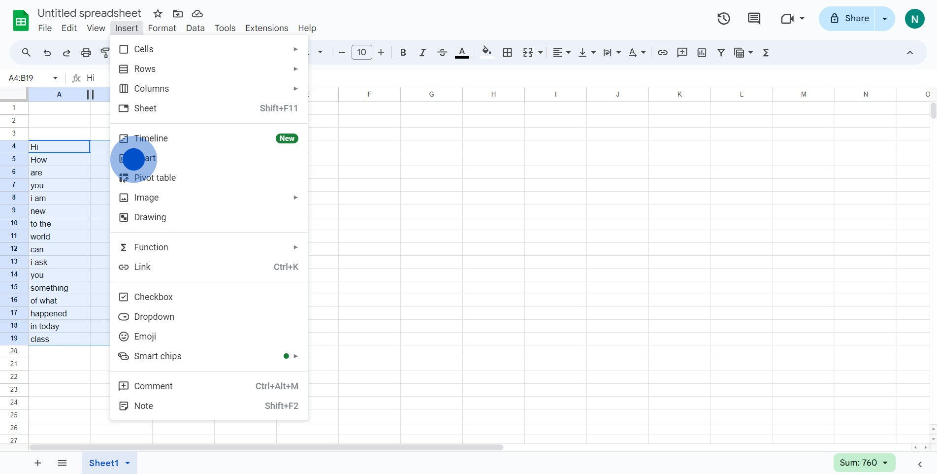
3. Next, choose the option for 'Chart'.
4. Right-click on the chart for more options.
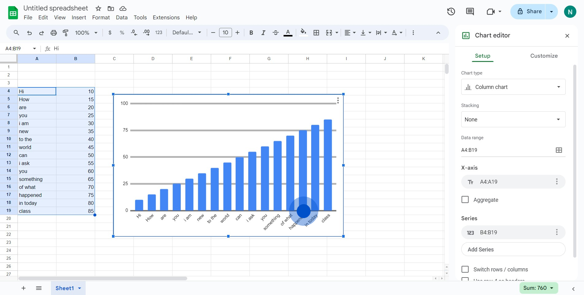
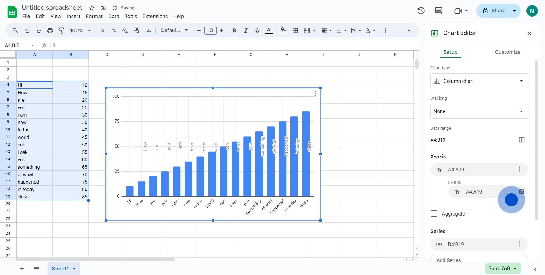
5. Tap on the three dots found in the X-axis.
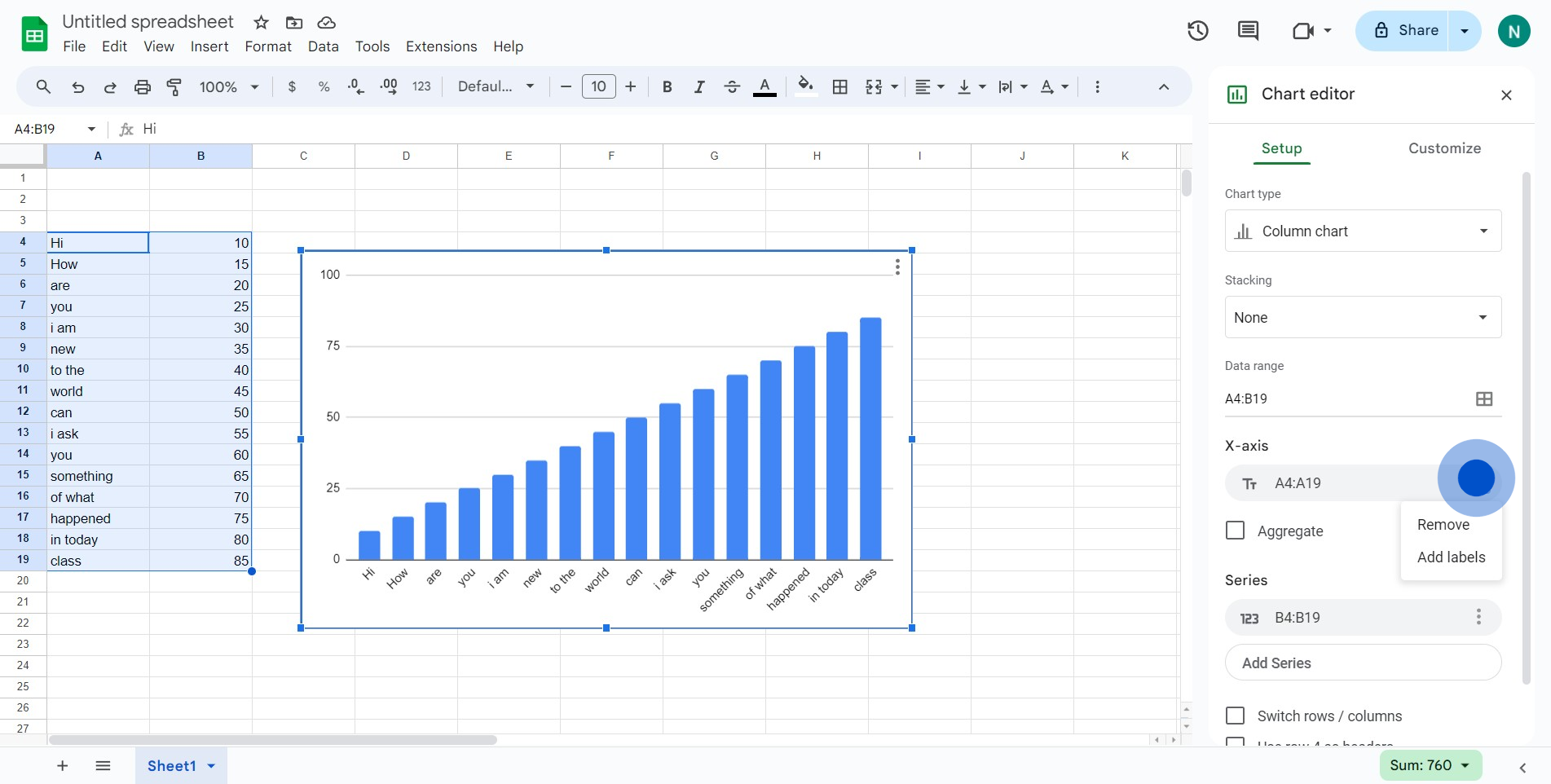
6. Conclude by selecting 'Add labels' to include an X-axis.
Create your own step-by-step demo
Scale up your training and product adoption with beautiful AI-powered interactive demos and guides. Create your first Supademo in seconds for free.