Overview:
Efficiently tailor your Google Sheets charts to meet your specific needs with this comprehensive guide on customization. Elevate your data visualization by personalizing chart elements, colors, and styles to enhance clarity and impact. Navigate the step-by-step instructions to seamlessly customize Google Sheets charts, providing you with the tools to optimize visual representation and better convey insights for effective data analysis.
Who is Google Sheets best suited for?
Google Sheets is best suited for a wide range of professionals, including Financial Analysts, Project Managers, and Data Analysts. For example, Financial Analysts can use Google Sheets for creating and analyzing budgets and financial models, Project Managers can leverage it for tracking project tasks and timelines, and Data Analysts can use it for organizing, processing, and visualizing data, all benefiting from Google Sheets’ real-time collaboration and data processing capabilities.
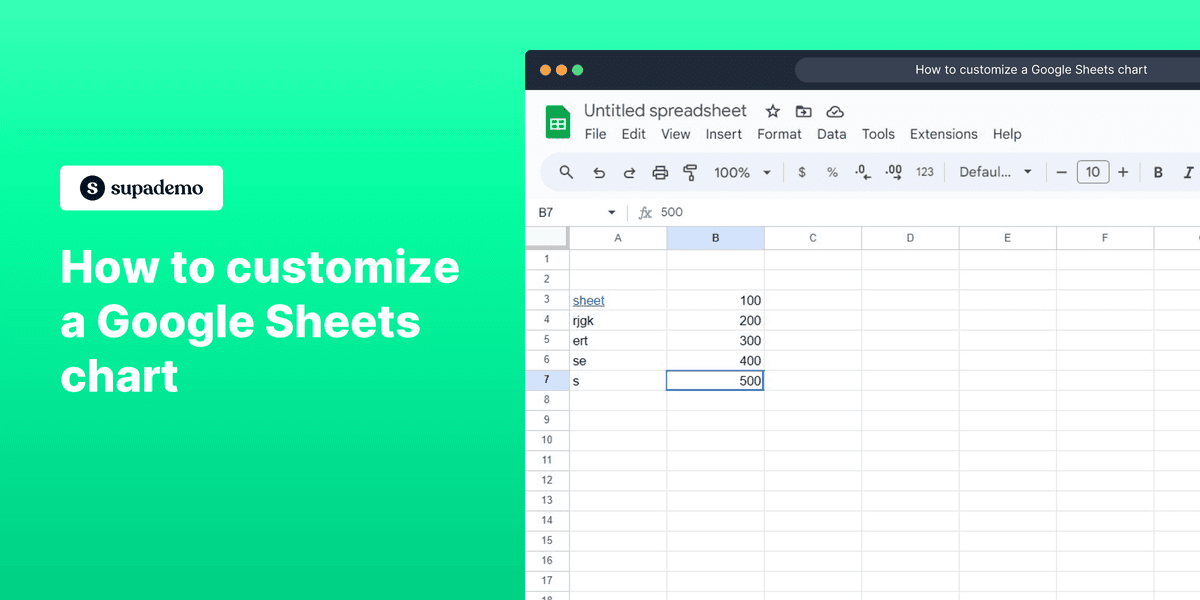
How to customize a Google Sheets chart
1. Choose the elements you want to modify.
2. Proceed by selecting 'Insert' from the menu.
3. Next, pick the 'Chart' option from the menu.
4. Click on 'Customize' to start customizations.
5. Select 'Vertical axis' for modifying.
6. Input your desired text in the given field.
7. Set the limit values and other options as per your requirements.
8. Lastly, explore more options to enhance your chart if you like.
Common FAQs on Google Sheets
Commonly asked questions about this topic.
How do I create and format a spreadsheet in Google Sheets?
How can I use formulas and functions in Google Sheets?
How can I collaborate and share Google Sheets with others?
Create your own step-by-step demo
Nithil Shanmugam
Nithil is a startup-obsessed operator focused on growth, sales and marketing. He's passionate about wearing different hats across startups to deliver real value.