
Overview:
Efficiently tailor your Google Sheets charts to meet your specific needs with this comprehensive guide on customization. Elevate your data visualization by personalizing chart elements, colors, and styles to enhance clarity and impact. Navigate the step-by-step instructions to seamlessly customize Google Sheets charts, providing you with the tools to optimize visual representation and better convey insights for effective data analysis.
Who is Google Sheets best suited for?
Google Sheets is best suited for a wide range of professionals, including Financial Analysts, Project Managers, and Data Analysts. For example, Financial Analysts can use Google Sheets for creating and analyzing budgets and financial models, Project Managers can leverage it for tracking project tasks and timelines, and Data Analysts can use it for organizing, processing, and visualizing data, all benefiting from Google Sheets’ real-time collaboration and data processing capabilities.
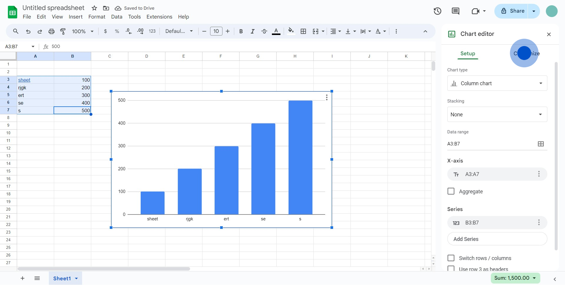
How to customize a Google Sheets chart
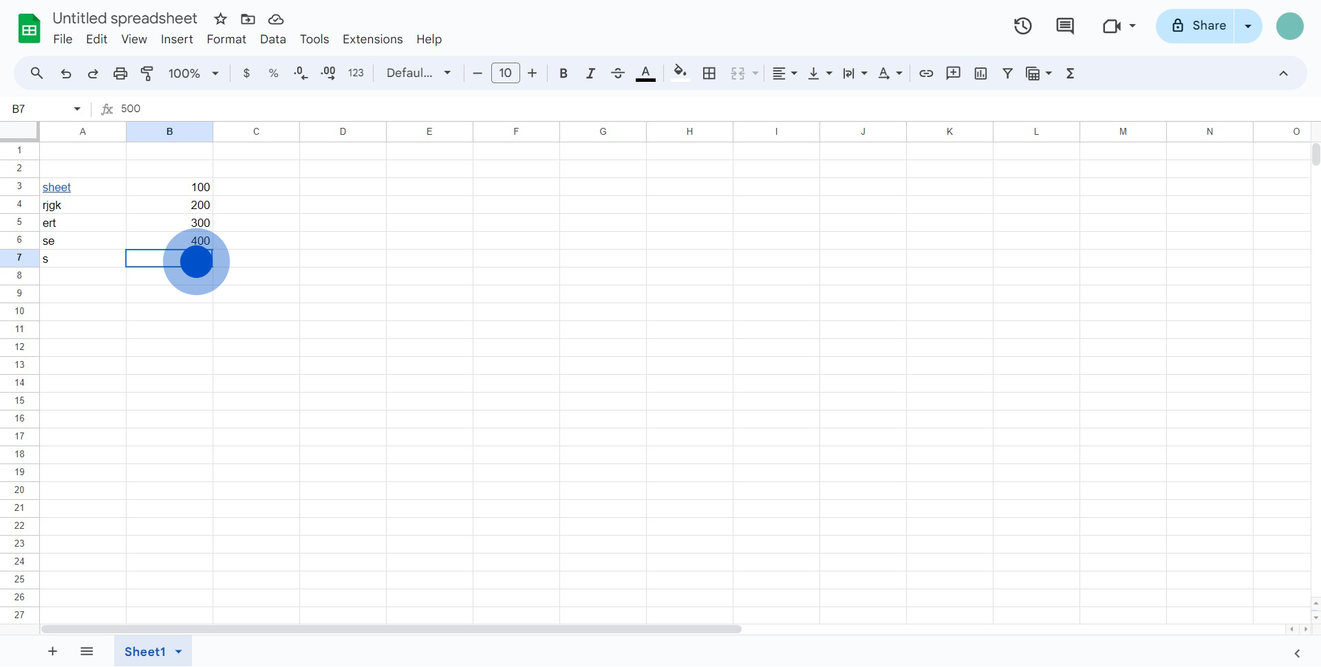
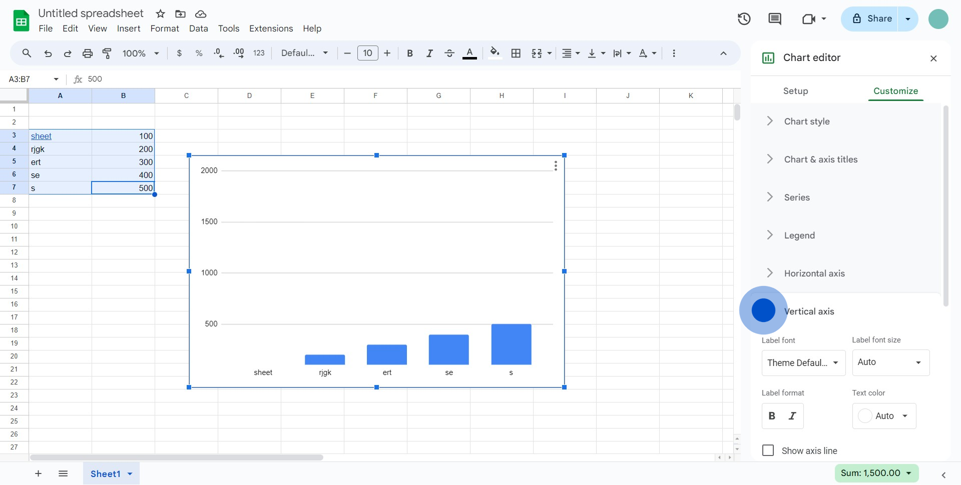
1. Choose the elements you want to modify.
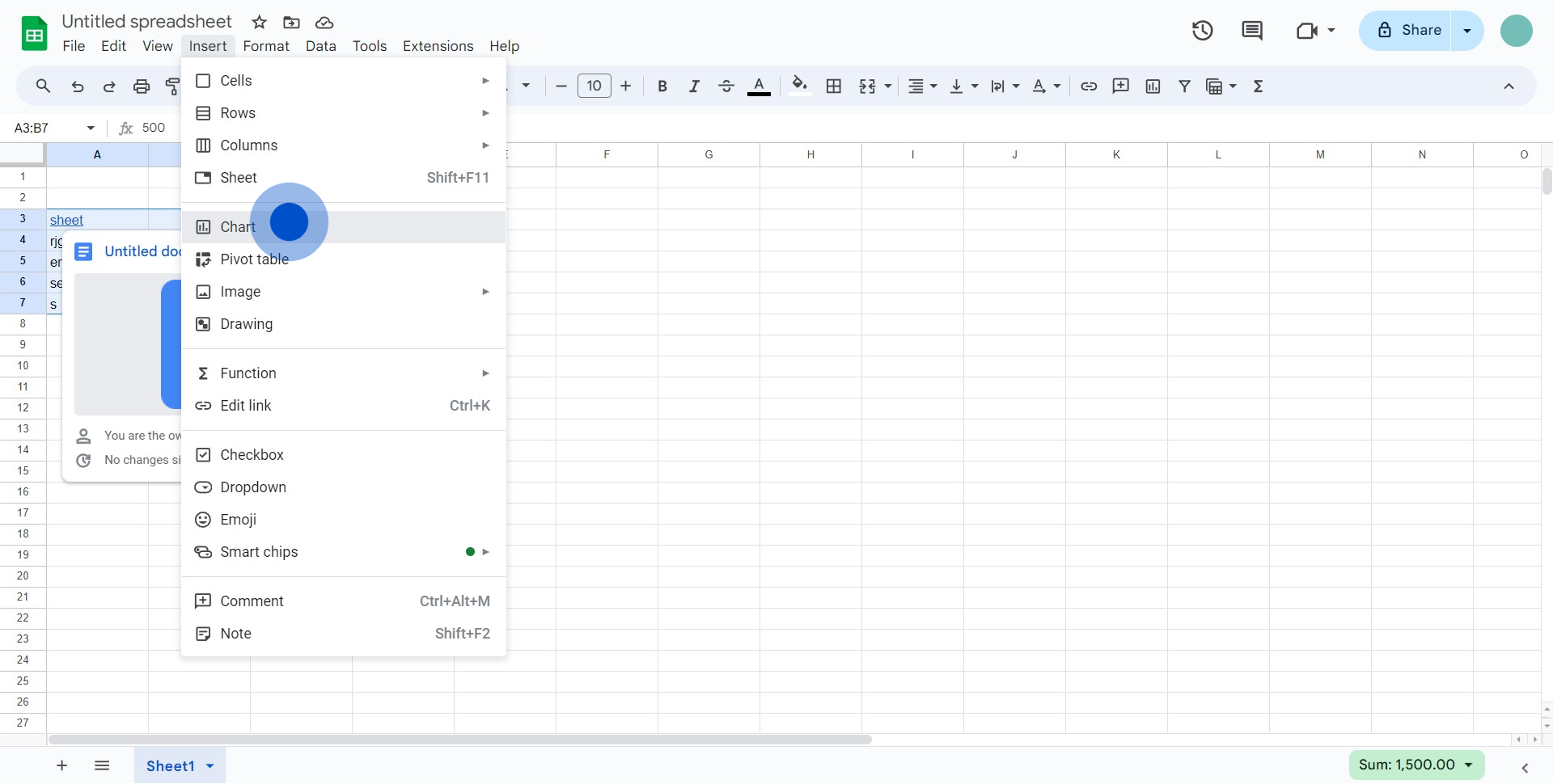
2. Proceed by selecting 'Insert' from the menu.
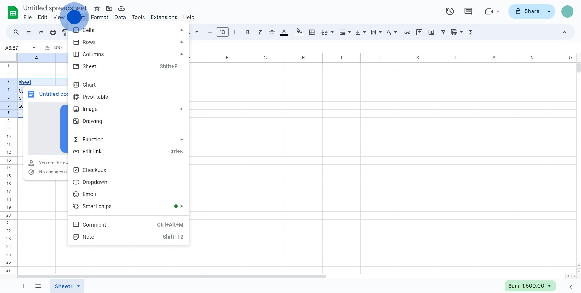
3. Next, pick the 'Chart' option from the menu.
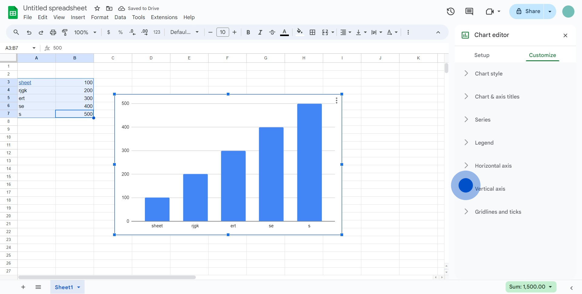
4. Click on 'Customize' to start customizations.
5. Select 'Vertical axis' for modifying.
6. Input your desired text in the given field.
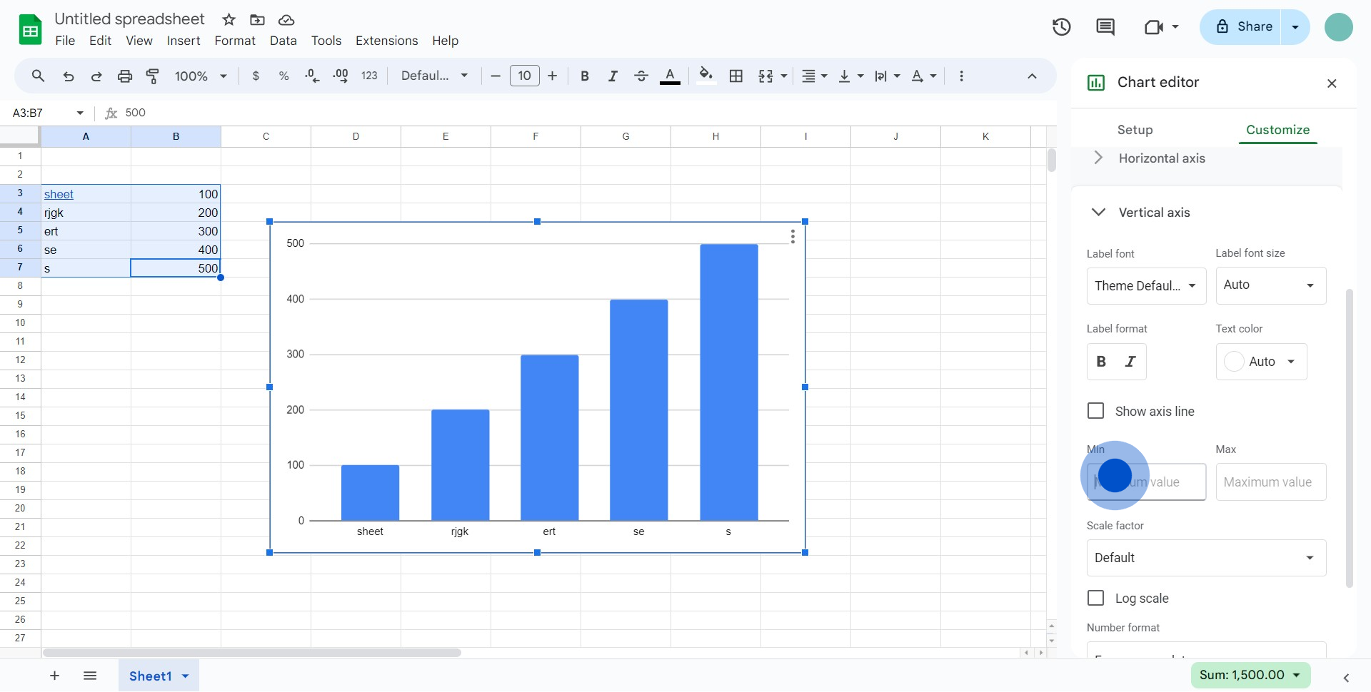
7. Set the limit values and other options as per your requirements.
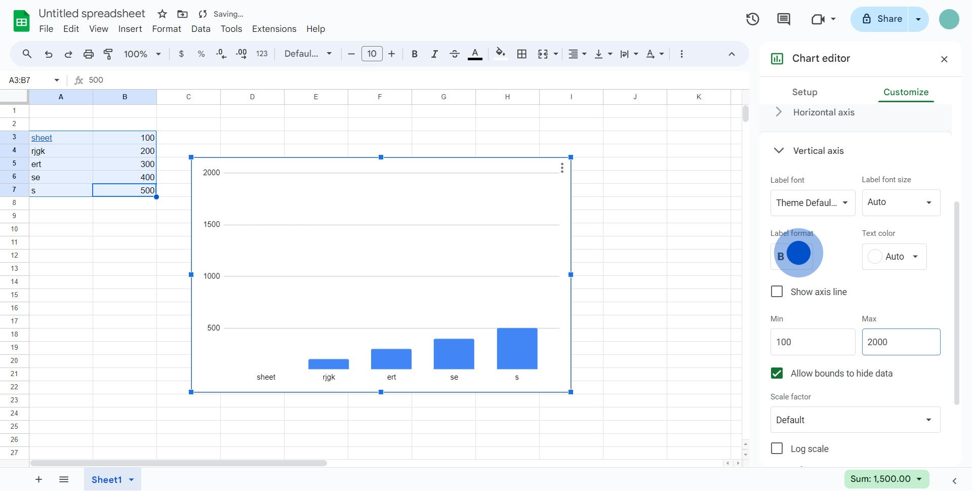
8. Lastly, explore more options to enhance your chart if you like.
Common FAQs on Google Sheets
How do I create and format a spreadsheet in Google Sheets?
To create a new spreadsheet in Google Sheets, go to Google Sheets and click on the “+ Blank” button or choose a template from the gallery. Once your spreadsheet is open, you can enter data into cells and use various formatting options to organize and present your information. To format cells, select the range of cells you want to format, then use the toolbar options to adjust font size, style, color, and alignment. You can also apply conditional formatting by going to “Format” > “Conditional formatting,” allowing you to highlight cells based on specific criteria. Additionally, you can use the “Data” menu to sort and filter your data for better organization.
How can I use formulas and functions in Google Sheets?
Google Sheets provides a wide range of formulas and functions to perform calculations and manipulate data. To use a formula, click on the cell where you want the result to appear and type “=” followed by the function name (e.g., =SUM, =AVERAGE, =IF) and the necessary arguments within parentheses. For example, =SUM(A1:A10) calculates the total of the values in cells A1 through A10. Google Sheets supports functions for arithmetic operations, statistical analysis, text processing, and more advanced data manipulation tasks. Use the “Function” button or explore the “Help” menu for a list of available functions and their descriptions.
How can I collaborate and share Google Sheets with others?
To collaborate and share a Google Sheets document, click the “Share” button in the top-right corner of the sheet. Enter the email addresses of the people you want to share with and choose their access level: “Viewer,” “Commenter,” or “Editor.” You can also generate a shareable link with specific permissions to control who can access the document. Once shared, collaborators can view, comment on, or edit the sheet in real-time, depending on their permissions. Google Sheets also features a built-in chat function for discussing changes and a comment feature for providing feedback directly within the sheet. Use the “Version history” (found under “File” > “Version history”) to review past versions and track changes made by collaborators.
Create your own step-by-step demo
Scale up your training and product adoption with beautiful AI-powered interactive demos and guides. Create your first Supademo in seconds for free.