
Overview
Empower your data analysis and visualization with a simple yet powerful guide on how to add an X-axis in Google Sheets. This step by step interactive guide helps you to unleash the potential of your charts and graphs by effortlessly labeling and organizing your data along the horizontal axis, creating visually impactful representations that convey insights with clarity and precision.
Who is Google Sheets best suited for?
Google Sheets is best suited for a wide range of professionals, including Financial Analysts, Project Coordinators, and Data Researchers. For example, Financial Analysts can use Google Sheets for budgeting and financial modeling, Project Coordinators can leverage it for tracking project timelines and tasks, and Data Researchers can use it for organizing and analyzing data sets, all benefiting from Google Sheets' collaborative features and powerful data processing tools.
Step by step interactive walkthrough
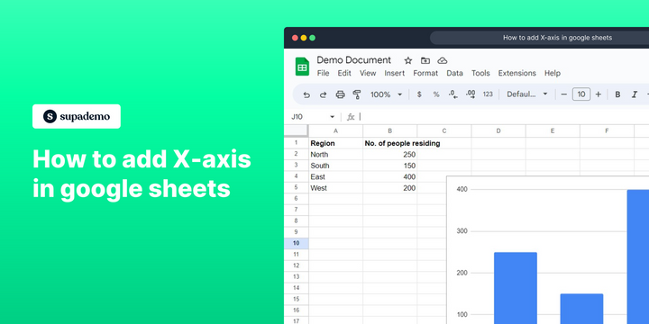
Steps to How to add X-axis in google sheets
1) Navigate to your google sheet document.
2) Double click on the chart to open chart editor.
3) Click on "Setup"
4) Click on the 3 dots icon under the X-axis section.
5) Click on "Add labels"
Common FAQs on Google Sheets
How can I create and use a drop-down list in Google Sheets?
To create a drop-down list, select the cell or range of cells where you want the list to appear. Click on “Data” in the top menu and select “Data validation.” In the Data validation dialog, choose “List of items” from the “Criteria” dropdown menu. Enter the items for your drop-down list, separated by commas. Click “Save,” and a drop-down arrow will appear in the selected cells, allowing users to choose from the list.
How do I merge cells in Google Sheets?
To merge cells, select the range of cells you want to merge. Click on “Format” in the top menu, then choose “Merge cells.” You can select from options such as “Merge all,” “Merge horizontally,” or “Merge vertically.” Merging cells combines them into a single cell, which can be useful for formatting headers or organizing data.
How do I use the QUERY function in Google Sheets?
The QUERY function allows you to perform complex data manipulations using a SQL-like syntax. To use it, type =QUERY(data_range, "query_string", [headers]) into a cell. Replace data_range with the range of data you want to query, and query_string with your SQL-like query (e.g., "SELECT A, B WHERE C > 100"). The [headers] argument is optional and specifies the number of header rows in the data range. This function can be used to filter, sort, and summarize data.
Enjoyed this interactive product demo?
Create your own interactive product demo in minutes. Drive growth, scale enablement and supercharge product led-onboarding with Supademo.
Sign up for free here with no credit card required.