

Overview:
Elevate your data organization in Airtable by mastering the creation of chart views. Enhance user experience and simplify data interpretation with visually compelling charts tailored to your needs. This guide offers a straightforward process to effortlessly craft and implement chart views in Airtable, empowering you to optimize data visualization for improved efficiency and clarity within the platform's project management capabilities.
1. Go ahead and press 'Add More'
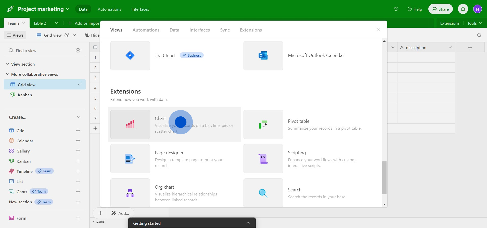
2. Next, select the 'Chart' option
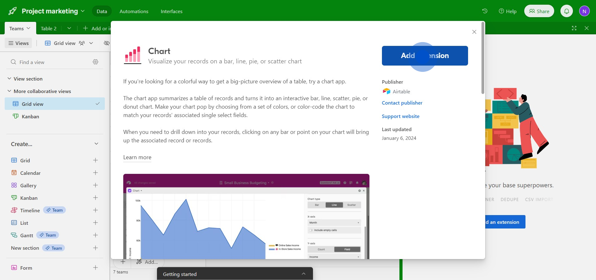
3. Now, click on the 'Add extension' button
4. Please choose the table you want to work with
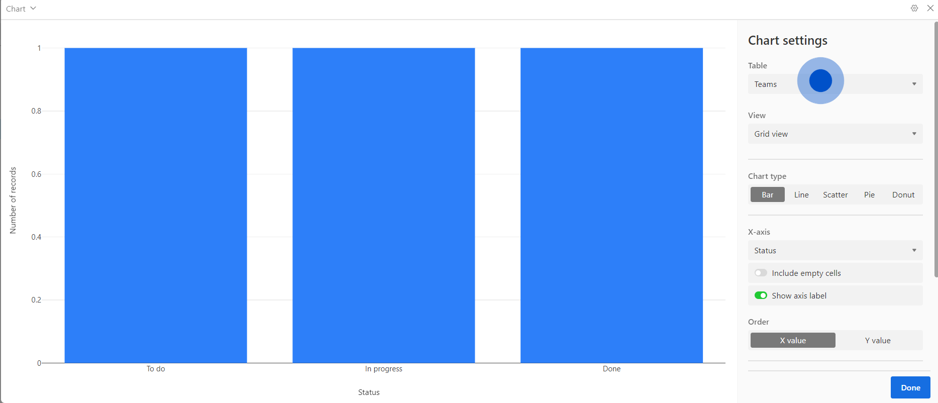
5. Then, select the view you wish to use
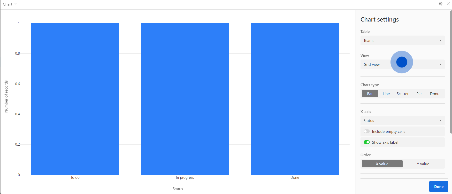
6. Proceed by clicking on 'Next'
7. Congratulations! Your chart has been successfully created
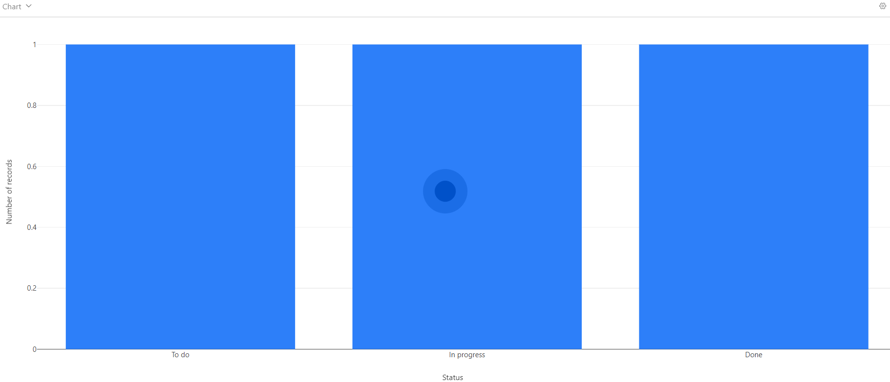
8. Great job! Your chart is now displayed next to your table.
Create your own step-by-step demo
Scale up your training and product adoption with beautiful AI-powered interactive demos and guides. Create your first Supademo in seconds for free.