Data shows that fully engaged customers contribute 23% more to revenue and profitability than the average customer. When users stay active, explore new features, and return often, your business grows.
But when engagement drops, even great acquisition numbers can’t make up for lost activity or churn. Low engagement affects revenue and slows product growth.
In this guide, we break down what user engagement really means, why it matters, and how you can improve it with 12 effective strategies and examples.
TL;DR
2. The biggest drop in engagement happens during onboarding when users struggle to see value fast enough.
3. Step-by-step, self-serve education helps users solve problems quickly and stay active without relying on support.
4. The best engagement insights come from a mix of metrics like activation, daily active users (DAU)/monthly active users (MAU), and feature adoption, tracked over time.
5. Continuous education keeps users interested after onboarding. Each new feature is a chance to guide and re-engage.
6. Supademo helps teams turn static help content into interactive demos that guide users to learn and stay active longer.
What is user engagement, and why does it matter?
User engagement shows how actively and meaningfully users interact with your product over time. It indicates how often they return, how deeply they explore, and how much value they gain from it.
For example, a project management app where users log in daily, complete tasks, and explore new features has higher engagement than one where users log in occasionally to check updates.
Here is a quick look at key metrics that define user engagement and what they measure:
When tracked together, these metrics show how users interact with your product and where friction exists.
Strong engagement highlights that users find the product useful and make it part of their routine. Here’s how engagement directly impacts business growth:
- Higher retention: Engaged users are more likely to renew, upgrade, and share positive feedback.
- Increased revenue: Strong engagement leads to longer subscriptions and better upsell opportunities.
- Faster growth: Active users drive referrals and positive reviews, which lower acquisition costs.
Why do users disengage?
Even great products lose users when the experience feels confusing or overwhelming. Engagement drops usually come from small but fixable gaps in onboarding, guidance, or perceived value. Some of the most common reasons users disengage include:
- Overwhelming onboarding: Too much information upfront confuses users and delays their first success.
- Unclear value: When users cannot see quick results or benefits, they lose interest in continuing.
- Poor product discovery: Hidden or mistimed features stop users from finding what matters most to them.
- Complex interfaces: Cluttered layouts or inconsistent design make navigation harder and reduce task completion.
- Lack of guidance: Users drop off when there is no clear path or help available at the right time.
Identifying these friction points helps you act early and guide users toward quicker wins and consistent adoption.
12 strategies to increase user engagement
These approaches work across different products and stages. Whether you are improving onboarding, education, or retention, the key is to remove friction and give users small, meaningful wins that build momentum.
Here’s a quick overview of the 12 strategies and when to use them:
Each of these strategies works best when applied at the right stage of the customer journey. You can combine several of them to create an engagement framework that grows with your product.
1. Create frictionless onboarding experiences
Onboarding shapes how users feel about your product from the very first click. If the experience feels simple, clear, and rewarding, users will keep going. If it feels confusing or forced, they often leave before discovering value.
The goal is to help users discover value quickly by removing friction and giving them the freedom to learn at their own pace.
Example:
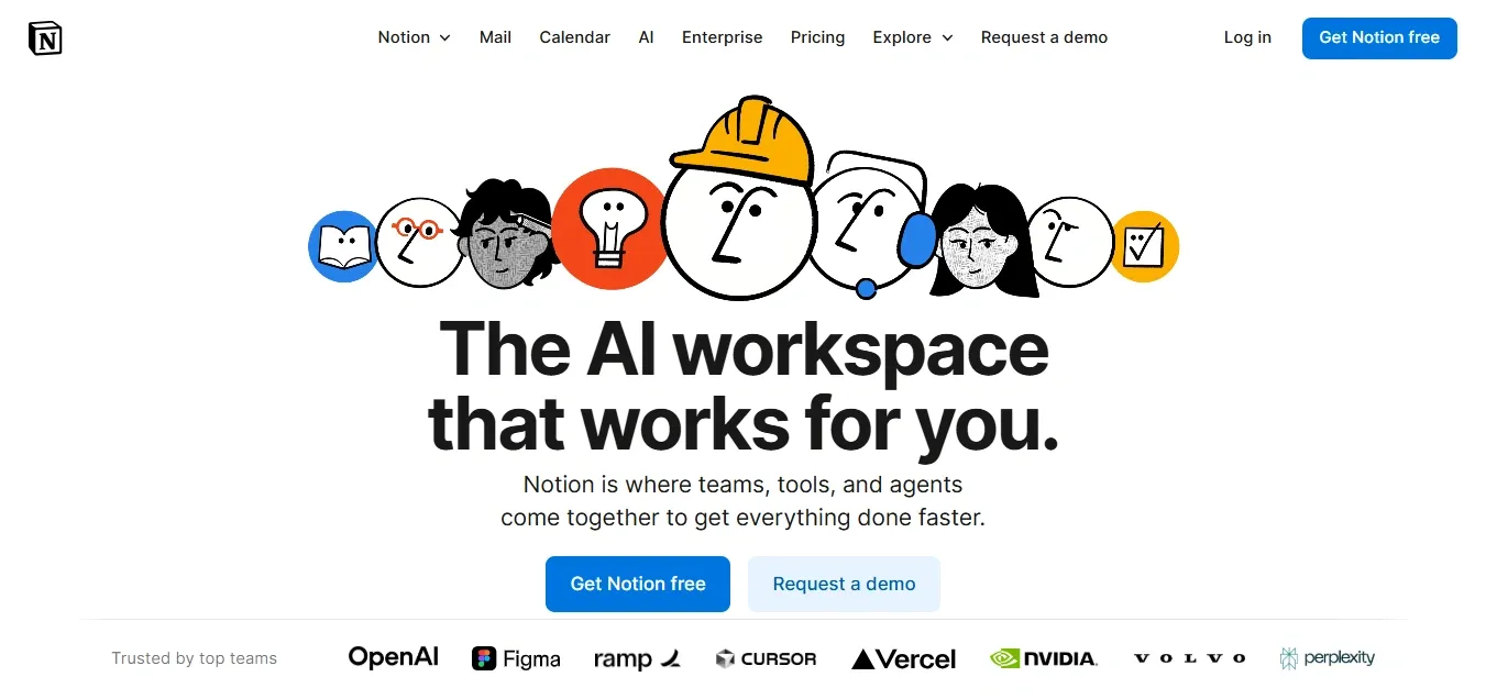
Notion keeps onboarding light and flexible. Instead of forcing users through a long tutorial, it lets them explore templates and features freely. As users start creating pages or databases, Notion provides short tooltips and inline prompts that explain what’s happening on screen. This helps users learn naturally and experience value within minutes.
1. Let users explore smoothly: Skip mandatory walkthroughs. Instead, offer a “Help me get started” option or a demo hub where users can learn when they are ready.
2. Guide toward one clear first win: Identify the simplest meaningful action, like creating a note, inviting a teammate, or adding a task, and design onboarding to lead users there fast.
3. Support with contextual learning: Place tooltips, hints, or short demos beside key interactions. Trigger them based on user actions so help appears only when needed.
Frictionless onboarding builds confidence early. When users can find value quickly without feeling overwhelmed, they stay curious, engaged, and ready to explore more.
However, traditional product tours often interrupt the flow and get skipped after the first few clicks. With Demo Hubs from Supademo, you can replace long, rigid walkthroughs with searchable, self-serve demo libraries that users open when they’re ready. This approach keeps help accessible without disrupting progress, leading to faster activation and higher user satisfaction.
2. Implement self-serve product education
After onboarding, users often want to explore new features or refresh steps without asking for help. When they can learn independently, they stay active and confident inside your product. Self-serve education makes that possible by offering the right guidance at the right time.
It also reduces the pressure on customer success and support teams, who often handle the same repetitive questions.
Example:

Canva helps users learn on their own through short in-app lessons and tooltips that appear when a new feature is used for the first time. These quick prompts give users just enough context to take the next step without needing a support article or video call.
1. Build a searchable help hub: Organize learning materials by topic and use everyday language in your titles. Add search filters and related links so users can find answers in seconds instead of scrolling through pages of text.
2. Place guidance in context: Identify where users get stuck most often and embed help directly into those screens. For example, add a small “Show me how” button beside complex actions so users can open a step-by-step walkthrough without leaving the app.
3. Use interactive demos, not static guides: Replace long how-to videos with clickable interactive product walkthroughs. Users can follow real steps and practice in a safe environment, which helps them remember better and complete tasks faster.
Self-serve education gives users instant access to help whenever they need it. It shortens response times, builds trust, and helps users feel more capable with each visit.
3. Reduce time-to-value
The faster users experience value, the more likely they are to stay engaged. Long setup times, confusing steps, or unclear next actions often delay that first win.
When users see results early, they build trust and motivation to continue exploring deeper features.
Example:

Slack makes new teams experience instant value by letting them send their first message within seconds of signing up. It skips long tutorials and focuses on helping users start a real conversation quickly. That early success reinforces the product’s purpose and keeps users active.
1. Simplify the first step: Remove unnecessary setup screens and guide users to one clear action that delivers visible results. For example, let users complete a task or view an outcome right after signing up instead of setting multiple preferences.
2. Personalize early tasks: Use user data or signup choices to show relevant features first. If a marketing manager joins, highlight campaign templates or reporting tools instead of generic setup options.
3. Set clear milestones: Break onboarding into short, trackable goals. Display progress indicators or checklists so users know what they’ve achieved and what comes next.
A short path to value keeps users motivated and reduces early drop-offs. It also creates a stronger emotional link between their goals and your product.
With Supademo, you can visually guide new users to that first success faster. Create guided HTML demos that show users real steps inside your product or sandbox demos that let them explore safely without setup. Each walkthrough helps users complete key tasks and see value in minutes, not days.
4. Leverage interactive product demos
Users learn best when they can see and try things for themselves. Interactive product demos turn learning into action by showing real steps in a safe, guided way. They help users understand your product faster, gain confidence, and stay engaged longer.
Static tutorials or videos often lose attention because they rely on passive watching. Interactive demos give users control, letting them explore features at their own pace and repeat steps until they feel comfortable.
Example:
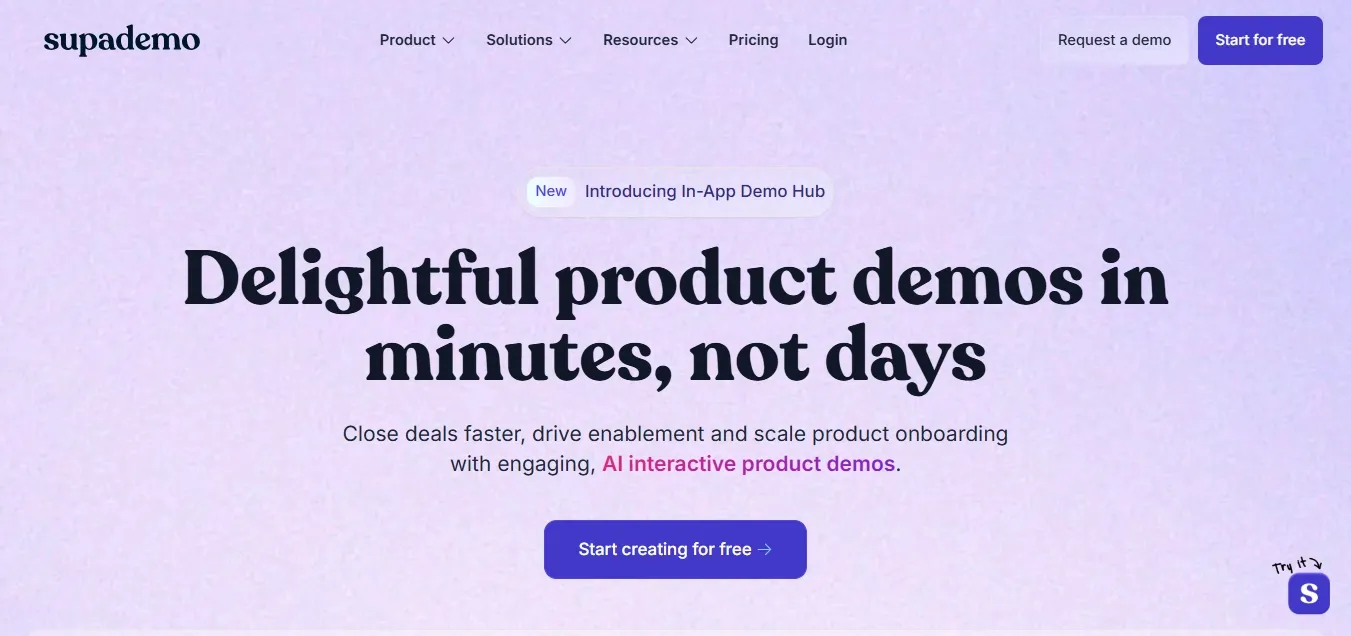
At Supademo, we use our own platform to educate and engage users throughout their journey. Interactive demos are embedded across the website, feature pages, and onboarding flows to show users how to record, share, and personalize demos.
The Supademo Learning Academy offers short, guided lessons that help users master each feature step by step.
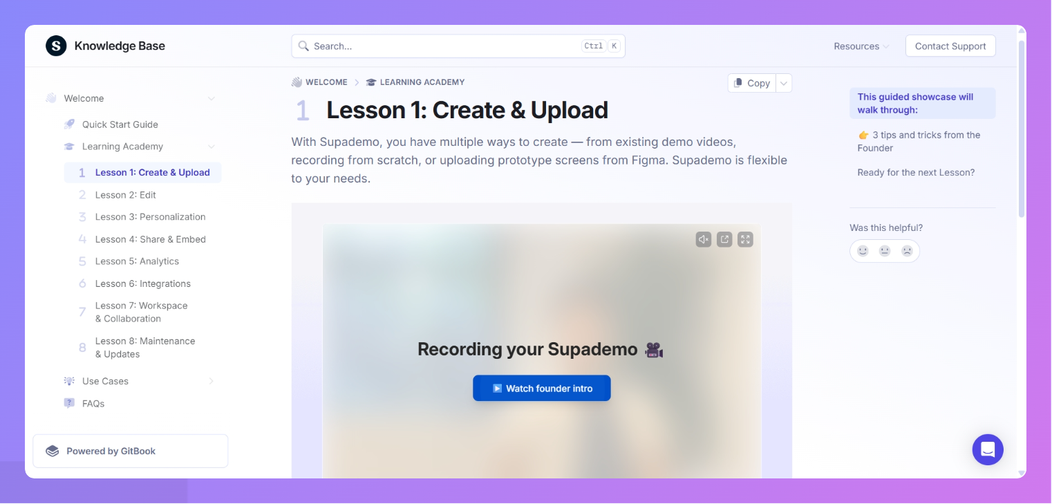
The Knowledge Base also provides clear tutorials with embedded interactive demos, so users can follow along directly instead of reading static text. This combination of self-serve demos and contextual learning helps users discover value quickly and stay active over time.
1. Integrate demos across key touchpoints: Add interactive demos on your homepage, pricing page, and feature sections to help visitors explore before signing up.
2. Use demos for ongoing education: Combine demos with short lessons or a learning hub so users can practice workflows and learn new features continuously.
3. Reinforce support content with demos: Embed interactive walkthroughs in your support and knowledge base articles to replace long text explanations with visual guidance.
Interactive demos make learning simple and consistent. They help users find value on their own, reduce dependency on support, and drive stronger adoption.
With Supademo, you can create and share clickable demos that teach users step by step. Use guided HTML demos for realistic, interactive experiences or guided screenshot and video demos for quick walkthroughs. Combine them in showcase collections to create a full learning hub that keeps users exploring, learning, and engaging.
5. Personalize user experiences
Every user signs up for a different reason. Personalization helps you guide each one toward what matters most to them. It ensures users see only the most useful content or features for their stage and goals.
When done well, personalization reduces friction and helps users reach value faster. In fact, studies show that 71% of users expect personalized experiences from brands.
Example:
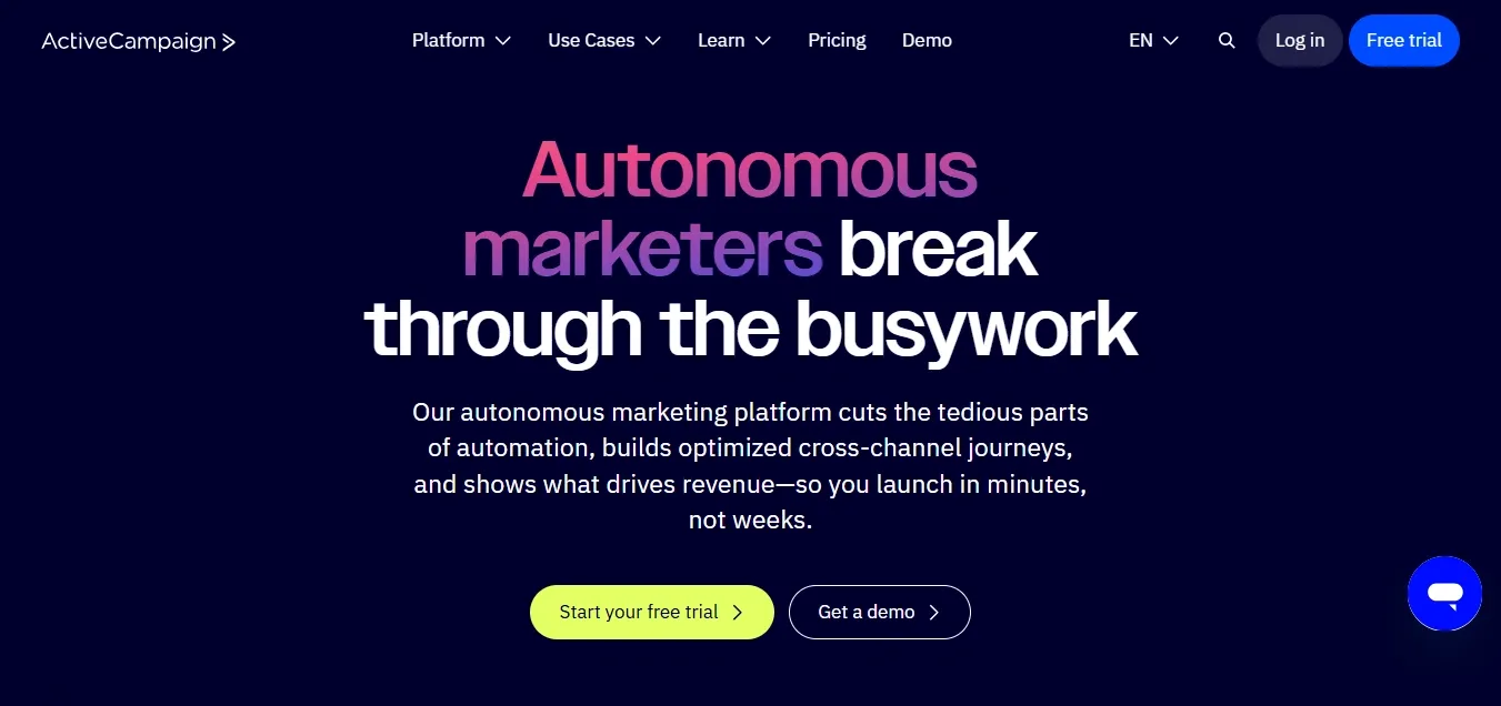
ActiveCampaign increases engagement from day one through goal-based onboarding. When a new user signs up, they answer a short survey about their goals, like sending newsletters or setting up automations. Based on these answers, ActiveCampaign builds a personalized onboarding checklist that guides users through the exact steps to reach their first success quickly.
1. Collect the right context early: Add one or two questions during signup asking about user goals or roles. Use this data to tailor dashboards, templates, or default settings automatically.
2. Use behavioral data to refine suggestions: Track the features users explore most. Then, use that insight to show next-step recommendations or hidden shortcuts through in-app cards or banners.
3. Update learning paths dynamically: Create a short “next step” checklist that adapts based on what a user has already completed. Remove tasks they’ve finished and add new ones that match their progress.
Personalization helps users focus on what they need most. It also signals that your product understands their journey and is built to help them succeed.
6. Improve product discoverability
Many users never explore beyond the first few features they try. Improving discoverability helps them find the full value of your product without feeling overwhelmed. It’s about guiding users at the right time, not showing everything at once.
Example:
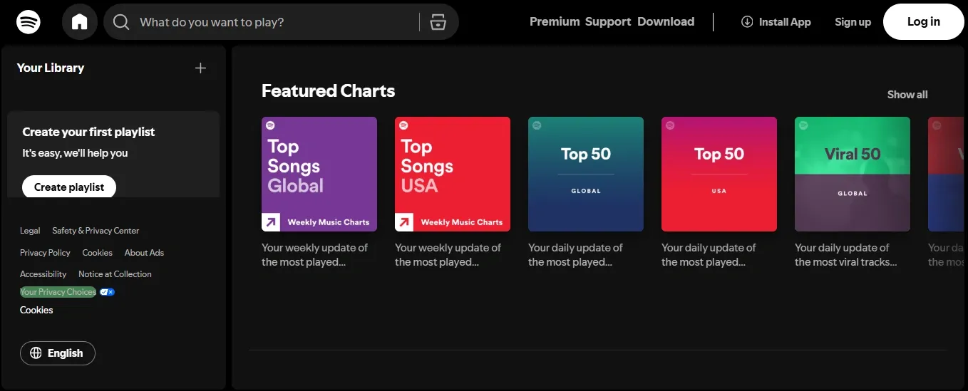
Spotify keeps users engaged by tailoring listening experiences around individual preferences. Every week, playlists like Weekly and Top Songs Global update automatically based on listening habits and new releases. This makes users return regularly to find music they enjoy, building a natural, ongoing engagement habit.
1. Design prompts around actions, not time: Trigger hints when a user completes a task instead of on login. For example, show an “automate this step” prompt after a manual workflow.
2. Use empty states wisely: Turn blank pages or dashboards into short, visual explainers. For instance, if a chart has no data yet, guide users on how to connect it.
3. Add a discover tab or hub: Group new features, releases, and tutorials in one in-app space. Make it easy for users to explore updates whenever they want instead of waiting for announcements.
Product discoverability should feel like uncovering helpful shortcuts. When users find features naturally, they stay curious and keep returning to learn more.
7. Build engaging in-app communication
In-app messages are one of the most effective ways to keep users informed and motivated. The key is to make them helpful, well-timed, and relevant to what the user is doing.
When messages fit into the flow, they feel like part of the experience rather than interruptions.
Example:
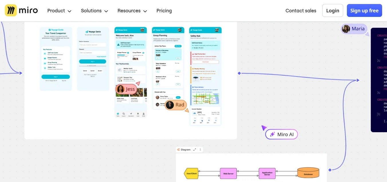
Miro guides users through small, contextual prompts. A new user sees a step-by-step product tour, which makes them aware of each of the features they get with Miro. Plus, returning users see short update cards about any new feature releases or updates. Messages appear only when they add value, keeping the experience smooth.
1. Define clear triggers for each message: Tie messages to real user actions, such as creating a project or finishing a task, so communication feels earned and contextual.
2. Use varied formats for different needs: Share updates in banners, teach workflows with short tooltips, and guide multi-step flows through embedded cards.
3. Review message frequency weekly: Audit your in-app messages to check for overlap or clutter. Remove older messages and limit new ones per session to avoid overload.
Engaging in-app communication feels conversational, not instructional. When done right, it strengthens user trust and helps them get continuous value from your product.
8. Create feedback loops
Continuous feedback helps you understand what users like, what frustrates them, and what they need next. More importantly, it shows users that their input matters, which builds trust and keeps them engaged longer.
A good feedback loop doesn’t just collect opinions; it closes the loop by acting on them and communicating those changes back to users.
Example:
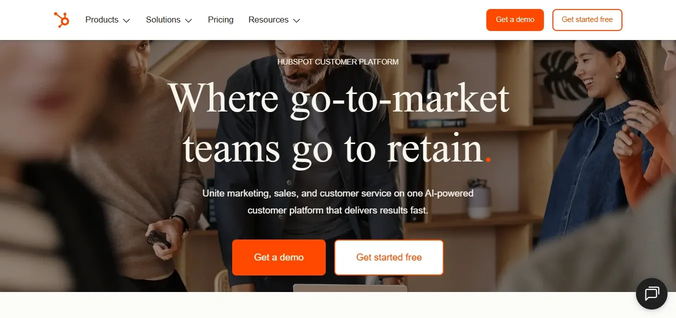
HubSpot builds engagement by involving users directly in its product roadmap. Through the HubSpot Ideas Forum, customers can suggest new features and vote on the ones they want most. When those ideas are released, HubSpot updates the community, reinforcing that user input truly drives product improvements.
1. Keep feedback short and contextual: Add small, one-question polls after key actions, such as completing a project or using a new feature. Avoid long surveys that break focus.
2. Tag and track common themes: Use a shared dashboard or tool to categorize feedback by feature or issue type. This helps product teams see patterns and prioritize what matters most.
3. Show users their feedback drives change: Announce updates that came from user suggestions in release notes or newsletters. For example, tag them as “requested by users.”
When users see that their input leads to real improvements, they feel part of your product’s growth. This sense of involvement turns casual users into loyal advocates.
9. Gamify the user experience
Gamification uses simple, motivating elements to make everyday tasks feel rewarding. It keeps users active by turning progress into something visible and satisfying.
The goal isn’t to add games, but to make engagement feel meaningful and fun.
Example:

Duolingo keeps users hooked with streaks, badges, and progress bars. Every small milestone, like completing a daily lesson, feels like an achievement. Users receive instant feedback and see their progress grow over time, which keeps them coming back.
1. Reward real progress: Link badges or levels to valuable actions such as completing setup, trying new features, or hitting usage milestones.
2. Visualize achievement: Add simple progress indicators that show users how far they’ve come and what’s next. Even a small completion bar can motivate continued action.
3. Encourage community recognition: Let users share achievements or progress within teams or communities. For example, show leaderboards or “most active” stats to spark friendly motivation.
Gamification works best when it enhances, not distracts. By helping users see and celebrate their progress, you create positive momentum that drives ongoing engagement.
10. Optimize for mobile and cross-platform
Users expect seamless experiences no matter where they interact with your product. If your app or platform feels clunky on mobile or inconsistent across devices, engagement drops quickly. Optimizing for mobile and cross-platform use helps users stay connected wherever they are.
Consistency builds trust. When the experience feels familiar and smooth on every device, users spend more time exploring instead of re-learning navigation.
Example:
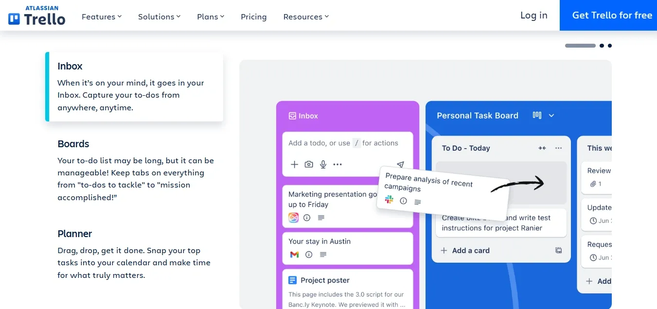
Trello keeps its mobile and desktop experiences almost identical in layout and flow. Users can move between devices without losing context or functionality. Real-time sync ensures any change made on one device instantly appears on another, keeping collaboration fluid.
1. Design mobile-first: Simplify key workflows so users can complete critical actions like adding tasks or replying to messages with one or two taps.
2. Use responsive design principles: Ensure layouts, buttons, and text adapt gracefully across different screen sizes without hiding essential features.
3. Test across devices regularly: Run usability tests on mobile, tablet, and desktop versions to identify friction points early. Prioritize fixing anything that slows down interaction or causes confusion.
Mobile and cross-platform optimization isn’t about fitting everything onto a smaller screen. It’s about making every user action easy, fast, and consistent, no matter where they are.
11. Use data to drive engagement
Data gives you clarity on how users actually behave inside your product. Tracking the right metrics helps you identify where engagement drops and which experiences drive retention.
The goal is to turn raw numbers into practical insights that improve how users interact and stay active.
Example:
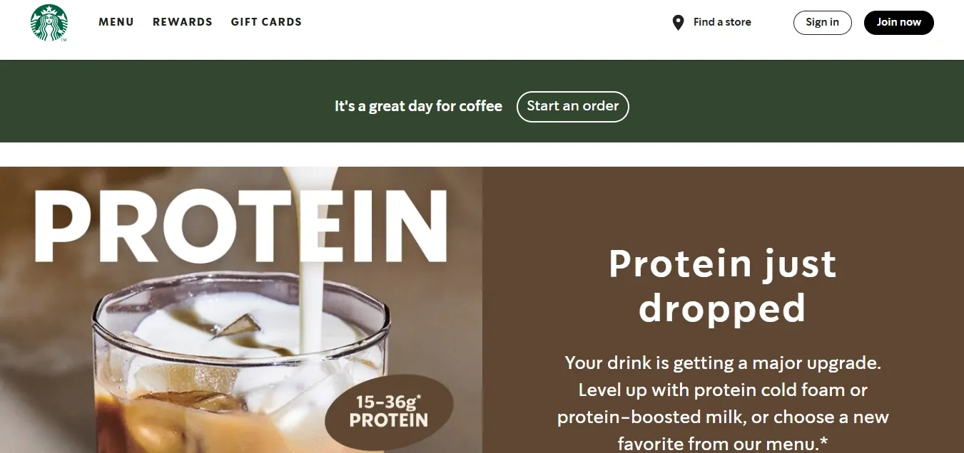
Starbucks uses purchase data from its rewards app to personalize recommendations and offers. Each time a customer orders, the app learns their preferences and suggests drinks, add-ons, or deals that match their habits. This approach makes every visit feel personal and keeps customers returning to earn more rewards and discover new items.
1. Start with clear engagement metrics: Track daily active users (DAU), session duration, and feature adoption to spot patterns in behavior.
2. Visualize data for quick action: Build simple dashboards for your team to see where drop-offs happen. Use these insights to prioritize improvements.
3. Run small A/B tests: Test one change at a time, such as button placement or tooltip timing to see how it affects engagement before rolling it out widely.
Using data to guide decisions helps you move from guesswork to precision. It ensures every new feature or change genuinely helps users stay active and find value faster.
12. Continuously educate with new features
Launching new features is not enough. Users need to know how to use them and why they matter. Continuous education keeps users engaged by showing them new ways to get value from your product.
When you make education part of every release, users feel supported and stay interested even after onboarding.
Example:

beehiiv educates its users with regular YouTube tutorials whenever new features are released. Each video focuses on a specific topic, such as connecting newsletters to Discord, setting up paid subscriptions, or using the updated dashboard. The tutorials are short, practical, and easy to follow. By teaching visually instead of relying on long announcements, Beehiiv helps users learn quickly and use new tools with confidence.
1. Pair every update with a quick tutorial: Create a one to three-minute walkthrough video or interactive demo that shows how the feature works in real scenarios. Focus on one use case at a time so it is easy to follow.
2. Promote updates in multiple places: Share new tutorials through in-app banners, newsletters, and social posts. Link directly to the demo or video so users can watch and try it instantly.
3. Build an effective resource hub: Store all updated tutorials and guides in one organized library or learning page. Tag them by topic or release date so users can easily revisit or explore past updates.
Ongoing education keeps your users active, informed, and confident. When they can see how each new feature helps them succeed, engagement becomes a continuous habit, not a one-time effort.
Common user engagement mistakes to avoid
To increase user engagement, it’s also essential to avoid patterns that make users lose interest. By spotting these early, you can build smoother experiences that guide users effectively.
Here are some common mistakes and how to fix them:
- Interruptive product tours that get skipped: Long, mandatory tours often cause frustration. Instead, create short, optional walkthroughs that users can open when they need help or explore later from a help menu.
- Sharing too much information upfront: Showing all features on the first visit overwhelms users. Break learning into smaller steps and introduce new features only after they reach key milestones.
- Treating every user the same: Different users have different goals. Use a short setup question or behavior data to personalize what each user sees first. Highlight features that fit their role or purpose.
- Ignoring user context and timing: If users see advanced tips before understanding the basics, they lose focus. Track usage patterns to show guidance when it makes sense for their progress.
Avoiding these common mistakes helps users learn at a steady pace and find value with less effort.
Measuring your user engagement success
Tracking the right metrics helps you know what users enjoy, where they pause, and which features drive the most value, which, in turn, helps you improve user engagement metrics.
Some of the key metrics and KPIs to track include:
These metrics should guide progress, not act as fixed goals. What matters most is consistent improvement over time.
Compare your results against your own history and product stage rather than industry averages. Early products might focus on activation and first value, while mature ones can track long-term retention and usage growth.
Tools like Mixpanel, Amplitude, and Supademo Analytics help you visualize trends and identify where users need more support. Regular measurement ensures that your engagement strategy keeps evolving with your users.
Increase user engagement through interactive learning with Supademo
The best way to keep users engaged is to make learning easy and accessible. When users can explore at their own pace and see how things work in real time, they build confidence faster and stay active longer. That’s where Supademo helps.
Supademo lets you create interactive, click-through demos that teach by showing. Whether you’re guiding new users through onboarding or educating existing ones about new features, you can turn any workflow into a hands-on experience without writing complex code.
Here’s how Supademo supports better engagement:
- Demo Hubs: Give users a central space to explore guided demos and tutorials whenever they need help.
- Guided HTML demos: Create realistic, interactive walkthroughs that look and feel like your actual product.
- Personalization: Tailor demos for different audiences using dynamic paths and variables.
- Analytics: Track engagement, completion, and drop-off rates to improve education strategies.
- Sharing: Embed demos anywhere or share them through trackable links, making learning available across every channel.
The best engagement happens when users learn by doing. With Supademo, you can create interactive demos that give every user an easy, self-serve way to explore your product, stay engaged, and find success faster.
FAQs
How can you shorten the time-to-value for new users?
Focus onboarding on one clear first success. Use guided demos or checklists to help users complete a small but meaningful task right away.
What is the best way to teach complex features without forcing a tour?
Use on-demand walkthroughs or demo hubs instead of long, mandatory tours. Let users open short, contextual lessons whenever they need help.
How do you time in-app messages without causing fatigue?
Send messages based on user behavior, not time. Trigger prompts only after a user completes a key action or reaches a specific milestone.
Which user segments should you personalize first?
Start with your largest or highest-value user groups. Tailor their onboarding and learning content based on goals or roles, then expand personalization to other segments.
How do you identify drop-off points in your product?
Use analytics tools to track where users stop engaging. Look at funnel steps, session recordings, or event data to see which actions cause users to leave.


