If I handed you a paper map and asked you to find your way, you might get there, but it’d take longer, feel frustrating, and leave you questioning if the destination was even worth it.
Now imagine the same journey with Google Maps: turn-by-turn guidance, real-time updates, and zero guesswork.
That’s the difference in-app product tours make. They’re the Google Maps of your product, helping users navigate features, discover value faster, and avoid dead ends. Whether you’re onboarding new users or guiding returning ones to underused features, a well-crafted in-app tutorial makes all the difference.
In this guide, we’ll break down exactly how to build in-app tutorials that do just that, with real-world examples, best practices, and a step-by-step framework you can use right away.
What are in-app tutorials?
In-app product tutorials are interactive, self-service guides built directly into your product’s interface. They walk users through how to navigate your app and use specific features.
You’ve likely seen one yourself. Maybe you signed up for a tool and got a pop-up nudging you to click a certain button. That’s an in-app tutorial doing its thing.
But great in-app tutorials do more than explain buttons. They show up throughout the user journey to educate, guide, and engage them to keep them engaged and boost retention.
✅ Launching a new tool? Walk users through it.
✅ Updating an existing feature? Explain the changes
✅ Low adoption? Provide contextual on-time nudges.
What are the benefits of using in-app tutorials?
In-app tutorials affect the entire user journey—from onboarding to retention, all because they serve numerous benefits if used correctly.
1. In-app tutorials drive feature discovery
It’s highly unlikely that even your power users know about all the new or hidden features, let alone your new users.
Not because they don’t want to—but because they’re busy. And when an employee, on average, juggles 10+ apps daily, the chances of them going on a treasure hunt to explore your tools are not likely.
This is where in-app tutorials shine. They surface the right features at the right time—without forcing users to look for them.
Think: tooltips that appear when someone hits a common friction point, or a pop-up prompting users to explore a new AI feature.
2. In-app tutorials increase feature adoption
Feature discovery is great—but adoption is what actually moves the needle. Just because users know the feature exists doesn’t mean they will use it. They need to see the benefits and understand the effort involved.
Product guidance like tooltips, checklists, and walkthroughs bridges the gap. They help users understand why a feature matters and how to make it part of their workflow.
When such guidance happens, you see: Lower time to value (TTV)
- More upselling opportunities
- Higher retention
3. In-app tutorials convert more free trial users
Leaving trial users to fend for themself is like locking them in an escape room—blindfolded. They might poke around and figure out a few things, but the clock’s ticking.
The result? Confusion → inaction → churn.
In-app tutorials remove that blindfold.
They highlight the first steps, reduce overwhelm, and unlock the IKEA Effect—the idea that people value things more when they’ve built or discovered them independently.
When you guide trial users to complete small but meaningful tasks—like creating their first report or sending a test email—they gain confidence, and (eventually) it leads to higher conversions.
4. In-app tutorials give you rich product data
In-app tutorials also act like your product's stethoscope—quietly monitoring where users hesitate, drop off, or double down.
By tracking tutorial completion, tooltip engagement, and checklist drop-offs, you’re collecting behavioral data that reveals: Where users get stuck
- What gets ignored What triggers action
That’s gold for you to improve existing tutorials, launch timely updates, and prioritize features that matter most to your users—not just your roadmap.
Types of in-app tutorials (and when to use each one)
Here's a quick rundown of the most-used in-app tutorials. 👇🏼
In-app tutorials | Description | When to use |
Interactive walkthroughs | Step-by-step guides that require user input to proceed | Step-by-step guides that require user input to proceed |
Guided checklists | Self-paced task lists that track progress | Structured onboarding with flexibility |
Setup wizards | Full-screen flows guiding workspace or account setup | Multi-step configurations or role-based personalization |
Hotspots (Pulsing dots) | Subtle nudges that draw attention to a UI element | Discovery of underused or secondary features |
Tooltips | Click/hover-based messages offering extra context | Technical or icon-heavy interfaces |
Pop-ups/modals | Interruptive overlays with key messages or CTAs | Announcements, major updates, or important guidance |
Banners/snack bars | Slim, persistent messages for passive alerts | Lightweight updates or feature reminders |
Embedded micro-videos | Short, contextual videos embedded in the UI | Teaching workflows or complex features visually |
Help widgets/resource centers | Docked help bubbles with links to support, docs, chat | Always-on, searchable self-serve support |
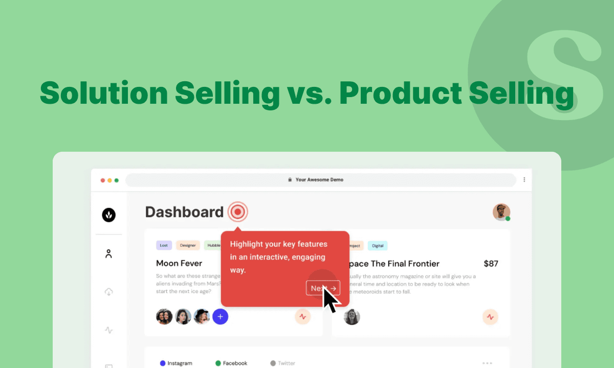
1. Interactive walkthroughs
In-app interactive tours are hands-on, step-by-step flows that walk users through your interface and require input to continue.
These are also among the most common UX patterns companies use as they give a 360-view of your product's key features at once.
Here's an example of an interactive walkthrough of Wise:
Use when: - You’re onboarding new users
- Launching new complex features
2. Guided checklists
Guided checklists offer users a choose-your-own-adventure approach to customer onboarding.
They provide structure without forcing a rigid order—and the progress tracking? It can be really addictive (in a good way!).

Use when: - You want users to build momentum (dopamine hits!)
- You want to reduce the paradox of choice by highlighting must-know features
3. Setup wizards
Setup wizards are full-screen flows that typically aim to personalize the initial experience or configure their workspace. Think of it as a “welcome assistant.”

Use when: - Onboarding involves multiple decisions (roles, teams, preferences)
- You want users to hit the ground running
Hotspots (Pulsing dots)
Hotspots are subtle, animated icons placed near UI elements. When clicked or hovered, they reveal a tooltip or modal explaining a specific action or overview.

Use when: - Highlighting lesser-known features
- Nudging users to try something they haven’t explored
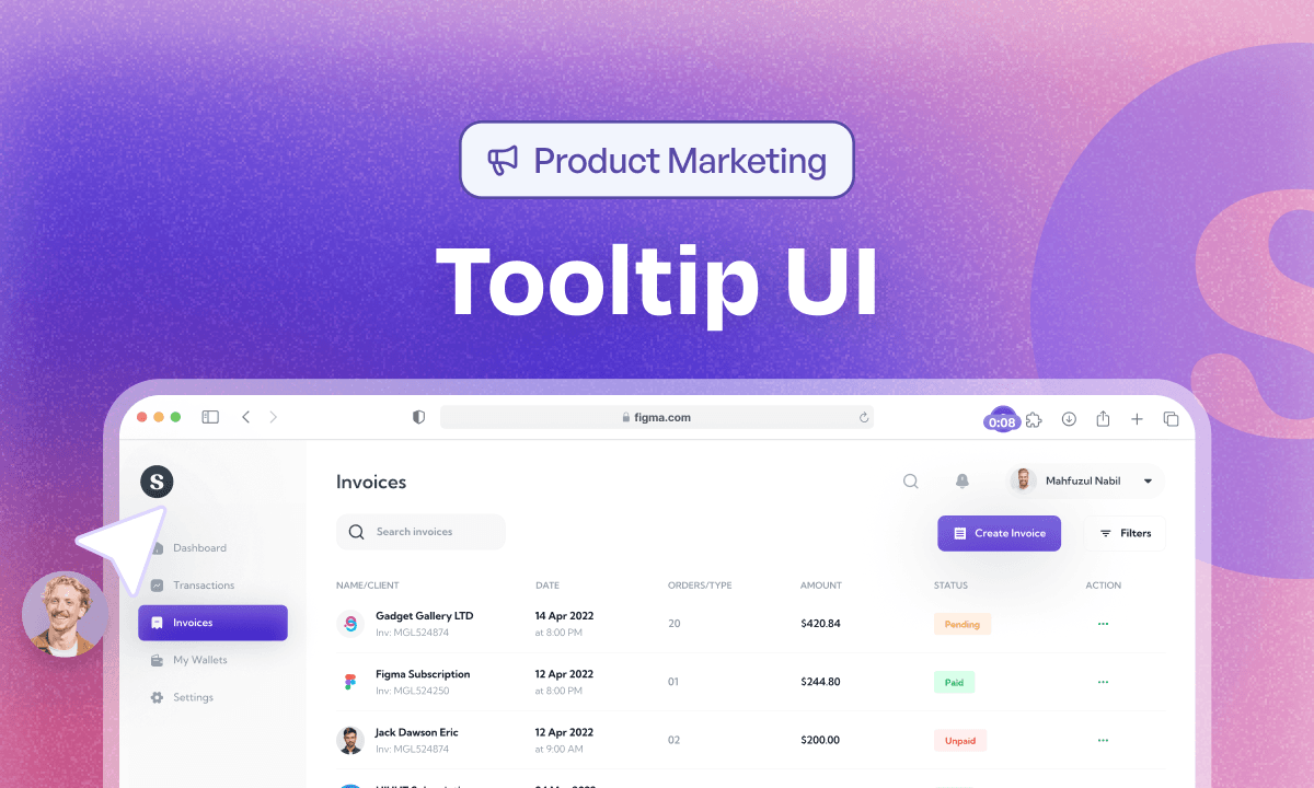
Tooltips
A tooltip is a brief contextual message that appears when users click or hover over it. They often appear as ⓘ or ? icon next to the feature or options they explain.

Use when: - Your UI is dense, icon-heavy, or technical
- You need to provide just-in-time help without breaking the flow
Pop-ups/modals
Pop-ups are interruptive but powerful modal windows that appear over your app's interface to draw the user's attention. It can contain textual information with graphics, GIFs, videos, or other media.
Use when: - You have a major product announcement
- You’re promoting a hidden gem feature
Banners/snack bars
Banners are persistent, lightweight messages at the top or bottom of the app screen, announcing major updates, new feature launches, or showing alerts.
Use when: - Announcing small changes
- Sharing passive alerts
- Promoting beta invites or trials
In-app demo hubs
In-app demo hubs are an in-app tutorial format that acts as a searchable, centralized library of interactive demos embedded directly inside your product or website. Unlike one-off tours or tooltips, demo hubs stay available at all times, letting users search, explore, and learn whenever they need guidance.
Use when: - You want always-on, self-serve product education.
- You need to centralize demos for sales, onboarding, or training.
- You want to reduce support requests by guiding users in-app.
Help widgets/resource center
Help widget is a common UI element that gives in-app access to a searchable knowledge base, tutorials, or live chat.

Use when: - You want to offer 24/7 help without overwhelming the UI
- You want to reduce support tickets with proactive self-service
How to build amazing in-app tutorials
Here are all the steps you need to follow to build a thorough and relevant in-app tutorial
Step 1: Map the actual user journey (not the ideal one)
Start by mapping the user journey—not the happy path. The actual, messy, real-world path.
A user journey map will show you
- All the touchpoints users take to navigate your product
- What actions do they take (or skip)?
- Where do they pause, backtrack, or drop off?
Use tools like Mixpanel, Amplitude, or Heap to analyze funnel reports and feature flows. You can analyze how many users complete onboarding, where they pause, and which features get ignored entirely.
Then, pair this “what” with the “why."
- Watch session replays (Hotjar, FullStory)
- Read chat logs or survey responses
- Read chat logs or survey responses
With that information, sketch the journey. A typical map might look something like Spotify's user journey map.
To get even more concrete data, become the user.
As Andrew Capland, PLG advisor and growth coach, suggests, go through your onboarding like a first-time user. You’ll spot issues no analytics tool can.
Step 2: Find gaps in the feature adoption
Once you have your user's journey blueprint, zoom in on feature adoption—not just which feature is being used, but how, by whom, and how often.
This step helps you identify which features are delivering value and which ones might be flying under the radar.
Here’s what to look for: User or adoption demographics: Look at adoption across different user segments. Is it mostly new users? Power users? A specific persona? This tells you a lot about the feature’s broader appeal and usability.
- Type and frequency of adoption: Are users trying it once and dropping it off? Or using it regularly? Dig into frequency and usage patterns to spot misalignments between design and actual behavior.
- Time and duration of adoption: Track how long it takes users to discover and start using the feature. Then look at how long they continue using it. This reveals whether the feature delivers lasting value or just initial curiosity.
Aspects of feature adoption | Questions to answer |
User demographics |
|
Type and frequency of adoption |
|
Time and duration of adoption |
|
Running the above analysis should give you a fair amount of information to enlist the potential gaps to address through in-app tutorials.
To collect the data points we mentioned above, use these two tactics: 1. Talk to your users
No tool can give you as rich insights as the real user. Run in-app surveys or feedback prompts, review support tickets, or carve out some time and hop on a call with them.
2. Use tools Mixpanel or Amplitude to understand metrics like activation rate, feature usage duration, etc.
- CRM tools like Segment, HubSpot, and Salesforce to under individual and account-level user demographics
- PostHog, Fullstory, and Google Analytics (for web apps) for behavioral analytics
- Hotjar, Smartlook for analyzing session recording and tracking in-app interactions
Step 3: Design your in-app tutorial
It’s time to put your research onto the digital canvas, your product’s interface.
Pick the right in-app guidance format
Choose your in-app elements based on the goal: Go with product walkthroughs or guided checklists to reduce time to value and showcase a specific feature or workflow in action
- Use hotspots or tooltips for just-in-time education with minimal interruption
- Use micro-videos to give a thorough walkthrough of a complex feature
Spoiler alert: You can opt for a combination of tutorials, each serving a different purpose (more on this below)
Sketch the tutorial flow
Use Figjam, Miro, or Canva to sketch how users will move through the tutorial. Consider users' different steps and how you want them to navigate to reach the aha! moment.
PRO TIP: Consider adding progress bars in interactive walkthrough as they increase completion rate 12%.
Write useful and clear microcopy
Microcopy is little but impactful words that educate, guide, and teach users through different steps and options.
Good microcopy reduces friction by answering users’ questions like: Where am I? What should I do next? How does it work?
Here are a few ways to write impactful copy: Use simple, plain language. Even experts prefer such language
- Format the copy. Bold or italicized words or phrases for emphasis
Infuse your brand voice (yes, drop the robot-speak!)
Build and launch the prototype
Jump into your chosen in-app tutorial platform to bring the sketch to life.
Use Pendo, Userguiding, or Userpilot to build these tutorials without writing a single line of code.
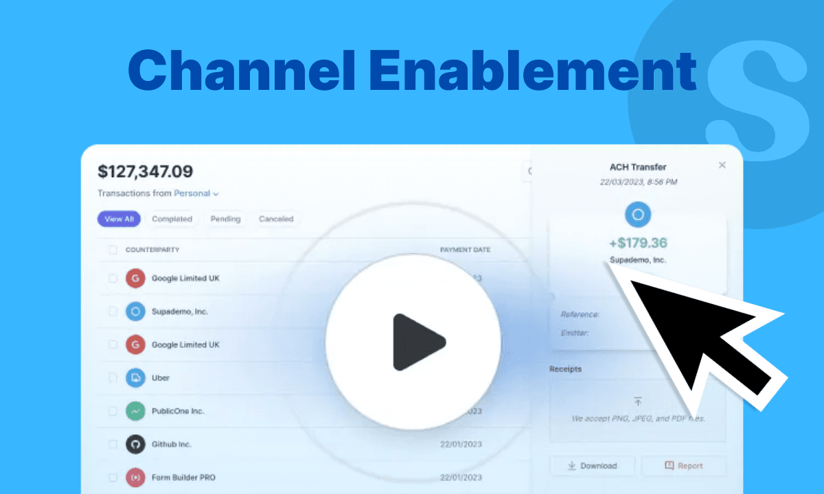
To simplify the building process even further, use Supademo. It helps you build interactive product walkthroughs using screen or HTML recording.
What’s interesting is that you can build these walkthroughs and trigger them in-app, reducing the effort of creating one from scratch while serving a dual purpose—educating website visitors and onboarding new users.
Step 4: Test it (before you make it live)
Run lightweight testing rounds to ensure the correct rendering, flow, and pace.
- Run internal tests: Ask teammates to go through the tutorial. Watch their interaction. Ask probing questions like, “Did this step help you do X?”
- Batch user testing: Release to a small user segment and collect feedback.
Based on the testing, iterate on the tutorials before you push them for public use.
In-app tutorial goldmine: 12+ examples from SaaS brands
We signed up for 50+ SaaS platforms to analyze their in-app tutorials as first-time users. We nitpicked these 12 standout examples—each one featuring thoughtfully crafted in-app guidance designed to make onboarding feel like a breeze.
1. Monday.com
Monday.com is a project management platform that helps teams create project proposals, collaborate with stakeholders, and monitor a project's progress.
Being a multi-use case product, there are tons of in-app tutorials offered to a new user—pulsing hotspots, non-intrusive pop-ups, and walkthroughs.
What we loved: Pop-ups appear in the bottom-right corner—out of the way but easy to notice. This allows users to choose their own experience without a hard push.
- Instead of relying on text alone, the pop-up includes short GIFs that show users how a feature works in action—helping them learn faster through visual cues.
- Subtle hotspots draw attention to core features without overwhelming the screen. When clicked, they offer plain-language explanations that feel friendly and helpful.
2. Loom
Loom, a video recording software, offers two in-app tutorials to its first-time users- a guided checklist alongside a video walkthrough.
What we loved: The top progress bar shows users how far they’ve come—building motivation through visible progress.
- The checklist offers options for each step—users can either complete the action or learn about it first. This makes the experience feel more supportive than pushy.
- The “How to record a Loom” video gives users a see it before you try it option, making it easier for those who want to get a thorough walkthrough before taking action.
3. Wordtune
Wordtune is an AI writing assistant that helps you improve your writing and summarize texts. As the tool is icon-heavy, each icon has a hover-based tooltip that explains its function.
What we loved: The use of tooltips fits perfectly with its icon-heavy interface, offering just-in-time learning to users.
- The tooltip copy is concise, clear, and impactful, giving enough information to make users understand each icon's job.
4. Pipedrive
Pipedrive, a sales CRM tool, uses a mix of in-app education to support users throughout their journey.
On its main dashboard, it shows 2-step walkthroughs with an option to explore the explained feature as a video as well.
Later on, when users explore specific features, Pipedrive surfaces targeted pop-ups with short intro videos—perfect for self-paced learning.
What we loved: Pipedrive meets its user's needs by offering a mix of tutorials to encourage self-paced learning.
- Each tutorial includes a clear CTA, allowing users to dive in, learn more, or take action immediately—without forcing a rigid path.
- The copy in each tutorial is concise and benefit-driven. It clearly explains what the tutorial is about and why it matters.
5. Reclaim.ai
Reclaim.ai is an AI productivity help that helps you manage your plan and prioritize work and personal life. It shows feature-level step-by-step tutorials that explain all the tools within that specific feature.
What we loved: The embedded image helps users connect what they’re reading with what they’re seeing—without needing to hunt for the feature. This reduces cognitive load and builds confidence (“Ah, I know where this is”)
- Each step is detailed and explains the 'what' and 'how' behind the feature.
- The walkthrough moves sequentially, helping users visualize a typical workflow once they get familiar with it.
- The confetti at the end is a real dopamine hit!
6. Butter
Butter is a virtual collaboration platform that offers a 'made it for you' experience before even seeing the product's interface.
What we loved: Giving users a way to customize their profile (random avatar or photo) quickly encourages them to engage more deeply with the platform from day one.
- Everything from the gradients to the microcopy reinforces Butter’s lighthearted, creative personality—setting clear expectations for the product experience.
7. Framer
Framer is a no-code website builder that helps businesses and creators launch beautiful, high-performing websites—fast. As most of the features relate to customizing the website, tooltips fit right into it.
What we loved: Each tooltip appears right next to the relevant feature label—minimizing confusion and making the guidance easy to spot.
- Instead of forcing instruction, Framer uses the familiar info icon (ⓘ) to invite curiosity. It gives users control over when they want to learn more.
- Tooltips include a “Learn more” CTA, allowing users to dive deeper only if they want.
8. Tolstoy
Tolstoy is a shoppable video platform that helps e-commerce build and embed interactive videos on their online store. A pop-up-based walkthrough appears, giving a teaser of its features.
What we love: The tutorial opens with a human touch—“Danielle from Support” introduces you. It creates instant relatability and reduces intimidation for new users.
- Users can delay the tour if they’re not ready—giving them control, which is key for reducing friction in onboarding.
- Instead of just text, each slide in th pop-ups has features, video thumbnails, and visuals of real use cases. It shows what’s possible.
9. Zapier
Zapier is an automation platform that integrates with 1000+ apps and helps you automate different aspects of your work. Rather than using a checklist or tooltip, Zapier uses a more immersive approach to in-app guidance—a video walkthrough by a human.
What we loved: The video's headline, “Get everything you need in just 3 minutes.” makes a promise and upfront answers the busy users' objection, I don't have time to watch a video,' by specifying the time duration.
- Featuring a real person explaining the product makes the experience more personal and engaging—especially for first-time users who might feel unsure.
- The videos are not just talk but show. It helps users learn how to build their first zap, the targeted action Zapier wants new users to take.
10. Buffer
Buffer is a social media management tool that helps marketing teams and content creators manage their social profiles. It reduces new user cognitive load by offering a simple 4-step checklist.
What we loved: The checklist follows the exact path a new user would take to publish their first post—connect a channel, draft an idea, and hit publish. There is alignment with the user action from the start.
- With just four steps, the checklist covers the essentials—getting users to their “aha!” moment fast, without unnecessary detours.
- Progress bars show users how far they’ve come and how close they are to finishing—creating a sense of momentum and satisfaction with each step.
11. Scoro
Scoro is a project management tool that offers the most colorful guided checklist we've seen so far.
What we loved: It gives users a "choose your own adventure" experience, letting them explore the product at their own pace.
- Welcome pop-up explains the value of the checklist upfront, helping reduce hesitation and giving users a clear reason to engage.
- Users can either follow the checklist or skip it and jump into a virtual demo—showing that Scoro caters to its user's different learning preferences or levels of familiarity.
12. Toggl
Toggl is a time-tracking software that helps businesses and solopreneurs track their time and manage projects. It walks users through a 5-step walkthrough soon after the signup.
What we loved: The tutorial walks users through each key action (e.g., starting a timer), one step at a time, making it easy for first-time users to follow without feeling overwhelmed.
- Each step is anchored near the right feature—exactly where the user should focus. This removes any guesswork and keeps users in context.
- “Step 2/5” assures users how long it will take to motivate them to stay engaged.
- Each step has a clear heading followed by a brief text description. It not only tells users what the feature is but also how users can use it.
Build your first in-app tutorial with Supademo
In-app tutorials are your product's GPS for your users.
From improving activation to turning trial users into loyal ones, they make product exploration smoother, faster, and far less frustrating. Whether it’s a subtle tooltip or an interactive checklist, great in-app guidance meets users where they are and nudges them toward value—without causing friction.
If you're ready to build tutorials that don’t just tell but truly teach, give Supademo a try. It’s the fastest and easiest way to create interactive walkthroughs and show them in-app at the right time to the right user segment. Start your free trial today!
FAQs
Commonly asked questions about this topic.
How to create in-app tutorials?
How to optimize in-app tutorials for engagement?
How do in-app tutorials reduce costs and improve adoption?
What mistakes should you avoid in in-app tutorials?

Nupur Mittal
Content Writer
Nupur is a content writer with 3+ years of experience writing for SaaS startups and agencies. Her expertise lies in writing customer-centric content.