Onboarding Snapshot
Activation Event
First newsletter issue drafted and published
Time-to-Value
~10–15 minutes, 10+ steps
Primary Strength
Phased walkthroughs break complex setup into clear milestones
Primary Risk
Upgrade prompt before First Strike shifts focus to pricing
Overview
beehiiv does something most creator tools don't: it treats the complexity of launching a newsletter as a problem the product needs to solve, not a burden the user should figure out. The three-phase walkthrough structure — account setup, website, newsletter design — is genuinely well-designed. It makes a ten-step onboarding feel manageable because each phase is bounded, completable, and clearly labeled.
What Should You Steal?
Swipe through actionable takeaways from this onboarding flow.
How beehiiv Uses Product Bumpers
Three distinct walkthrough phases keep complexity from arriving all at once.
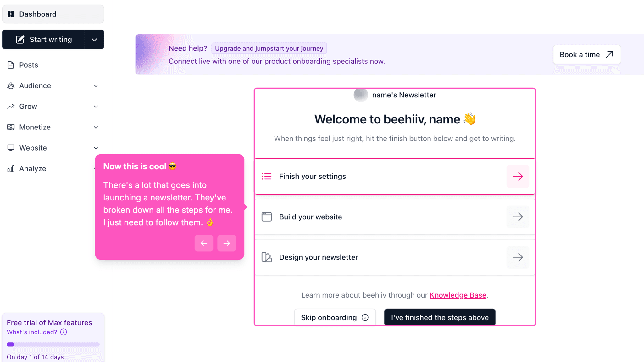
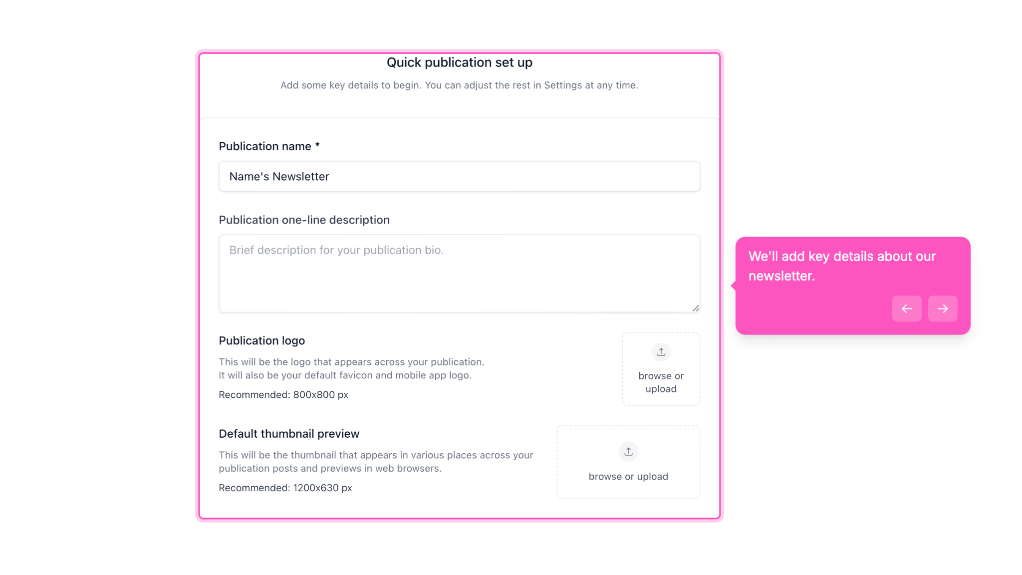
After signup, beehiiv doesn't drop users into the full dashboard and wish them luck. Instead, it sequences the setup into three focused phases: account setup, website configuration, and newsletter design. Each phase has its own checklist with progress tracking. This means users never face the full surface area of the product at once — they're always working inside a bounded, completable task.
How beehiiv Uses Product Bumpers
The progress bar during pre-workspace setup does real work.
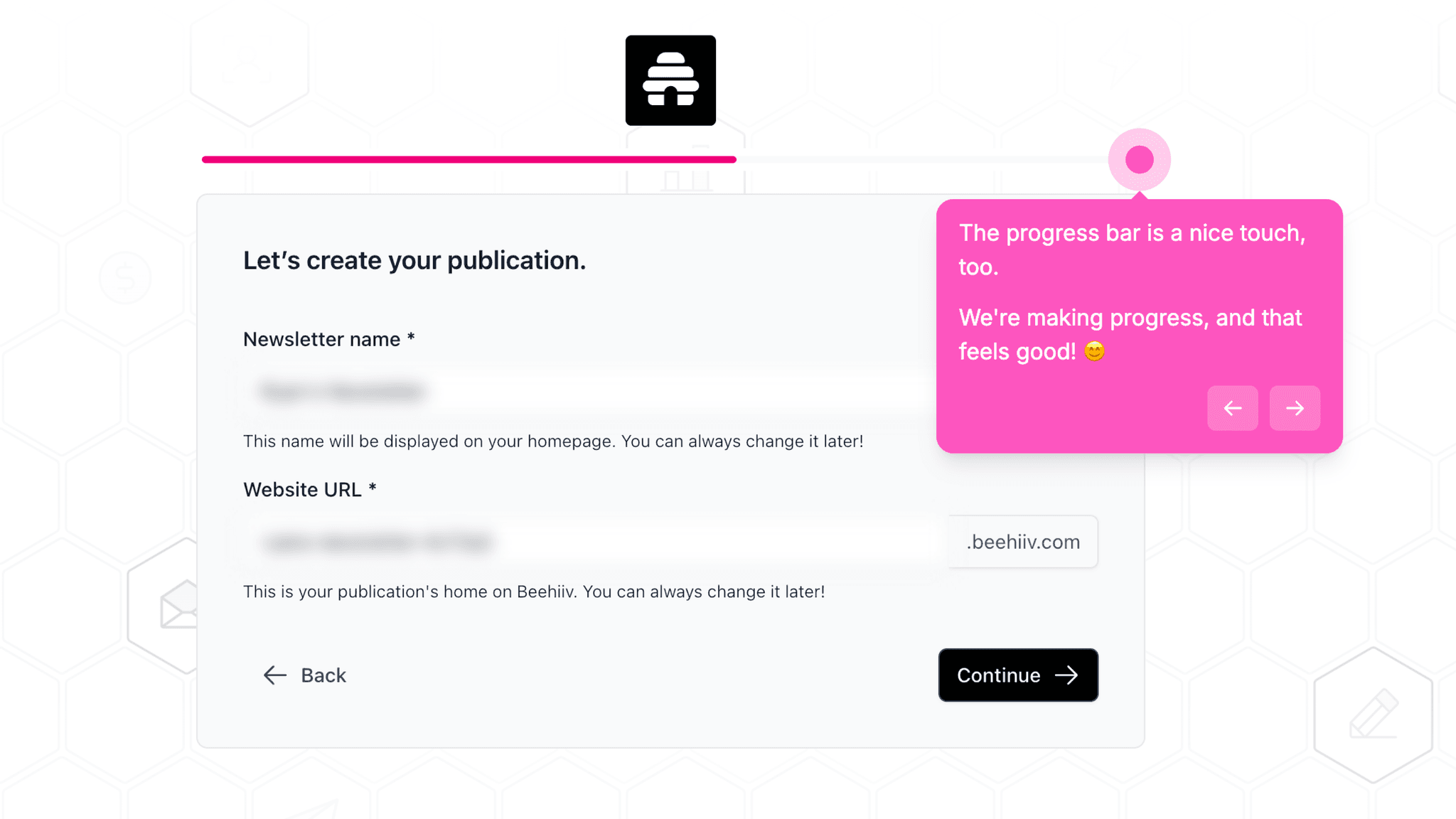
beehiiv shows a visible progress indicator during the multi-step signup flow covering publication name, URL, experience level, and source attribution. This isn't decoration — it's the difference between a user who drops off at step four because they don't know how many more steps are coming and one who completes it because they can see the end. The bar functions as a commitment device, not just visual feedback.
How beehiiv Uses Product Bumpers
Templates eliminate blank-page paralysis at two separate moments.
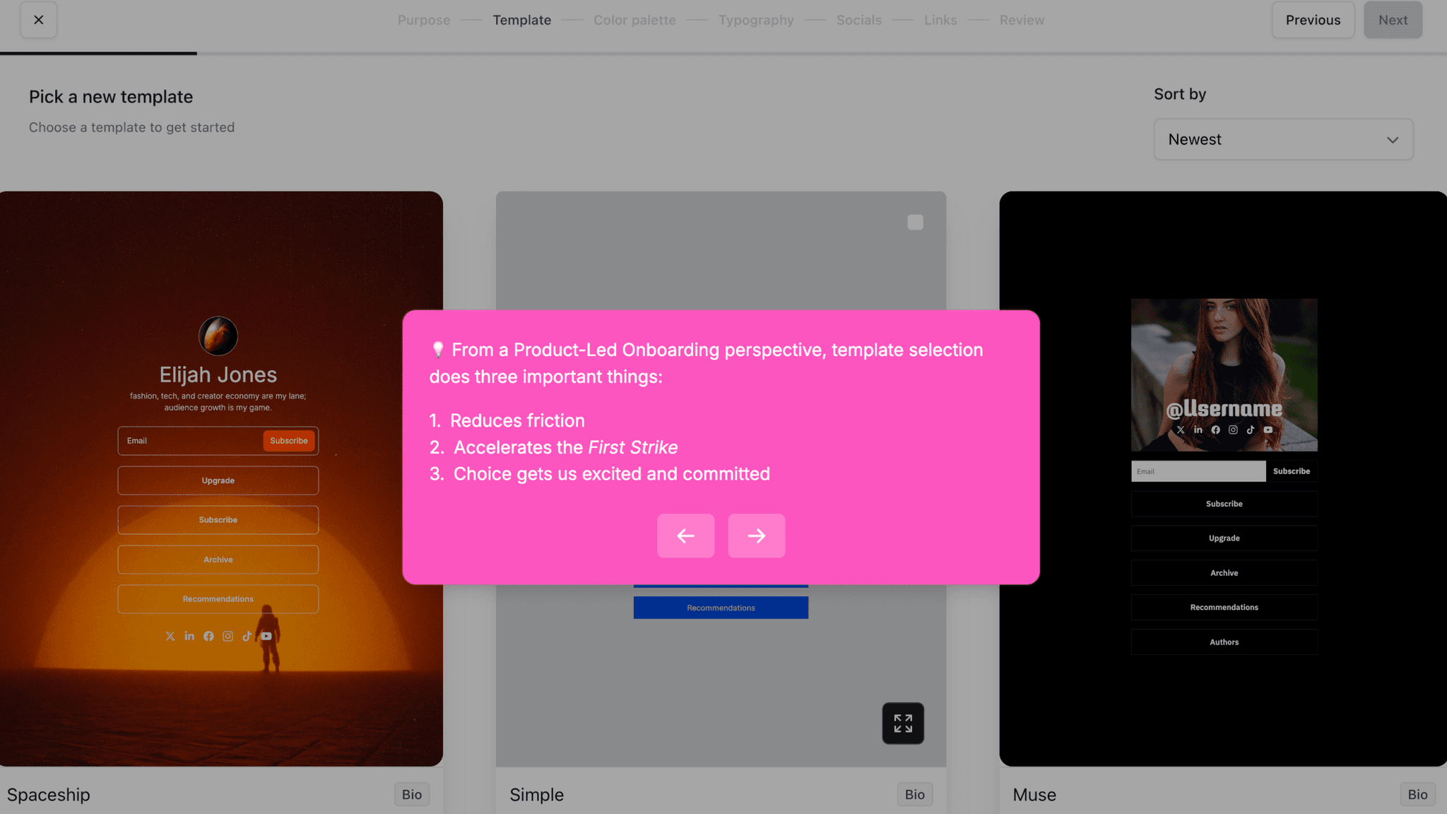
When configuring the website and when designing the newsletter, beehiiv offers pre-built templates. The choice is narrow enough to be fast but wide enough to feel like a real decision. Users arrive at their first published issue with a setup that already looks complete — not something they had to build from scratch while also learning the interface.
How beehiiv Reduces Decisions Early
Naming the publication and locking the URL in pre-workspace steps creates early psychological investment.
Before I see any features, I've already made two identity-level decisions: what this newsletter is called and what URL it lives at. These aren't cosmetic questions. Committing to a name and a URL makes the product feel real before I've touched it. That investment carries forward through the setup steps that follow.
How beehiiv Reduces Decisions Early
Experience and origin questions during signup don't appear to change the workspace experience, but they create momentum.
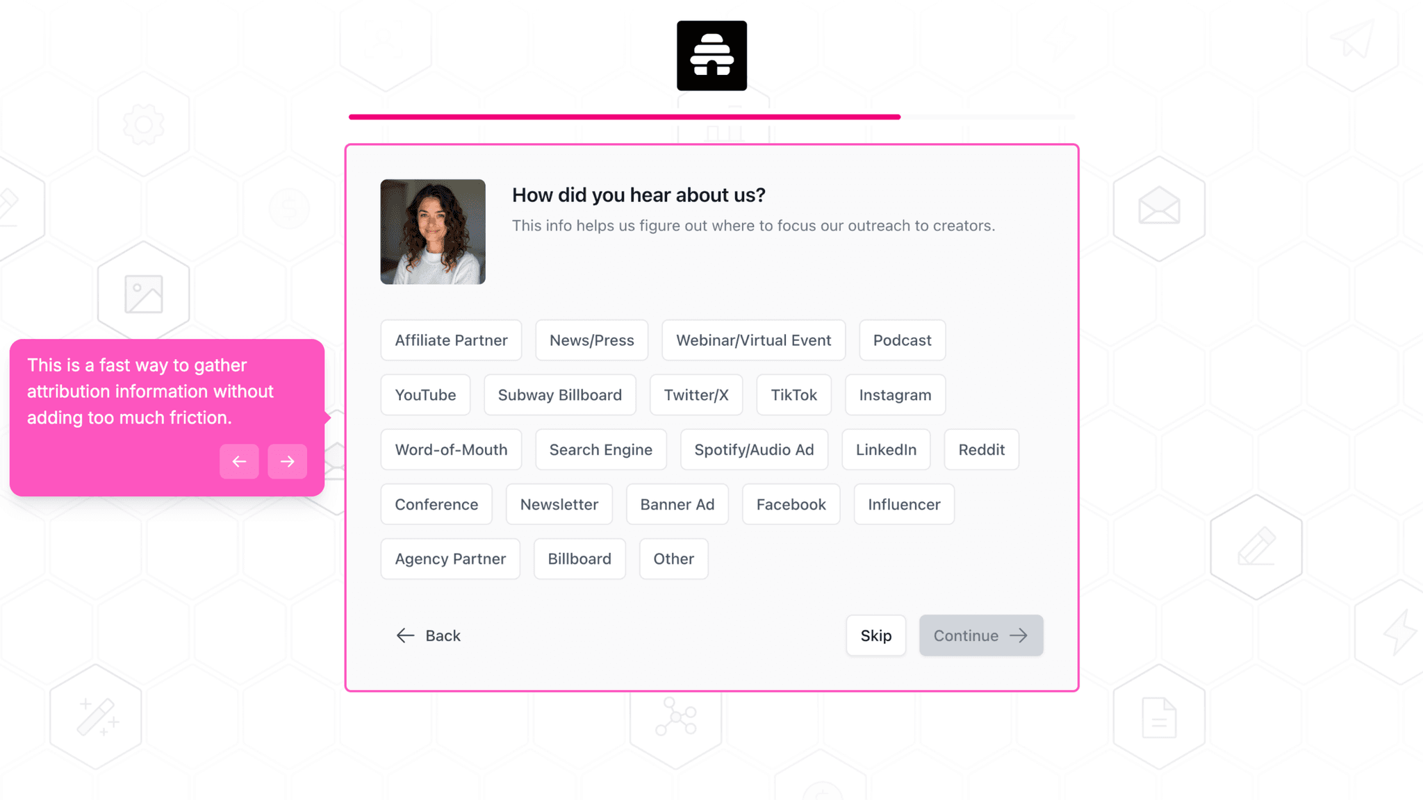
beehiiv asks whether I'm new to email or migrating from another platform, and how I heard about them. These questions take maybe 30 seconds, and I don't see evidence that the answers change what I see next. The value here is pacing — they slow the signup just enough to feel like a product that wants to understand me, without making me do anything hard.
Onboarding Tactics That Work
Three sequential walkthrough phases prevent feature overload during first session
Visible progress bar throughout pre-workspace signup prevents mystery-step drop-off
Website and newsletter templates remove blank-canvas paralysis at two separate moments
Where There's Friction
Upgrade/trial decision appears before user has published a single issue
Personalization questions (experience level, migration status) don't visibly alter workspace
10+ steps before reaching First Strike is longer than most creator tools in this category
When Is the In-App Activation Moment?
The Activation Event in beehiiv is drafting and publishing a first newsletter issue — the moment a user has set up their publication, configured their website, designed their newsletter, and sent it live.
Getting there takes 10–15 minutes across more than ten steps. That's a long path by PLG standards, but most of the steps are essential: choosing a publication name and URL, setting up the website, and configuring the newsletter design are all prerequisites for a first send. Where beehiiv earns the step count is in how those steps are structured. The product never asks me to navigate an empty dashboard and figure out what to do. Each phase of the walkthrough tells me where I am and what comes next.
Progress is signaled throughout — a progress bar in the pre-workspace signup flow, checklists inside each workspace phase. There's no ambiguity about how far I've come or how much is left.
The friction that stands out is the upgrade prompt. Before I've published anything, beehiiv surfaces a trial vs. upgrade decision. For users who came in curious and motivated, this anchors the commercial relationship early. But it also shifts cognitive mode from "get to my first send" to "evaluate this product" at exactly the wrong moment in the onboarding flow.
After the first issue publishes, beehiiv doesn't offer a defined next-step prompt in the flow I walked through. The product trusts the milestone to create its own momentum.
The Bottom Line on beehiiv's Onboarding
beehiiv does something most creator tools don't: it treats the complexity of launching a newsletter as a problem the product needs to solve, not a burden the user should figure out. The three-phase walkthrough structure — account setup, website, newsletter design — is genuinely well-designed. It makes a ten-step onboarding feel manageable because each phase is bounded, completable, and clearly labeled.
The honest critique is the upgrade prompt. Asking me to choose a plan before I've drafted a single line is a commercial decision that works against the activation goal. The rest of the flow is built around getting me to first send — that one screen points me toward a pricing page instead.
Steal the phased walkthrough structure. If your product requires multiple setup steps before value is possible, don't present them as a single overwhelming list. Break them into focused phases, give each one a visible progress indicator, and let users complete one thing at a time.
FAQs
Common questions about beehiiv's onboarding flow and what makes it effective.
How does beehiiv onboard new users?
beehiiv's onboarding begins with a multi-step signup flow covering publication name, URL, experience level, and source attribution — all backed by a visible progress bar. After entering the workspace, users move through three sequential walkthroughs covering account setup, website configuration, and newsletter design. The Activation Event — publishing a first newsletter issue — typically takes 10–15 minutes across 10 or more steps.
What makes beehiiv's onboarding experience stand out?
The phased walkthrough structure is the defining pattern: instead of exposing the full product at once, beehiiv sequences setup into three focused checklists with their own progress indicators. This approach makes a technically complex product feel manageable on first login. The pre-workspace progress bar is also well-placed — it prevents the kind of drop-off that happens when users don't know how many steps remain.
How long does it take to reach value in beehiiv?
Based on the walkthrough, reaching the Activation Event takes approximately 10–15 minutes across 10 or more steps. That's longer than most PLG creator tools, but most of the steps are genuinely necessary before a first send is possible. The step count is high; the friction is relatively low, because the path through it is guided throughout.
How does beehiiv's onboarding compare to other SaaS tools?
beehiiv sits between HeyReach and Clay in terms of guided activation. HeyReach drops users into an empty dashboard with no activation path; Clay generates a working workflow immediately from a problem-selection screen. beehiiv takes longer than Clay but guides every step, making it the better comparison for products where setup complexity is unavoidable and the goal is confident launch readiness rather than instant output.