Onboarding Snapshot
Activation Event
First AI-generated video produced and watched
Time-to-Value
Moderate — pricing page and demo CTA appear before any product experience
Primary Strength
Blurred dashboard preview and progress bar create momentum through setup steps
Primary Risk
Pricing page appears immediately after homepage CTA, before any value is demonstrated
Overview
Once past the pricing page, Synthesia's onboarding is well-designed. The blurred dashboard, the AI prompt from video type selection, the progress bar, and the post-activation tour all show clear thinking about how to build momentum and reduce friction.
What Should You Steal?
Swipe through actionable takeaways from this onboarding flow.
How Synthesia Personalizes Onboarding by Job-to-Be-Done
The blurred dashboard behind the segmentation modal is a lock-and-unlock mechanic worth copying.
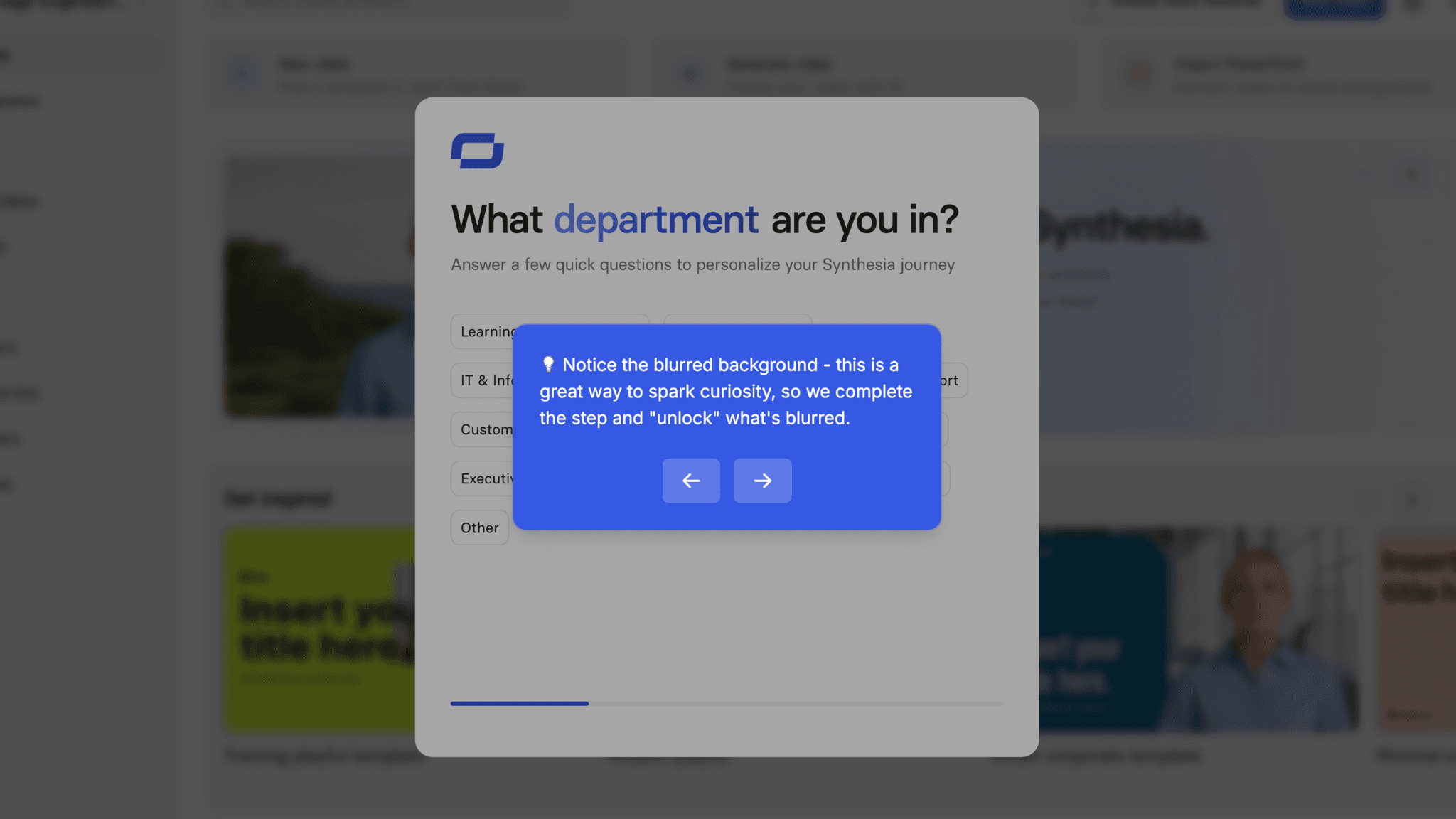
After account creation, Synthesia asks which department I'm in — but the backdrop to that modal is the blurred workspace I'm about to enter. Filling out the question doesn't feel like handing over data. It feels like removing a blur. The modal isn't gatekeeping. It's revealing.
How Synthesia Personalizes Onboarding by Job-to-Be-Done
Video type selection drives AI prompt generation, removing cold-start friction.
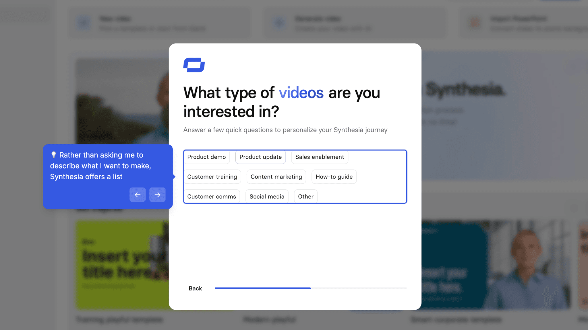
Rather than asking me to describe what I want to make, Synthesia offers a list: Product FAQ, Case Study, Event Promo, and others. Selecting one generates a templated prompt pre-filled with the relevant structure. I can add my audience, which folds into the output. The result is a starting point built from my choices — not a blank field waiting for me to invent something.
How Synthesia Uses Product Bumpers
The generation progress bar keeps users engaged through the wait.
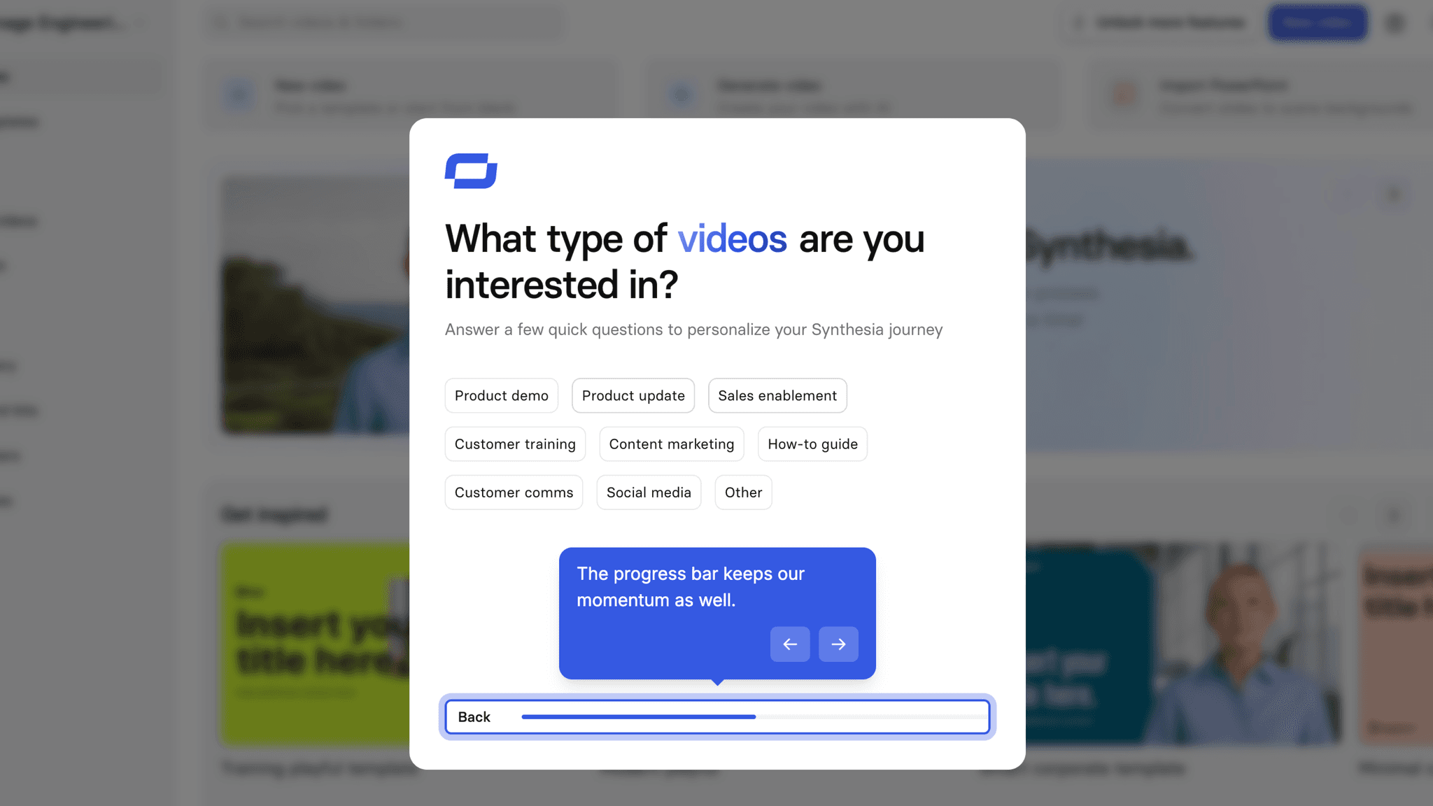
After submitting the prompt, the video takes several minutes to generate. A blurred preview appears alongside a percentage completion bar. The blur signals that output is forming; the percentage creates anticipation for the reveal. Users are watching something happen, not waiting for something to start.
How Synthesia Uses Product Bumpers
The 4-step post-activation tour is well-scoped.
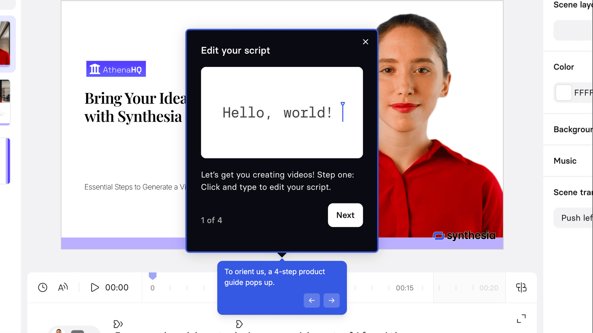
After the video generates, it covers four key editor features — and only four. It doesn't walk through the whole platform. It orients users in the space where they've just landed and shows what's immediately actionable. Short, contextual, and timed correctly.
Onboarding Tactics That Work
Blurred dashboard backdrop creates a lock-and-unlock feeling during segmentation
Video type selection generates a pre-filled AI prompt, removing cold-start friction
Blurred video preview with progress bar keeps users engaged during AI generation
4-step post-activation editor tour is tightly scoped to immediate next actions
Where There's Friction
Pricing page appears immediately after "Get started for free" CTA — before any product experience
Demo booking pop-up appears before user has seen any value
Both commercial friction points arrive at the moment users are most likely to drop off
Templates appear on the main dashboard but only after activation — not at the start
When Is the In-App Activation Moment?
The Activation Event in Synthesia is watching the first AI-generated video. A prompt becomes a real, playable video the user made.
Getting there is not as fast as it could be. The path includes:
Two of those steps — the pricing page and the demo pop-up — arrive before the user has experienced anything the product can do. Once past them, the onboarding becomes genuinely good. But it asks users to make commercial decisions before they have any basis for making them.
The blurred dashboard is the best UI decision in the flow.
It reframes data collection as an unlock. I'm not filling out a form. I'm removing a blur. Small framing shift, meaningful psychological difference.
The progress bar during generation is the second standout decision.
A blurred preview plus a percentage counter keeps users watching. Output is visibly forming, anticipation builds, and the risk of abandonment during a multi-minute wait drops significantly.
After the video appears, the 4-step editor tour orients users without overwhelming them. Clean transition from activation into the next stage of the product.
The Bottom Line on Synthesia's Onboarding
Once past the pricing page, Synthesia's onboarding is well-designed. The blurred dashboard, the AI prompt from video type selection, the progress bar, and the post-activation tour all show clear thinking about how to build momentum and reduce friction.
Where it falls short:
Moving the pricing page to after the first video generates — or at minimum after account creation — would compress Time-to-Value and protect the funnel at its most vulnerable point.
Steal the blurred dashboard mechanic. If your product collects user data before entering the workspace, blur the workspace behind the modal. It stops feeling like a gate and starts feeling like a key.
FAQs
Common questions about Synthesia's onboarding flow and what makes it effective.
How does Synthesia onboard new users?
Synthesia's onboarding begins with a pricing page immediately after the homepage CTA, followed by a demo booking pop-up, before users reach account creation. After signing in with Google, users complete a department segmentation modal with the blurred dashboard visible behind it, then select a video type, receive an AI-generated prompt, and watch their first video generate in real time. The Activation Event, watching a completed AI video, happens within the onboarding session.
What makes Synthesia's onboarding experience stand out?
Two decisions. The blurred dashboard backdrop reframes data collection as unlocking the product rather than gating it. And the generation wait state — a blurred preview alongside a percentage progress bar — is better wait-state design than most AI video tools manage. Both reduce the psychological friction of steps that could otherwise feel like delays.
How long does it take to reach value in Synthesia?
Moderate. The pricing page and demo pop-up add decision-making before any product interaction begins. Once inside, video type selection and prompt generation move quickly. Video generation takes a few minutes, but the progress bar keeps users oriented. The Activation Event happens within the session for most users.
How does Synthesia's onboarding compare to other SaaS tools?
Synthesia's pre-value pricing page follows the same friction pattern as VEED's onboarding, though VEED places it after account creation rather than before. The AI prompt generation from a selection menu is closest to Airtable's onboarding, which also uses user inputs to generate a personalized starting point. The generation progress bar mirrors VEED's real-time progress indicator — both treating the wait state as a drop-off risk that visible feedback can address.