Onboarding Snapshot
Activation Event
First interactive page template saved and ready to share
Time-to-Value
Fast — under 5 minutes from signup to first saved template
Primary Strength
In-product step-by-step guidance eliminates the blank-page problem
Primary Risk
Credit gamification and early action choice risk decision paralysis
Overview
Sendr's onboarding is built around speed to first output. The workspace setup is lightweight, the skips are generous, the template library removes blank-page hesitation, and the in-product pop-up prompts handle guidance without documentation. For a sales tool where the primary user is likely a time-pressed rep or founder, that orientation toward fast creation is the right call.
What Should You Steal?
Swipe through actionable takeaways from this onboarding flow.
How Sendr Gets You Into Creation Without Explanation
Sendr skips the product tour almost entirely.
After signup, a modal appears with two action options and the flow moves from account creation to workspace setup to first template in a single session, no detour into a feature explanation screen. What makes this work is the workspace personalization step — adding a company name and logo before the editor opens means when the template canvas appears, it already feels like mine. A workspace that looks like my company, not a generic demo environment.
How Sendr Uses Guided Interaction Instead of Documentation
Rather than opening with a full tooltip tour, Sendr surfaces small contextual prompts that appear at exactly the right moment and point to exactly where to click next.
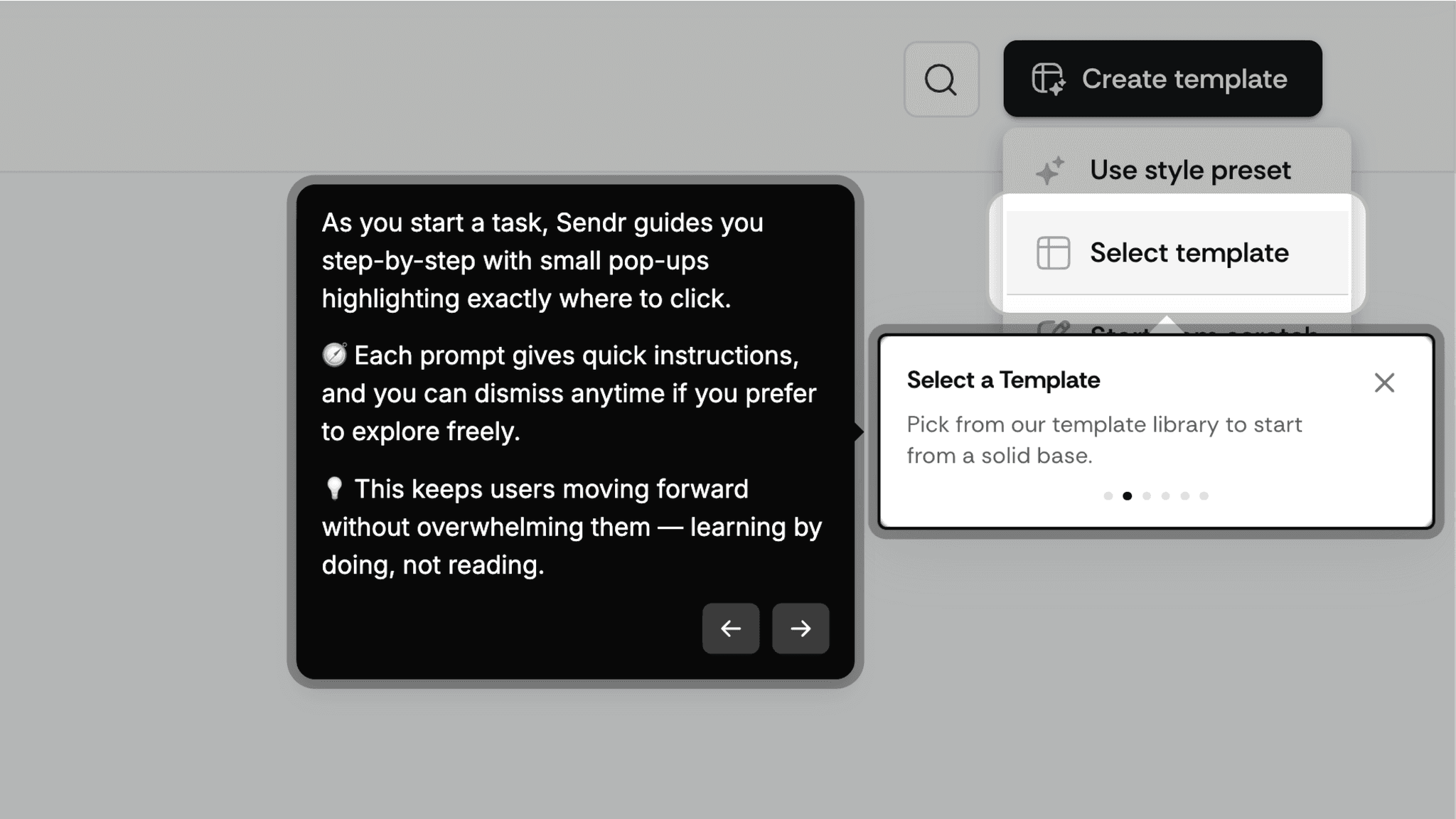
They're dismissable at any point, so anyone who already knows what to do isn't forced through instructions they don't need. The template library removes the blank-canvas problem, and the pop-ups remove the 'what do I click next' problem. The two pieces work together, and neither would be enough on its own.
How Sendr Handles Optional Steps
Optional steps like adding meeting links are clearly surfaced and skippable, and the product doesn't gate forward progress behind them.
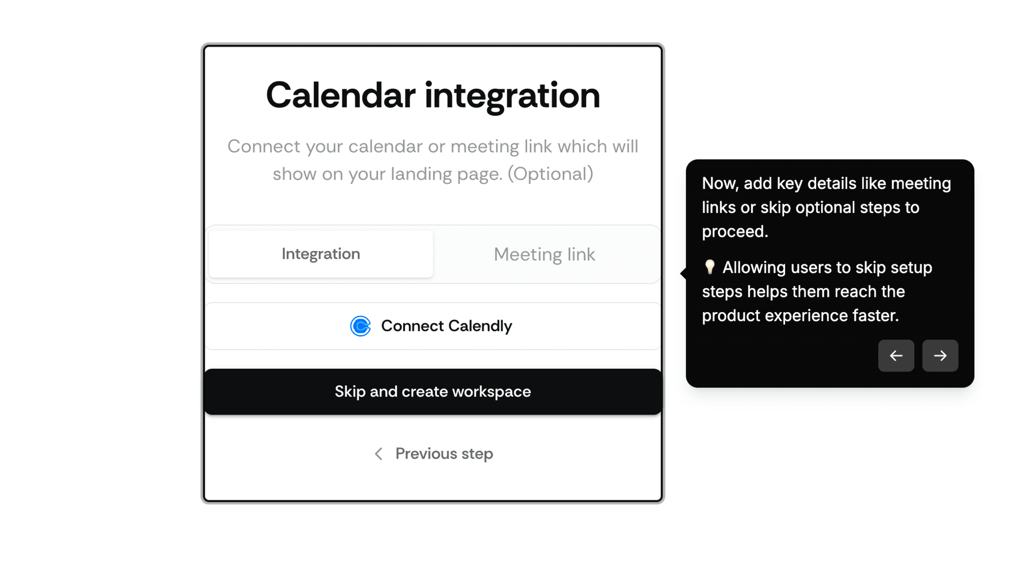
People who want to add meeting links will come back for it. People who want to get to the editor aren't forced to engage with setup that doesn't feel urgent yet. Keeping optional things optional is harder to execute than it sounds, and Sendr mostly gets it right.
Onboarding Tactics That Work
Workspace personalization (logo, name) before editor opens creates immediate ownership
In-product pop-up prompts guide action without requiring me to read documentation
Optional steps are clearly skippable, keeping momentum toward the editor
Where There's Friction
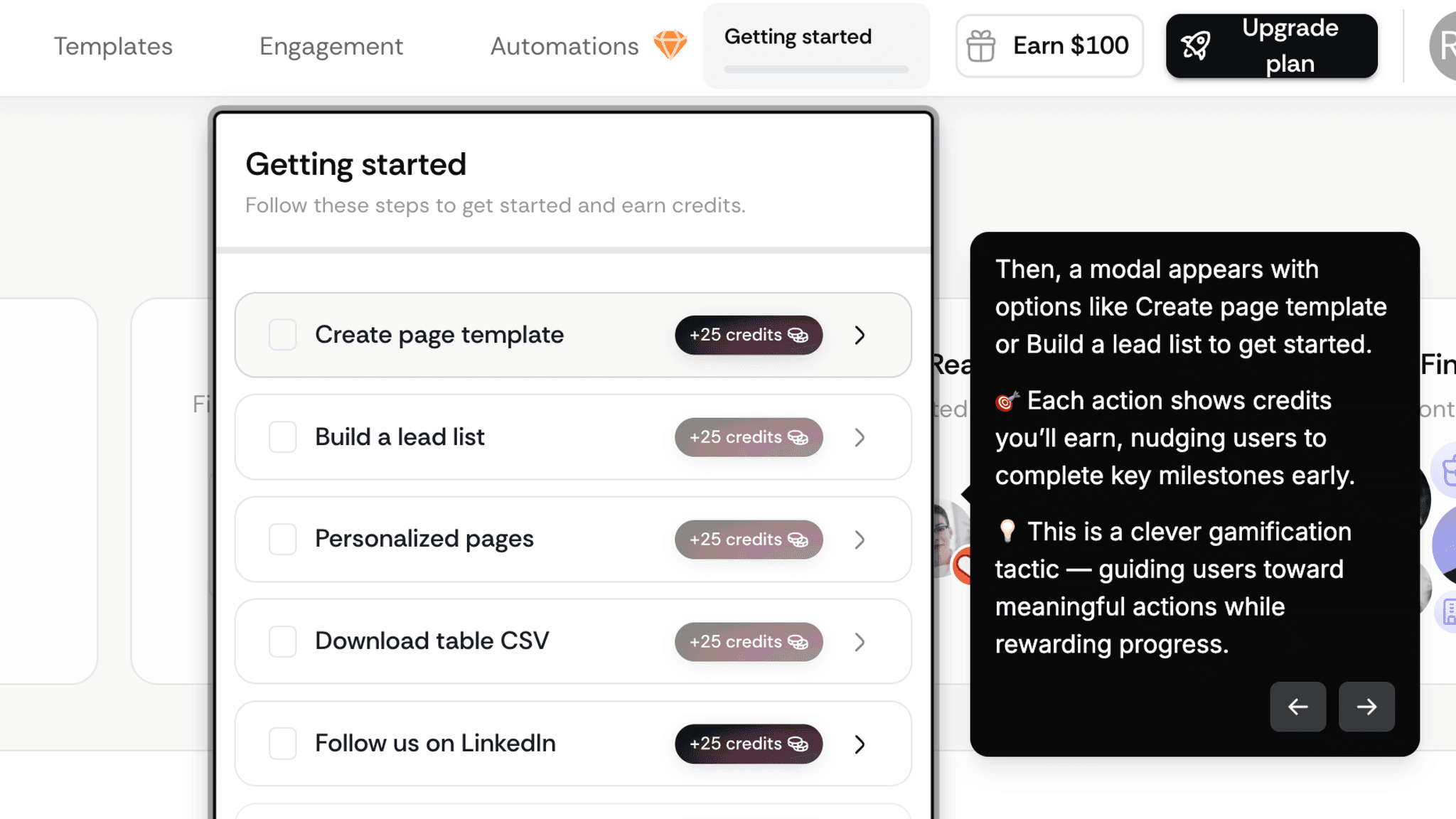
Modal choice between 'Create template' and 'Build lead list' may cause hesitation
Credit gamification can feel more manipulative than motivating, depending on context
No post-save prompt or next-step nudge after first template is completed
When Is the In-App Activation Moment?
Saving the first interactive page template is the moment. A page that could be sent to a prospect today.
Getting there is fast. The path runs through signup, a lightweight profile setup, workspace personalization with a company logo, an optional meeting link step, a modal with action choices, template selection, editing, and save. Most of that sequence takes under five minutes. The skippable steps help considerably.
The template library is the critical piece. When I arrive at the editor, I'm not starting from nothing. I'm selecting a format and personalizing it. That's a fundamentally different starting condition than an empty canvas with a blinking cursor, and it changes what creation actually feels like. I noticed this most at the moment the editor opened: there was no hesitation, because the question 'where do I start?' had already been answered for me.
After saving, the template is ready to use. The activation moment doesn't require another person to complete an action, unlike a form builder or collaboration tool where value only materializes when someone else responds. Sendr's first value is creation itself. A page exists that didn't exist before. That's the loop closed.
What's missing after the save is any signal of what comes next. The product doesn't push me toward sharing the template, testing it with a prospect, or building a second one. Most people will leave that moment without knowing what to do with it.
The Bottom Line on Sendr's Onboarding
Sendr's onboarding is built around speed to first output. The workspace setup is lightweight, the skips are generous, the template library removes blank-page hesitation, and the in-product pop-up prompts handle guidance without documentation. For a sales tool where the primary user is likely a time-pressed rep or founder, that orientation toward fast creation is the right call.
The credit mechanic is where I'd push back. Attaching numbers to first actions suggests the product has thought carefully about which behaviors drive retention, but the framing can feel transactional rather than helpful. Some people will find it motivating. Others will notice they're being nudged and feel the friction of that realization. It's a gamble on user disposition, not a reliable design pattern.
Steal the contextual pop-up guidance pattern. Small, dismissable prompts that appear at the exact point of action, and disappear when no longer needed, are a cleaner alternative to a full product tour.
FAQs
Common questions about Sendr's onboarding flow and what makes it effective.
How does Sendr onboard new users?
Sendr walks me through a fast, low-friction signup flow: authentication, a brief profile setup, and workspace personalization with a company name and logo. From there, a modal surfaces two action options with credits attached to each. Selecting 'Create template' opens a template library, and in-product pop-up prompts guide me through editing and saving my first interactive page. The activation event, saving a ready-to-share template, typically happens within the same session.
What makes Sendr's onboarding stand out?
Two things: workspace personalization before the editor opens, and contextual in-product pop-up guidance instead of a feature tour. Personalizing the workspace with a logo and company name means the editor feels like mine before I've built anything. The step-by-step pop-ups handle instruction at the point of action, which means I'm learning the interface while doing the thing rather than before I've started.
How long does it take to reach value in Sendr?
Under five minutes for most people. The skippable optional steps and pre-built template library keep the path short. From signup to a saved, ready-to-share interactive page, the flow is among the faster ones in this gallery, especially given that the product is building something with a real output, not just completing a tutorial.
How does Sendr compare to other SaaS tools?
Sendr's in-product pop-up guidance most closely mirrors Figma's onboarding, which also uses contextual, dismissable prompts to guide first use without forcing a tour. The template library approach mirrors Canva's onboarding. Both use pre-built starting points to remove blank-canvas hesitation.