Onboarding Snapshot
Activation Event
First design edited from template and exported
Time-to-Value
~3–5 minutes
Primary Strength
Templates eliminate blank-canvas friction immediately on dashboard entry
Primary Risk
AI feature density creates decision overload before first design is complete
Overview
Canva's strongest onboarding decision is the one most users don't notice: there is no blank canvas. The template-first dashboard removes the design tool's most common drop-off point before it can set in. Combined with a fast authentication flow and a use-case question that does actual personalization work, the path from signup to first design is about as short as it can reasonably be for a product with this much surface area.
What Should You Steal?
Swipe through actionable takeaways from this onboarding flow.
How Canva Reduces Decisions Early
The homepage CTA is outcome-framed, not account-framed.
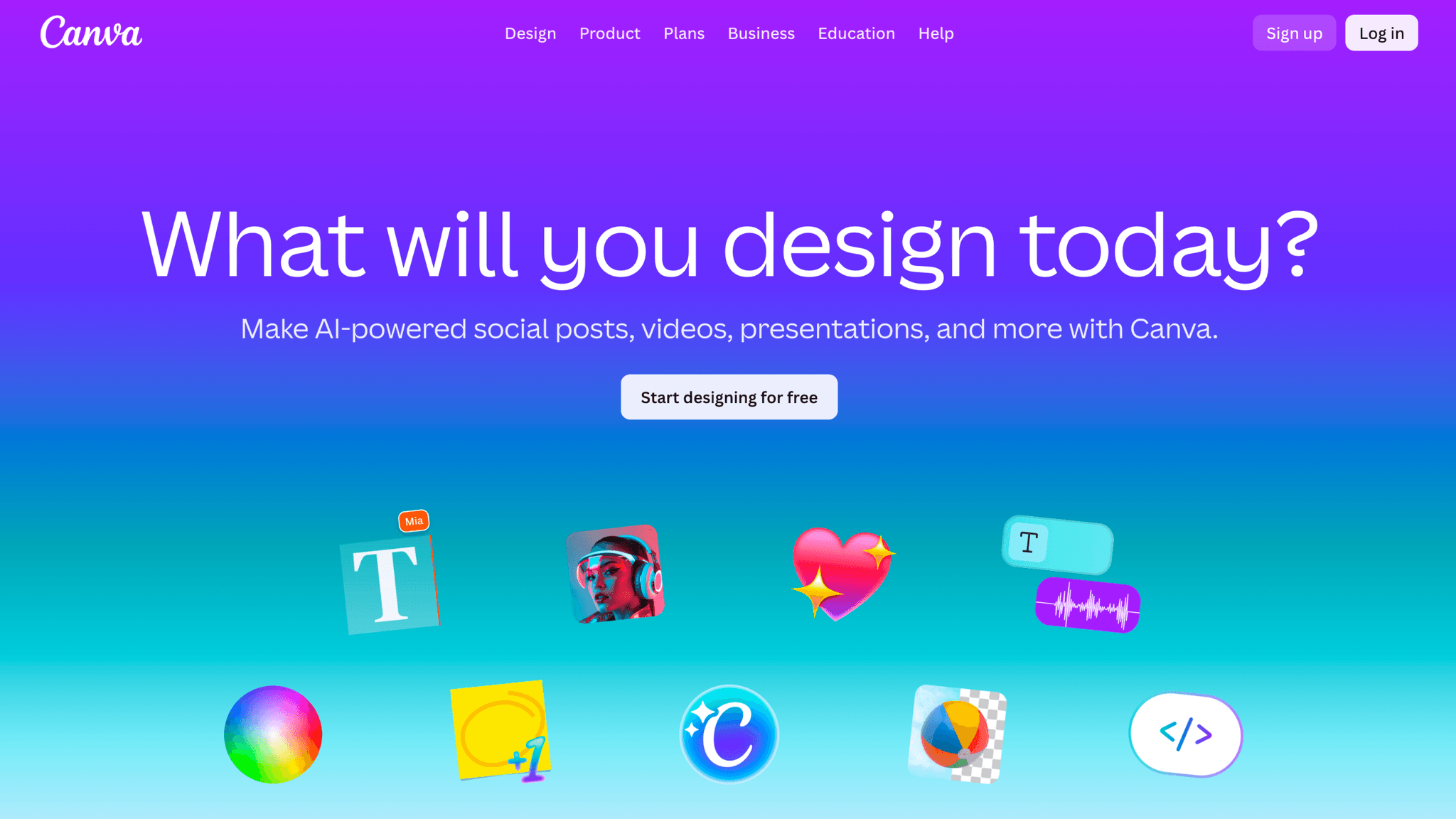
"Sign up and start designing" tells me what I'm about to do, not what I'm agreeing to. Users who arrive wanting to create something are already primed for activation, and the CTA meets them there instead of redirecting attention toward registration. It's a small framing decision that sets the right tone before the product is even open.
How Canva Reduces Decisions Early
Authentication options are broad; required fields are minimal.
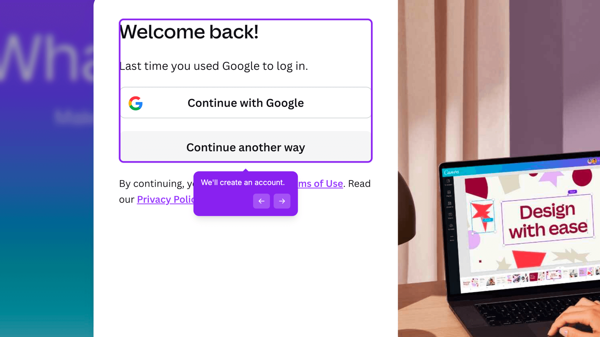
Canva offers Google, Apple, email, and phone login. Once in, I provide a name and an intended use case. No company size, no role depth, no revenue range. The signup flow asks for the minimum to get me to the dashboard, and it gets there fast.
How Canva Reduces Decisions Early
The use-case question — Personal, Work, Education, or Nonprofit — takes two seconds, doesn't delay dashboard access, and lets Canva tailor template suggestions without requiring a tour to explain the personalization.
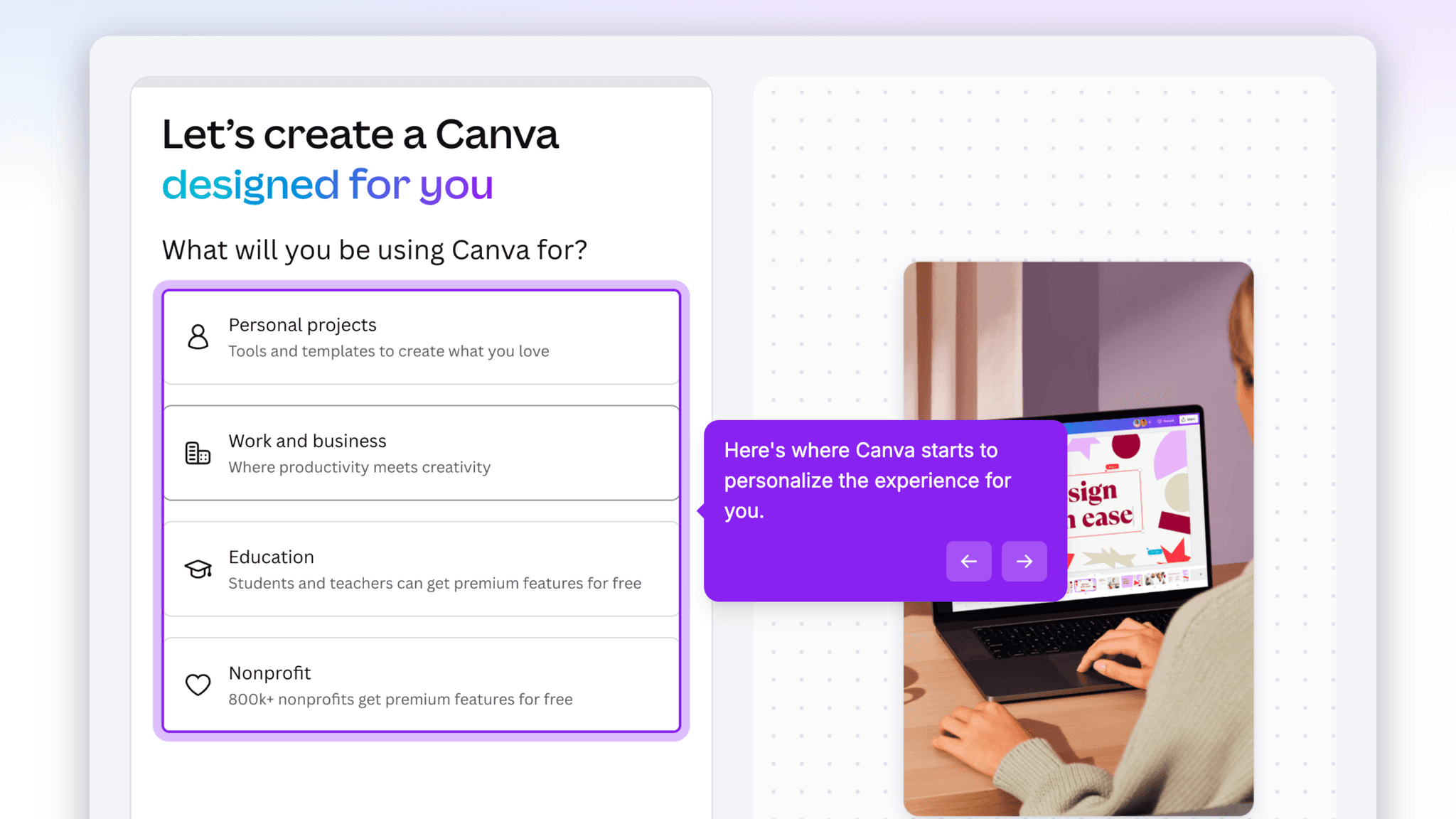
One question. Done.
How Canva Handles Empty States
Templates are the empty state.
When I land on the dashboard, there's no blank canvas. There are pre-built social posts, presentations, marketing assets, documents, and video formats. The first thing I see is work I can start editing immediately. For a product where the blank page is the primary reason people quit, this is the right call.
How Canva Handles Empty States
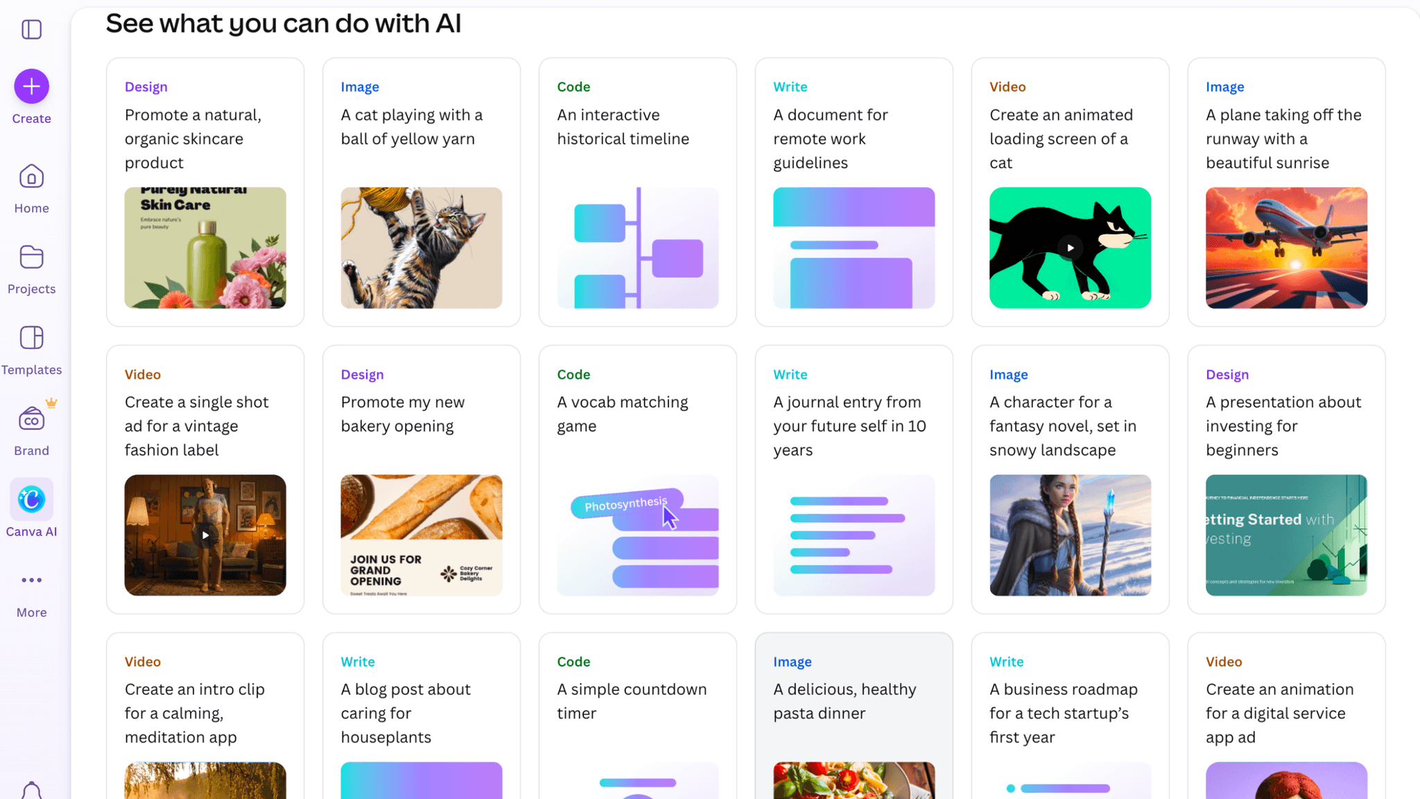
AI tools appear on the dashboard alongside templates:
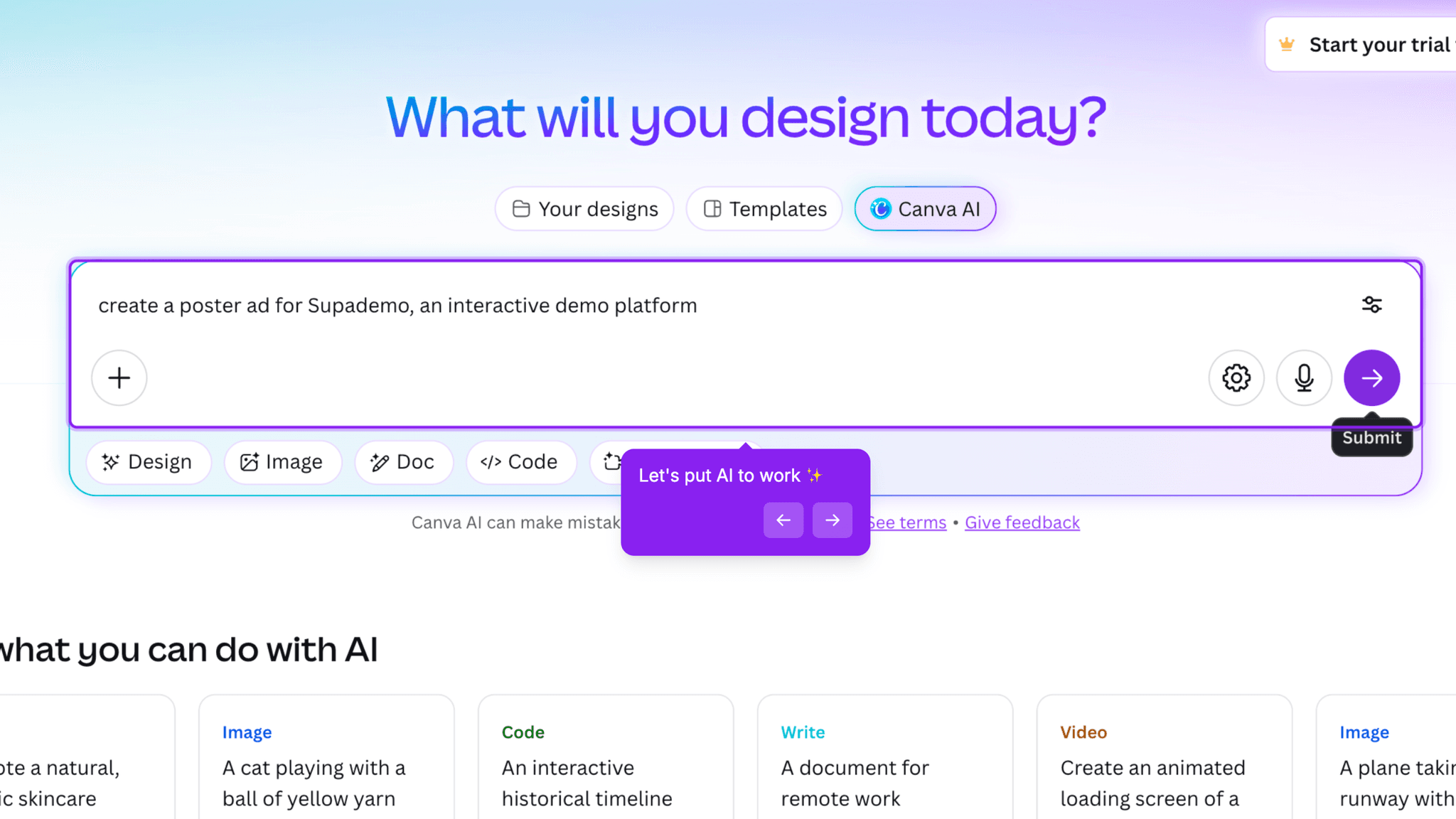
image generation, video creation, writing assistance, automated design. For experienced users, this signals depth. For someone still trying to complete a first design, it opens multiple competing paths at exactly the moment they need a single clear direction. The AI surface isn't a mistake. The timing is the problem.
Onboarding Tactics That Work
Homepage CTA frames signup around creation outcome, not account registration
Five authentication options with minimal required fields protect early momentum
Single use-case question personalizes the dashboard without delaying access
Where There's Friction
No explicit activation nudge pointing toward "complete your first design"
AI tools surface alongside templates, introducing parallel paths before first design is done
No milestone celebration or next-step prompt after the first design is exported
When Is the In-App Activation Moment?
The Activation Event in Canva is editing a template and exporting a completed design. That's the moment a user moves from browsing to actually producing something they can use.
Getting there takes 3–5 minutes from signup. The path is short: authenticate, answer one question, land on the dashboard, pick a template, edit it, export. Everything except the last two steps happens before I've touched the canvas. Once I'm inside a template, the remaining distance to activation is whatever time it takes me to customize and hit export.
There's no progress indicator pointing toward that moment. No checklist, no step counter. Templates function as implicit guidance, showing what's possible without telling me to do anything specific first. For users who arrive with a clear output in mind, the implicit path works fine. For users who are still deciding what they want to make, the dashboard's surface area — templates, AI tools, recent files, suggested formats — can delay the moment they actually start.
What happens after first export is quiet. No celebration. No suggested next design. No prompt to share or publish what they just made. Users who get a strong first output will come back. Users who hit an unfamiliar export setting or a result they're not happy with have nothing to anchor a second attempt.
The Bottom Line on Canva's Onboarding
Canva's strongest onboarding decision is the one most users don't notice: there is no blank canvas. The template-first dashboard removes the design tool's most common drop-off point before it can set in. Combined with a fast authentication flow and a use-case question that does actual personalization work, the path from signup to first design is about as short as it can reasonably be for a product with this much surface area.
The gap is what comes after. Canva trusts the first output to generate its own momentum, with no celebration, no follow-up prompt, no acknowledgment that the user has done the thing the product was built for. For a product that already does so much to reduce the distance to activation, that silence is a real missed opportunity.
Steal the template-first empty state. If your product has a blank-page problem, the answer isn't a tutorial. It's giving users something to react to.
FAQs
Common questions about Canva's onboarding flow and what makes it effective.
How does Canva onboard new users?
Canva's onboarding starts with a fast authentication flow, Google, Apple, email, or phone, and a single use-case question before landing users directly on the dashboard. No mandatory tour, no modal walkthrough. The dashboard immediately surfaces templates across multiple formats, and the Activation Event, editing and exporting a first design, typically happens within 3–5 minutes of signup.
What makes Canva's onboarding experience stand out?
The template-first dashboard is the defining pattern. Instead of a blank canvas, Canva surfaces pre-built designs across social, presentation, document, and video formats the moment users arrive. Users react to existing work rather than starting from nothing, which shortens the path to first output. The homepage CTA framing, creation as the goal rather than account registration, also sets the right expectations before signup begins.
How long does it take to reach value in Canva?
From homepage to first exported design takes approximately 3–5 minutes across 4–5 steps. The template-first dashboard means most of that time is spent inside the product rather than waiting to enter it. The path to activation is short. The gap is what follows — there's no guided next step once the first design is complete.
How does Canva's onboarding compare to other SaaS tools?
Canva's template-first approach is structurally similar to Lovable's onboarding, which also collapses the distance between arrival and first output. Both share the same post-activation silence problem. Tools like Clay handle that moment differently — Clay explicitly marks the first activation event with a visible reward that reinforces the behavior. Canva activates users quickly. It just doesn't mark the moment when they get there.