Onboarding Snapshot
Activation Event
First prompt submitted, generated app appears on screen
Time-to-Value
~2–3 minutes
Primary Strength
Homepage is the product — chat input live before signup
Primary Risk
Credit ceiling interrupts creation loop right after activation
Overview
Lovable does one thing better than almost any other PLG product I've walked through: it collapses the distance between curiosity and value. Most products treat signup as the starting line. Lovable treats it as a checkpoint the user hits after they've already seen the product work. By the time I'm creating an account, I'm motivated, not just curious.
What Should You Steal?
Swipe through actionable takeaways from this onboarding flow.
How Lovable Reduces Decisions Early
No signup wall before first value.
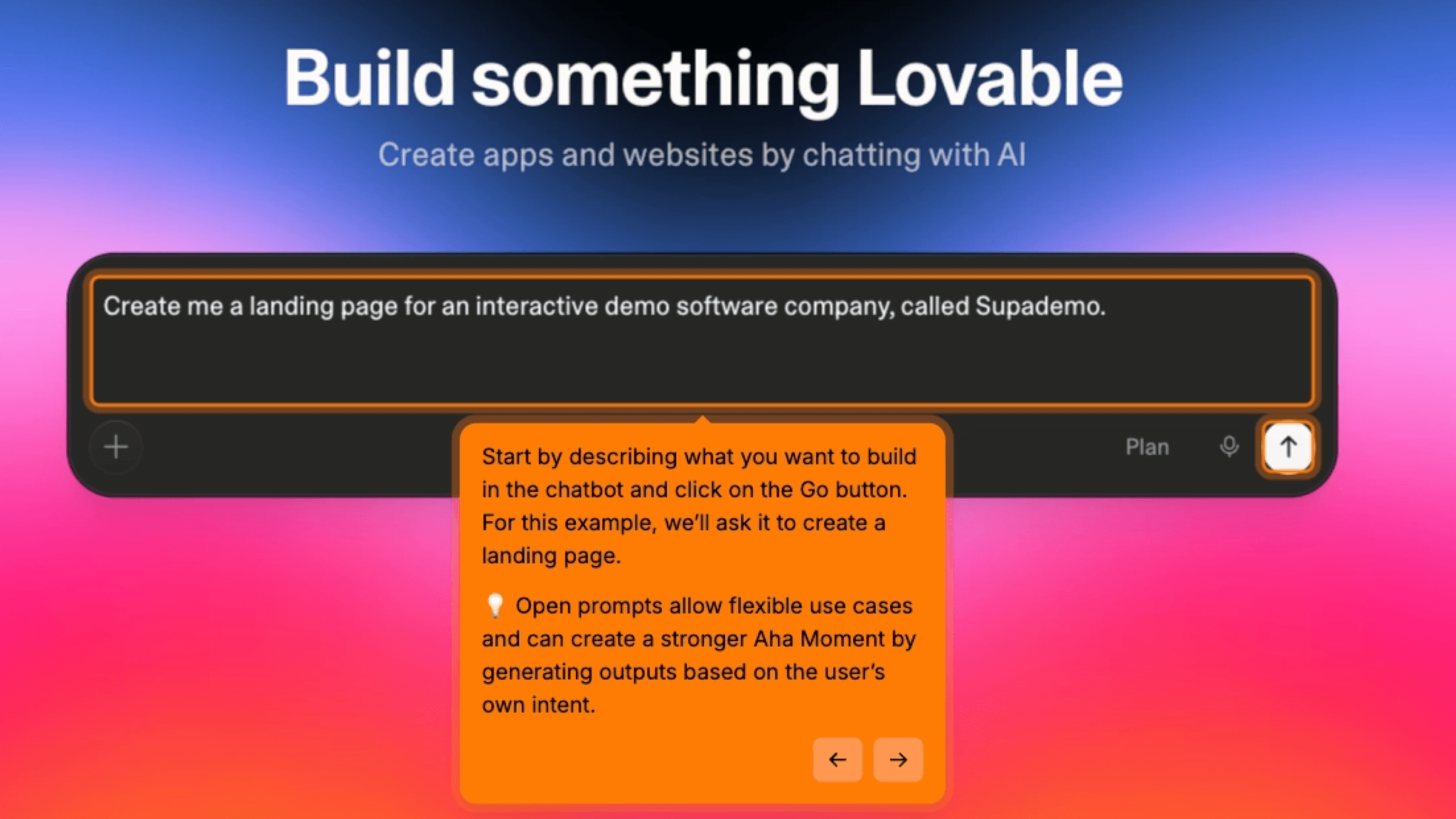
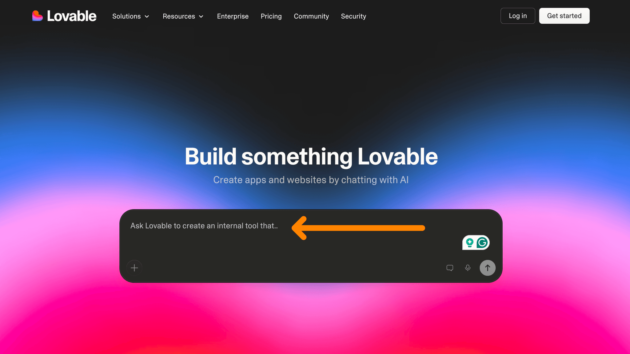
The chat input is live on the homepage. I type a prompt and see output before I've created an account. This removes the single biggest drop-off moment in most SaaS onboarding: asking for commitment before demonstrating value.
How Lovable Reduces Decisions Early
Complexity offloaded to AI, not the user.
No template selection, no configuration screen, no "choose your use case" flow. I describe what I want in plain language and the product makes every structural decision for me. The cognitive load at first interaction is close to zero.
How Lovable Reduces Decisions Early
Segmentation collected after engagement, not before.
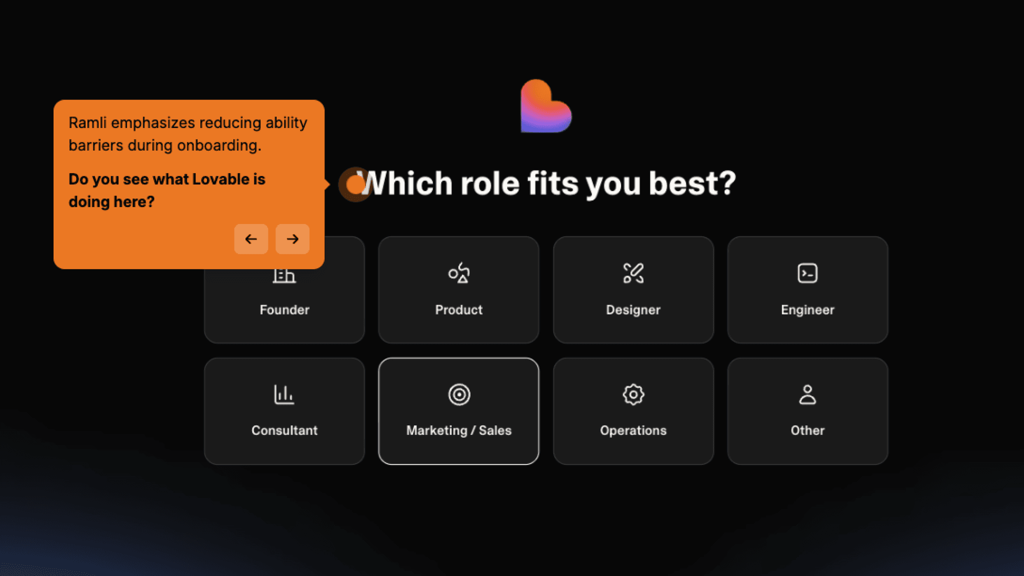
Role and team size questions appear post-signup, after I've already seen the product work. Asking for this data before the first interaction would add friction at the worst possible moment, and Lovable avoids it.
How Lovable Handles Empty States
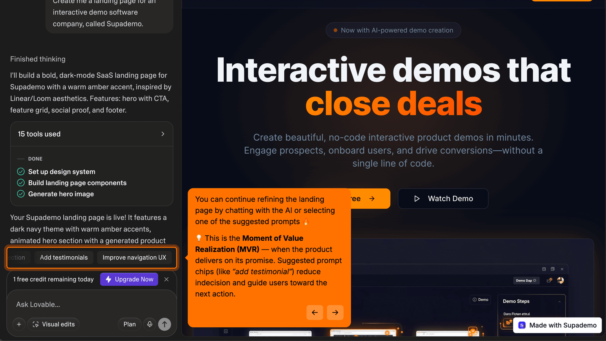
The empty state is a prompt input, not a blank canvas.
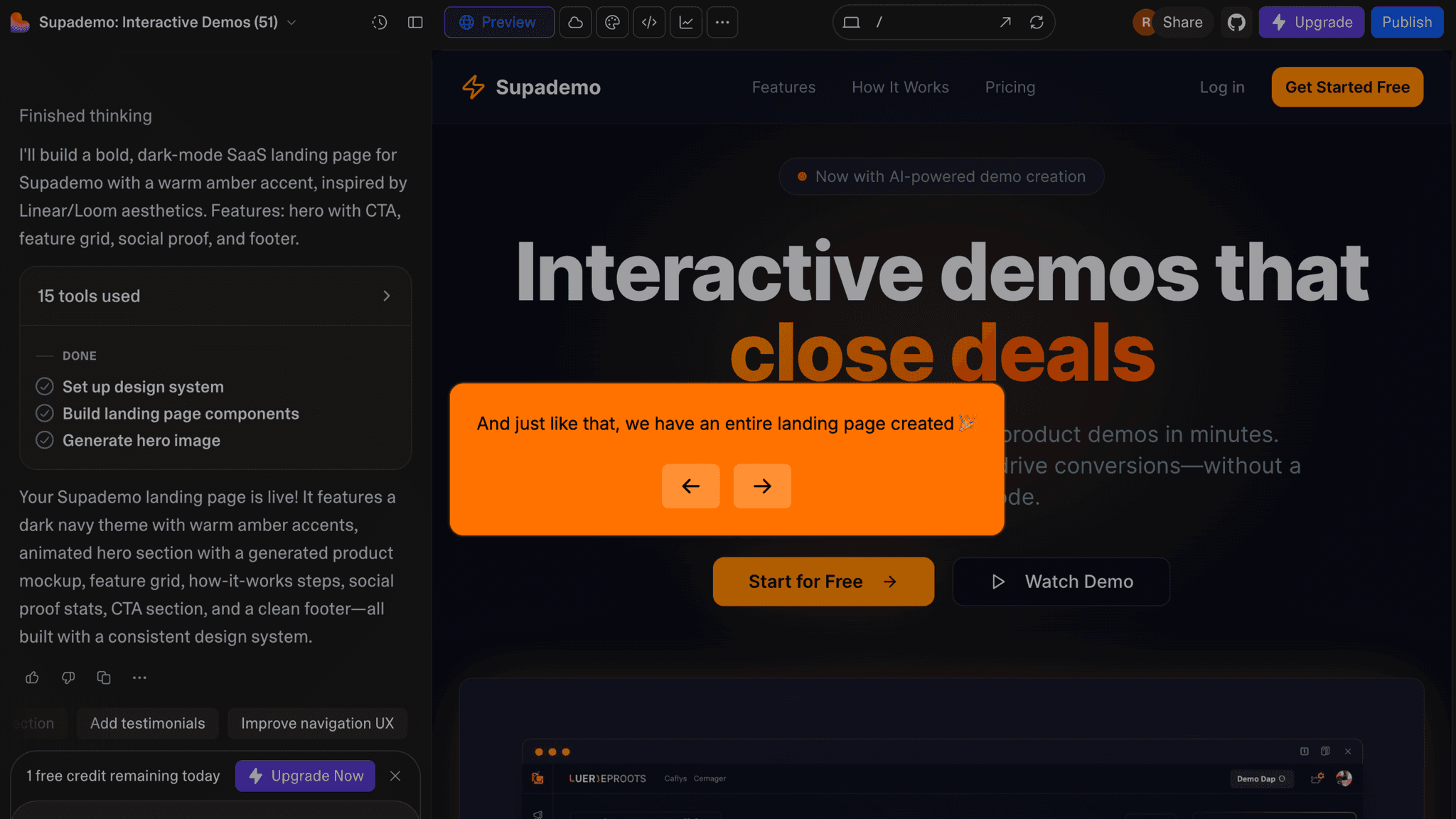
When I land in the workspace, my first generated output is already there. No empty project to stare at. The implicit message is clear: keep talking to it.
How Lovable Handles Empty States
Suggested prompts on the homepage show short example inputs before I've typed anything, demonstrating what's possible without a tutorial.
This is the most effective onboarding UI element in the flow. It also disappears entirely after signup, which is exactly when users are most likely to stall and most in need of a starting point.
Onboarding Tactics That Work
Chat input live on homepage — first interaction happens before signup
Generated output waiting in workspace on first login — no empty state to navigate
Segmentation deferred until after first value — no pre-engagement data collection
Where There's Friction
Suggested prompts disappear after signup, removed when users need them most
Segmentation questions (role, team size) don't appear to change workspace experience
Credit counter visible early, creating monetization pressure during habit formation
When Is the In-App Activation Moment?
I type a prompt on the homepage, hit enter, and within seconds something appears on the right side of the screen. A landing page. A structured UI. Something that looks like a thing I made. That's the Activation Event, and it happens before I've created an account.
Getting there is four steps: land on homepage, type a prompt, see output, create an account. No email verification wall, no required integration, no template to browse first. By the time I'm filling out a signup form, the product has already proven itself.
There's no progress indicator anywhere in this flow. No checklist, no step counter. That's not an oversight — activation happens on the homepage before I'm even a registered user, so there's nothing to track.
What comes after is where it gets quiet. Once the first output exists, the product offers nothing: no celebration, no suggested next prompt, no nudge toward publishing or sharing. The credit counter is visible but only signals that the clock is running, not what to do with the time. For users who already know what they want to build next, the silence works. For everyone else, it's the moment the drop-off starts.
The Bottom Line on Lovable's Onboarding
Lovable does one thing better than almost any other PLG product I've walked through: it collapses the distance between curiosity and value. Most products treat signup as the starting line. Lovable treats it as a checkpoint the user hits after they've already seen the product work. By the time I'm creating an account, I'm motivated, not just curious.
The missed opportunity is what comes after. Once the first output exists, there's no scaffolding to carry momentum forward. The suggested prompts that worked so well on the homepage don't follow users into the workspace. The segmentation data collected at signup doesn't shape the experience. Nothing points anywhere.
Steal this: put the product on the homepage and make signup a consequence of engagement, not a prerequisite for it.
FAQs
Common questions about Lovable's onboarding flow and what makes it effective.
How does Lovable onboard new users?
Lovable's onboarding starts on the homepage with a live chat input, no account required. After a first prompt produces a generated output, users sign up, answer two brief segmentation questions, and land in a workspace where their app is already waiting. The Activation Event typically happens within 2–3 minutes, before account creation is complete.
What makes Lovable's onboarding experience stand out?
The homepage-as-product pattern is the defining feature. Most app builders gate output behind account creation; Lovable inverts that entirely, so the Activation Event arrives before any commitment is made. The suggested prompts on the homepage are also a well-placed onboarding UI decision: they eliminate blank-canvas friction at the exact moment a new visitor is most likely to leave.
How long does it take to reach value in Lovable?
From landing on the homepage to seeing a generated output takes approximately 2–3 minutes across four steps: type a prompt, see output, create account, enter workspace. The Activation Event happens before account creation is complete, which is unusually fast for this category of tool.
How does Lovable's onboarding compare to other SaaS tools?
Lovable's onboarding is structurally closest to Bolt and v0, both AI-native builders that prioritize output before account creation. Compared to traditional no-code tools like Webflow or Bubble, which require significant setup before delivering a first output, Lovable's time-to-value is dramatically shorter. The gap is post-activation: tools like Webflow offer more structured guidance for what to do after the first creation.