Onboarding Snapshot
Activation Event
First real layout designed inside a Figma file
Time-to-Value
~30 minutes
Primary Strength
Pre-loaded interactive example files replace external tutorials
Primary Risk
Blank-canvas intimidation before users find the example files
Overview
Figma's onboarding makes a deliberate choice: it doesn't hide the tool's complexity, it contextualizes it. The pre-loaded example files, the feature tour, the templates — none of them simplify what Figma is. They orient users so they can engage with the full product rather than a version of it that's been made safe.
What Should You Steal?
Swipe through actionable takeaways from this onboarding flow.
Onboarding UI Patterns Worth Copying
Pre-loading "Figma Basics" and "FigJam Basics" directly into the workspace is the right call for a professional-grade tool.
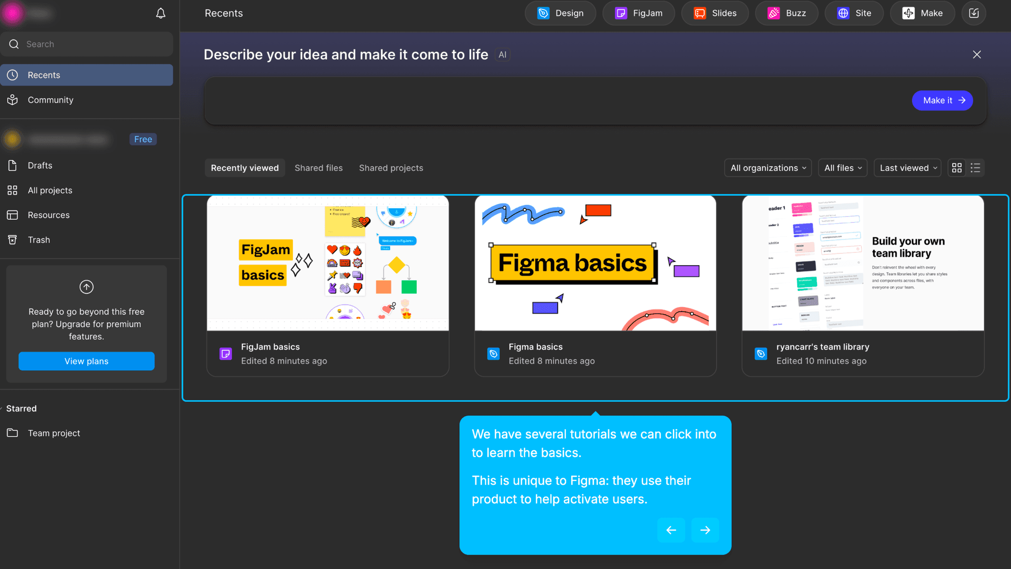
Instead of pointing me to documentation or an external tutorial site, Figma drops interactive example files into the workspace on first login. I can click through them, edit layers, manipulate real objects, and explore the tool using actual design artifacts, not screenshots or videos. Watching someone use Figma and using Figma are completely different experiences.
Onboarding UI Patterns Worth Copying
The example files are safe to explore without being simplified.
Nothing is locked, toy-like, or stripped down. I'm working inside real Figma files with real layers, real components, and real constraints. The scaffolding is the starting point, not a training mode. That framing treats me as a capable learner rather than someone who needs to be eased into the product carefully.
How Figma Handles Empty States
The blank canvas is surrounded by enough scaffolding to make it approachable.
The feature tour, embedded example files, and available templates mean I'm never purely confronting an empty file with no direction. The blank canvas is still there. It still feels large. But I arrive at it with enough context to know what I'm trying to do with it.
How Figma Handles Empty States
The feature tour is load-bearing in a way most product tours aren't.
For most tools, a mandatory tour is friction. For Figma, skipping it would cost more time than taking it. The tool has enough surface area that navigating it cold means wasting significant effort just finding where things live. The tour doesn't teach design. It maps the environment so I can start working without getting disoriented.
Onboarding Tactics That Work
Interactive example files embedded in workspace replace external documentation
Feature tour maps tool environment for complex, professional-grade software
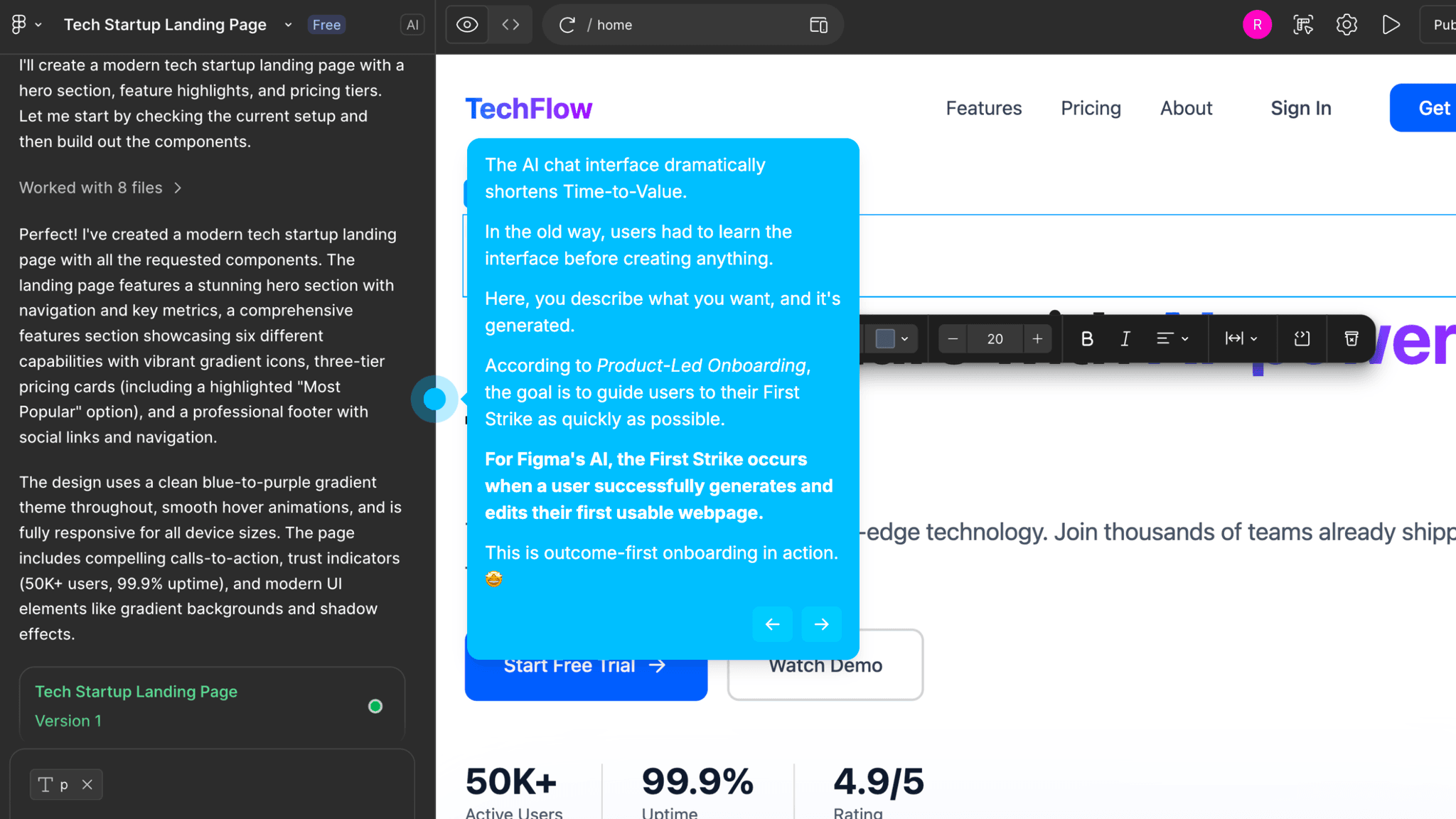
AI layout generation offers a fast creative starting point for new designs
Collaboration layer expands value without requiring it for activation
Where There's Friction
~30 minute Time-to-Value is long by PLG standards — activation requires genuine learning
Blank canvas remains the default starting point; example files must be discovered
AI output is inspirational, not production-ready — momentum shifts to manual work
Non-designers may need more guided creation paths than current onboarding provides
When Is the In-App Activation Moment?
The Activation Event in Figma is designing a first real layout inside a Figma file. Not exploring an example, not generating something with AI — actually building a layout that didn't exist before I opened the canvas.
Getting there takes around 30 minutes. That's long. Canva's activation takes 3–5 minutes; Notion's takes 3–6. Figma is a professional design tool with a learning curve that can't be compressed without removing what makes it worth learning. The 30-minute path isn't a failure of onboarding. It's a reflection of what the product actually asks users to do.
The "Figma Basics" file does significant work before I get to that moment. It gives me real objects to manipulate before I've started my own file, so I arrive at the blank canvas with some working knowledge of how layers, frames, and components behave. That prior experience matters. The difference between a blank canvas that feels possible and one that just feels blank is usually about 20 minutes with the example files.
Figma AI can generate a full layout from a chat prompt, and the result can look polished at first glance. It works better as a starting sketch than a finished design. The real value moment still comes from building something manually. AI gets something on the canvas faster, but activation is when I've made something myself.
Collaboration shows up after activation, not before. Live cursors, shared files, team workflows — these reveal a different layer of the product's value. Solo creation is enough for First Strike. The collaborative depth is expansion.
The Bottom Line on Figma's Onboarding
Figma's onboarding makes a deliberate choice: it doesn't hide the tool's complexity, it contextualizes it. The pre-loaded example files, the feature tour, the templates — none of them simplify what Figma is. They orient users so they can engage with the full product rather than a version of it that's been made safe.
The honest constraint is time. Thirty minutes to activation is a long ask for a freemium product. There's a population of non-designer users who will hit the blank canvas, feel lost, and not push through to the example files that would have helped them. The onboarding works well for motivated product teams. For more casual first-time users, more guided creation paths would close that gap.
Steal the embedded interactive files. If your product has a learning curve, don't link to documentation. Put real artifacts into the workspace on first login and let users learn by touching actual objects.
FAQs
Common questions about Figma's onboarding flow and what makes it effective.
How does Figma onboard new users?
Figma combines a feature tour with pre-loaded interactive example files, "Figma Basics" and "FigJam Basics," dropped directly into the workspace on first login. These files let users explore real design artifacts before starting their own work. The Activation Event, designing a first real layout inside a Figma file, takes approximately 30 minutes and requires working through the tool's learning curve.
What makes Figma's onboarding experience stand out?
The embedded example files are the differentiator. Rather than pointing users to external tutorials, Figma pre-loads interactive files into the workspace so users learn by doing inside real Figma files from the first session. The feature tour is also well-calibrated for a tool this complex — it maps the environment rather than explaining features in the abstract.
How long does it take to reach value in Figma?
Approximately 30 minutes from signup to designing a first real layout. That's longer than most PLG tools in this gallery, but Figma is a professional design platform with genuine depth. The pre-loaded example files and feature tour compress that time as much as the learning curve reasonably allows.
How does Figma's onboarding compare to other SaaS tools?
Figma's 30-minute Time-to-Value sits at the longer end of the tools in this gallery. Canva's onboarding reaches activation in 3–5 minutes through a template-first dashboard, but Canva serves a different audience. The more useful comparison is Notion — both use embedded scaffolding to organize complexity rather than eliminate it. Figma's activation path is longer, but it's appropriate for what the product actually is.