Onboarding Snapshot
Activation Event
First AI-generated video produced from a prompt
Time-to-Value
~5–8 minutes, most delay before dashboard access
Primary Strength
Focused dashboard with clear Generate path to Aha Moment
Primary Risk
Pre-value friction from segmentation questions and pricing exposure
Overview
VEED does the hard part well. Once inside the dashboard, the activation path is clear, the generate flow is structured, and the progress indicator during AI generation handles the wait state better than most tools in this category. Watching a typed prompt produce a real video is a concrete, memorable moment — the kind that makes a user want to try it again.
What Should You Steal?
Swipe through actionable takeaways from this onboarding flow.
How VEED Reduces Decisions Early
"Start for free" and "No credit card required" do real anxiety removal before signup even begins.
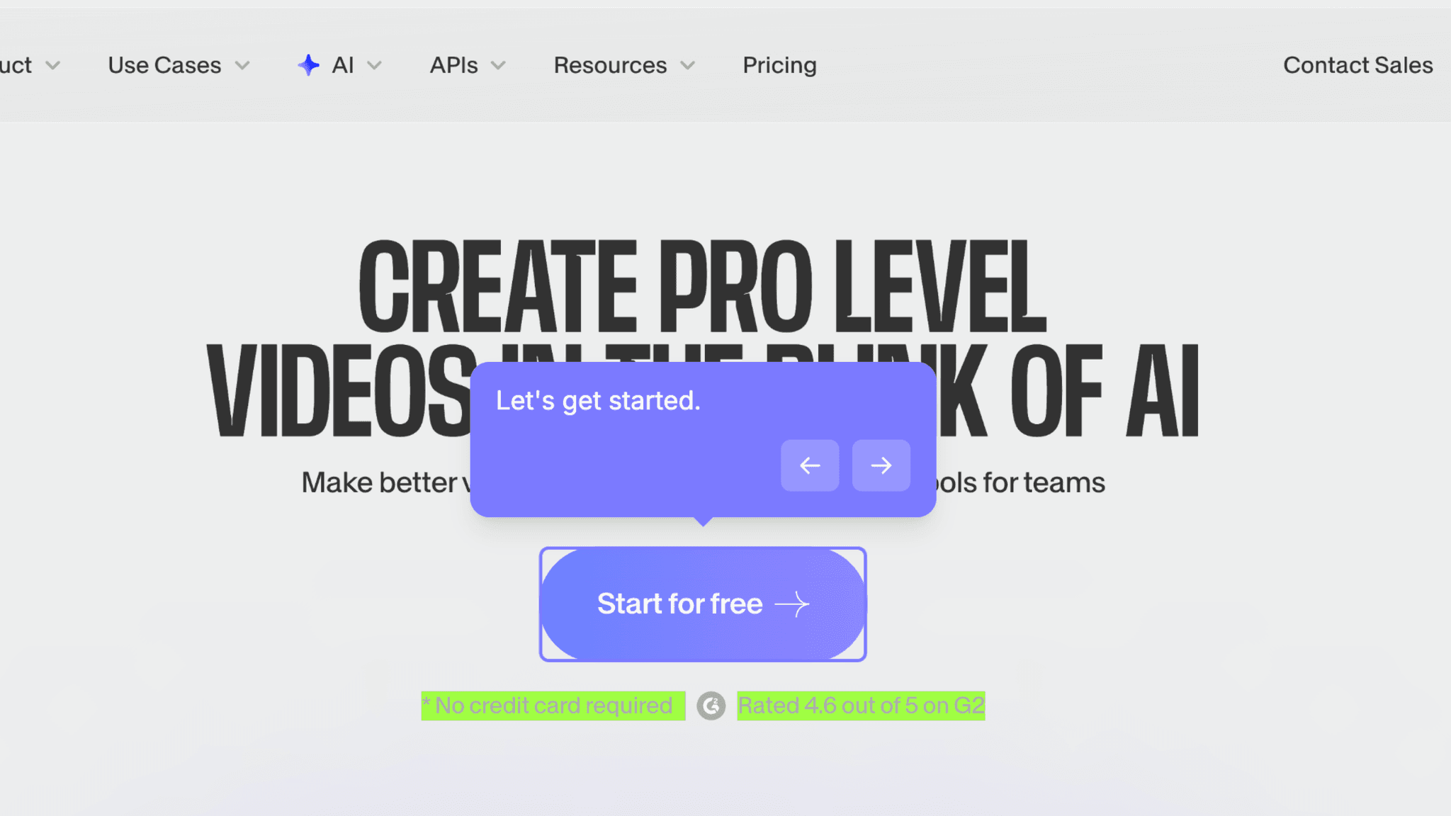
VEED neutralizes the three questions most users are silently asking before they click: Is this going to cost me something? Can I trust this product? Is it actually good? Combining no-credit-card messaging with a visible G2 rating handles all three before I've entered an email address. By the time I hit the signup form, the psychological work of risk removal is already done.
How VEED Handles Empty States
The dashboard entry is focused in a way that most video tools aren't.
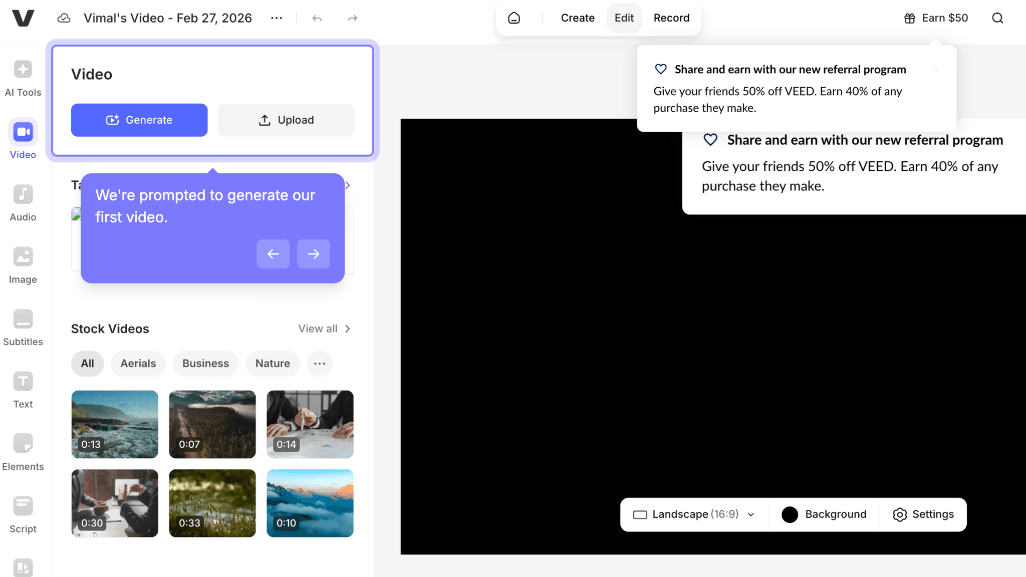
Once inside, two actions dominate: Generate and Upload. No feature grid, no sidebar overload, no modal asking what I want to make. The Generate path leads directly to the Aha Moment, and the dashboard makes that path easy to find without explaining it.
How VEED Handles Empty States
The real-time progress percentage during AI generation is worth stealing on its own.
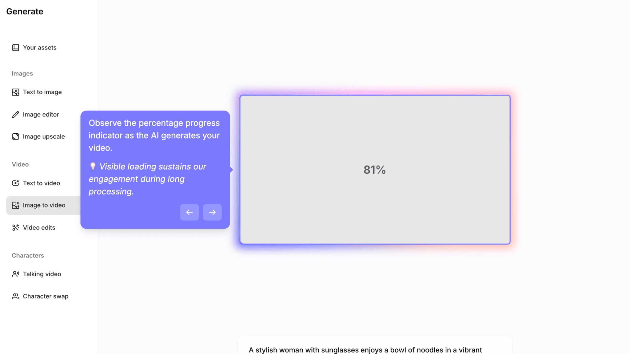
Most AI tools fail at wait-state design. The generation runs, a spinner spins, and users have no signal about whether the system is working or quietly broken. VEED shows a visible progress percentage through the generation step. That number is the difference between a user who waits and one who closes the tab.
Onboarding Tactics That Work
"No credit card required" and G2 rating remove financial and trust anxiety pre-signup
Passwordless auth and SSO options reduce cognitive load during signup
Focused dashboard surfaces Generate path with minimal clutter
Real-time generation progress indicator prevents abandonment during AI wait state
Where There's Friction
Four-screen auth flow adds micro-friction before any product experience
Segmentation questions (use case, role, acquisition, email prefs) delay dashboard access
Pricing exposure before first video shifts users into evaluation mode too early
Referral pop-up on dashboard entry competes for attention before activation is complete
When Is the In-App Activation Moment?
The Activation Event in VEED is generating a first AI-powered video from a prompt. You type something, you watch it become a video, you can download it. That's the moment.
Getting there takes 5–8 minutes, but the time isn't evenly spread. Inside the dashboard, the path to first video is fast: pick a format, select a generator, enter a prompt, watch the progress bar, download. Most of the 5–8 minutes is spent before that sequence begins, in the authentication flow, the segmentation questions, and the pricing screen.
The segmentation questions cover use case, role, acquisition source, and email preferences. None of them are difficult. Collectively, they sit between authentication and the product, and that placement is the problem. They delay the moment I reach the dashboard without moving me closer to generating anything.
The pricing screen that follows has a similar issue. Showing pricing before I've produced output asks me to evaluate something I haven't experienced yet. Trust-building through transparency is a real goal, but the timing works against activation rather than for it.
The referral pop-up on dashboard entry is the most misplaced element in the flow. A $50 referral prompt is a retention mechanic. Retention mechanics work after satisfaction. Showing it before I've generated my first video means it lands when I'm most focused on finding the Generate button, not on recommending the product to anyone.
After first generation, the experience is clean. The video appears, I can download or regenerate, and watching a prompt turn into a real video does the job the Aha Moment is supposed to do.
The Bottom Line on VEED's Onboarding
VEED does the hard part well. Once inside the dashboard, the activation path is clear, the generate flow is structured, and the progress indicator during AI generation handles the wait state better than most tools in this category. Watching a typed prompt produce a real video is a concrete, memorable moment — the kind that makes a user want to try it again.
The honest critique is everything before that moment. The segmentation questions, the pricing screen, and the referral pop-up all arrive before activation is complete. None of them are serious friction on their own. Together, they make the path from "Start for free" to first video longer than it needs to be, and they do it at the part of the flow where impatience is highest.
Steal the progress indicator. If your product has a wait state during AI generation or any async process, visible progress is not optional. It's the difference between a user who trusts the system is working and one who doesn't.
FAQs
Common questions about VEED's onboarding flow and what makes it effective.
How does VEED onboard new users?
VEED's onboarding starts with risk-reduction messaging on the homepage, "Start for free" and "No credit card required," before a multi-screen auth flow with Google, Apple, Microsoft SSO, and passwordless email options. After authentication, users answer segmentation questions and see a pricing screen before reaching the dashboard. The Activation Event, generating a first AI-powered video from a prompt, typically takes 5–8 minutes.
What makes VEED's onboarding experience stand out?
Two things: the focused dashboard that surfaces the Generate path without clutter, and the real-time progress indicator during AI video generation. Most AI tools leave users in an unmarked wait state during generation. VEED shows a visible progress percentage, which reduces uncertainty and keeps users engaged through the part of the flow most likely to cause abandonment.
How long does it take to reach value in VEED?
Approximately 5–8 minutes from homepage to first generated video. The dashboard-to-video segment is fast and well-designed. Most of the time is spent in pre-dashboard steps: authentication, segmentation questions, and the pricing screen. Compressing those steps would bring VEED's Time-to-Value closer to the 3–5 minute range of tools like Canva and Tally.
How does VEED's onboarding compare to other SaaS tools?
VEED's pre-signup risk removal is the same pattern Tally uses to reduce commitment anxiety before authentication. Where they differ is post-auth: Tally drops users directly into a functional editor, while VEED adds segmentation and pricing screens before the dashboard. The dashboard itself is closer to Canva's onboarding in structure — both use a focused, low-clutter entry that makes the primary activation action easy to find.