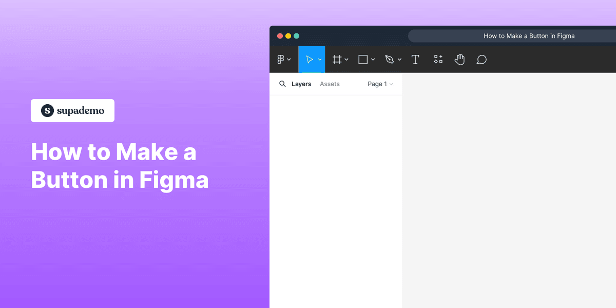
1. How to Make a Button in Figma
2. First, open the Figma project where you want to create a button.
3. Click on the "Text" tool.
4. Video Step (
5. Once that's done, click on the "Rectangle" tool from the toolbar.
6. Then, click on "Rectangle".
7. Video Step (
8. Video Step (
9. Next, click on the "Colour Icon" under the "Fill" tab to choose a colour for the button.
10. Choose a colour from the "Custom colour panel" for the button and Click on it.
11. Video Step (
12. Right-click using your mouse and click on "Group Selection".
13. Congratulations!
You have successfully made a button on Figma.
14. Create a Supademo in seconds
This interactive demo/guided walkthrough on How to Make a Button in Figma was created using Supademo.
How to Make a Button in Figma : Step-by-Step Guide
Let's begin by exploring how to design a button in Figma, a versatile tool for UI design that helps you bring your ideas to life with ease.
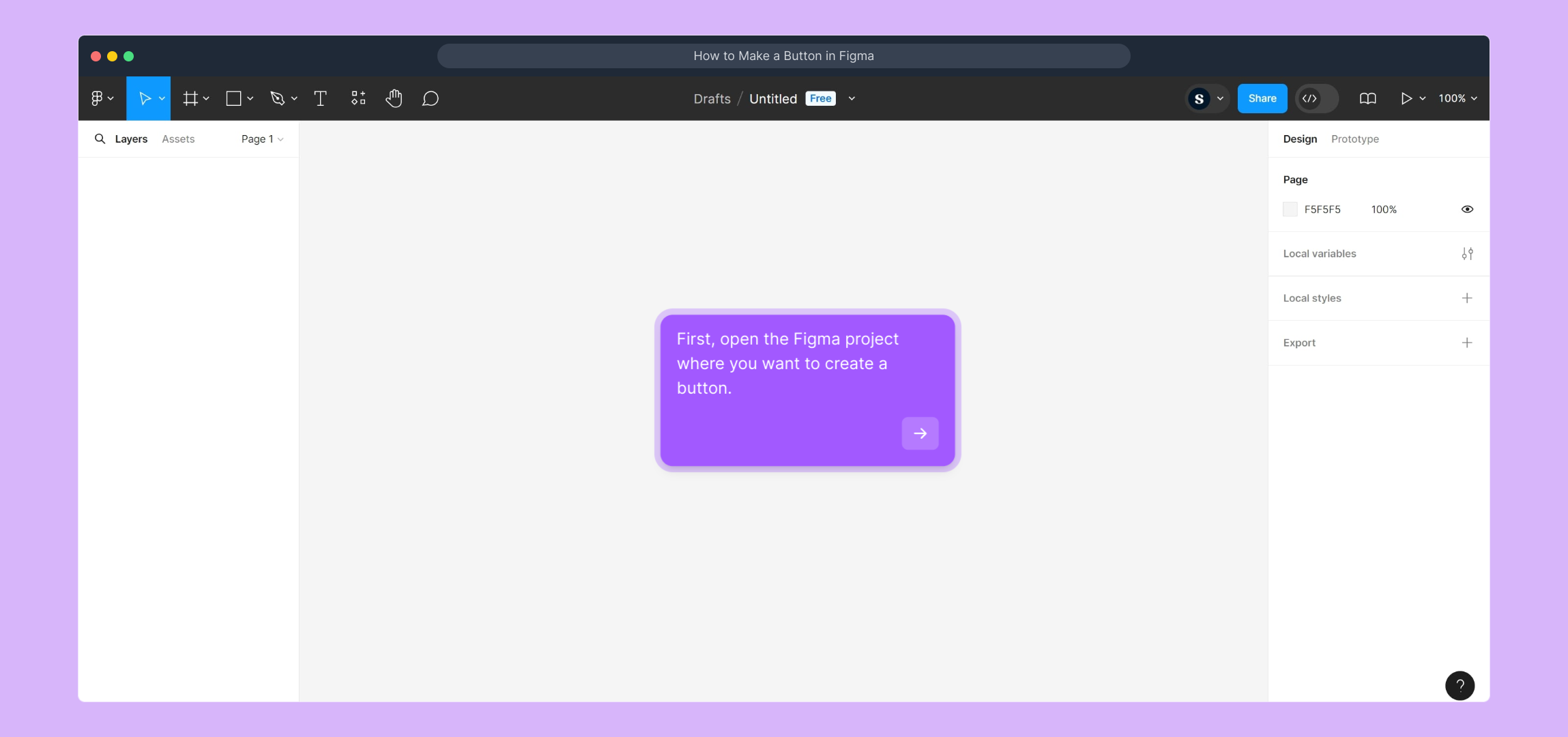
Start by opening the Figma project where you'd like to add your new button. This is where all your design components come together, so make sure you’re in the right workspace!
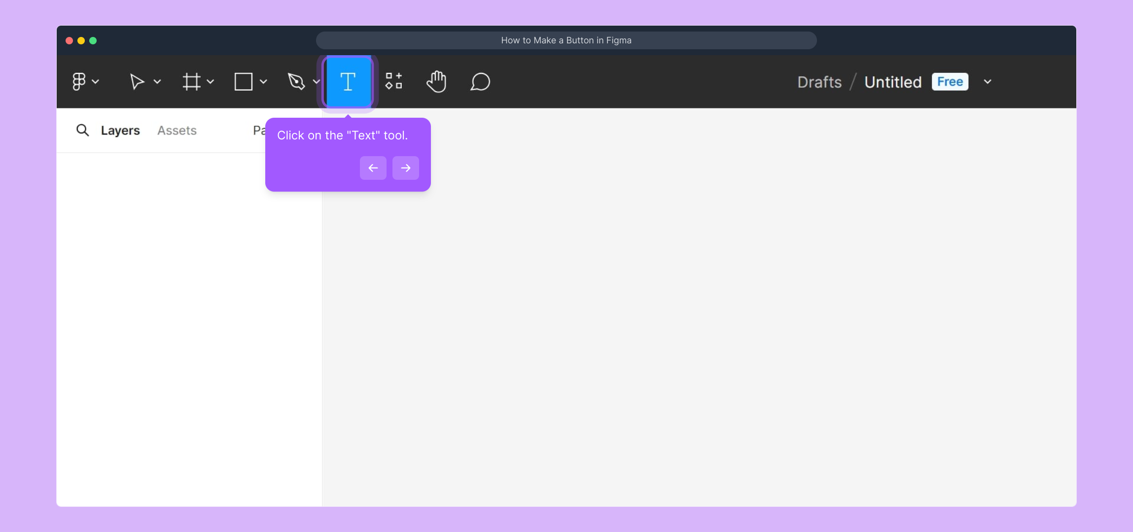
Next, locate and select the "Text" tool from the toolbar. This tool allows you to add and customize the text that will appear on your button, giving it a clear, inviting label.
For a more detailed walkthrough of adding text, check out this quick video tutorial to see the process in action.
(
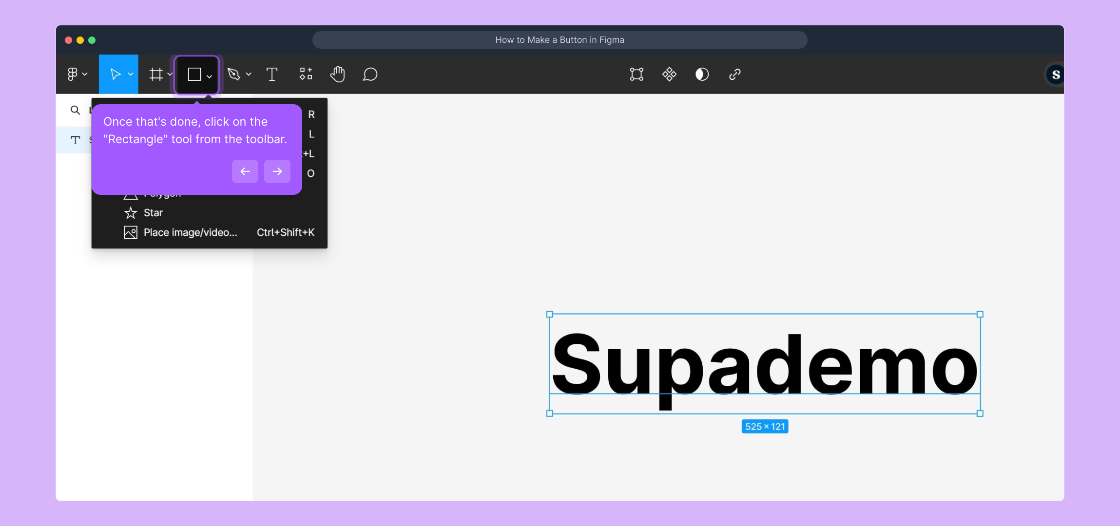
After setting up the text, head over to the toolbar and select the "Rectangle" tool. This shape will serve as the base of your button, giving it structure and form.
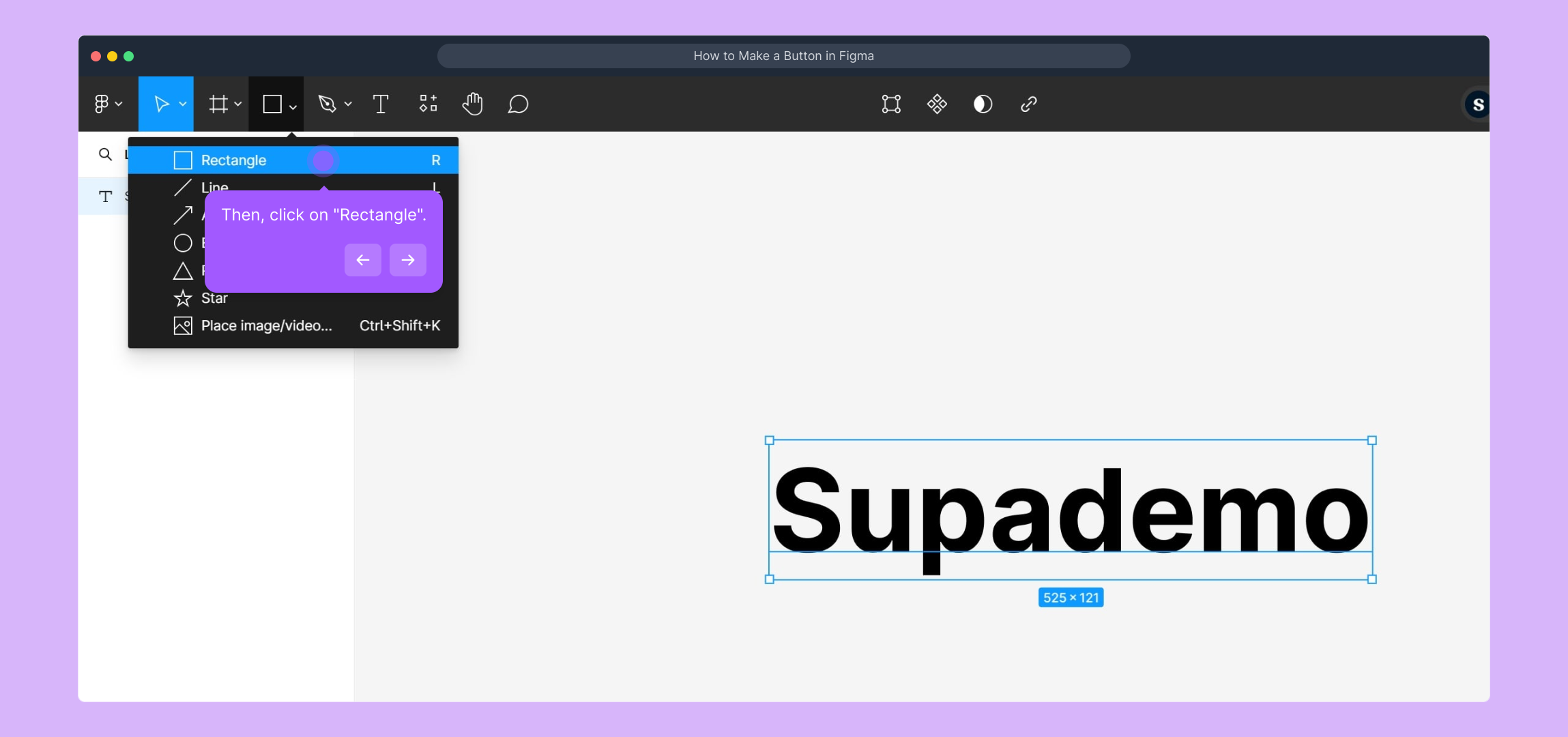
Click on the "Rectangle" option to activate it, so you can draw the button’s background on your canvas exactly where you want it.
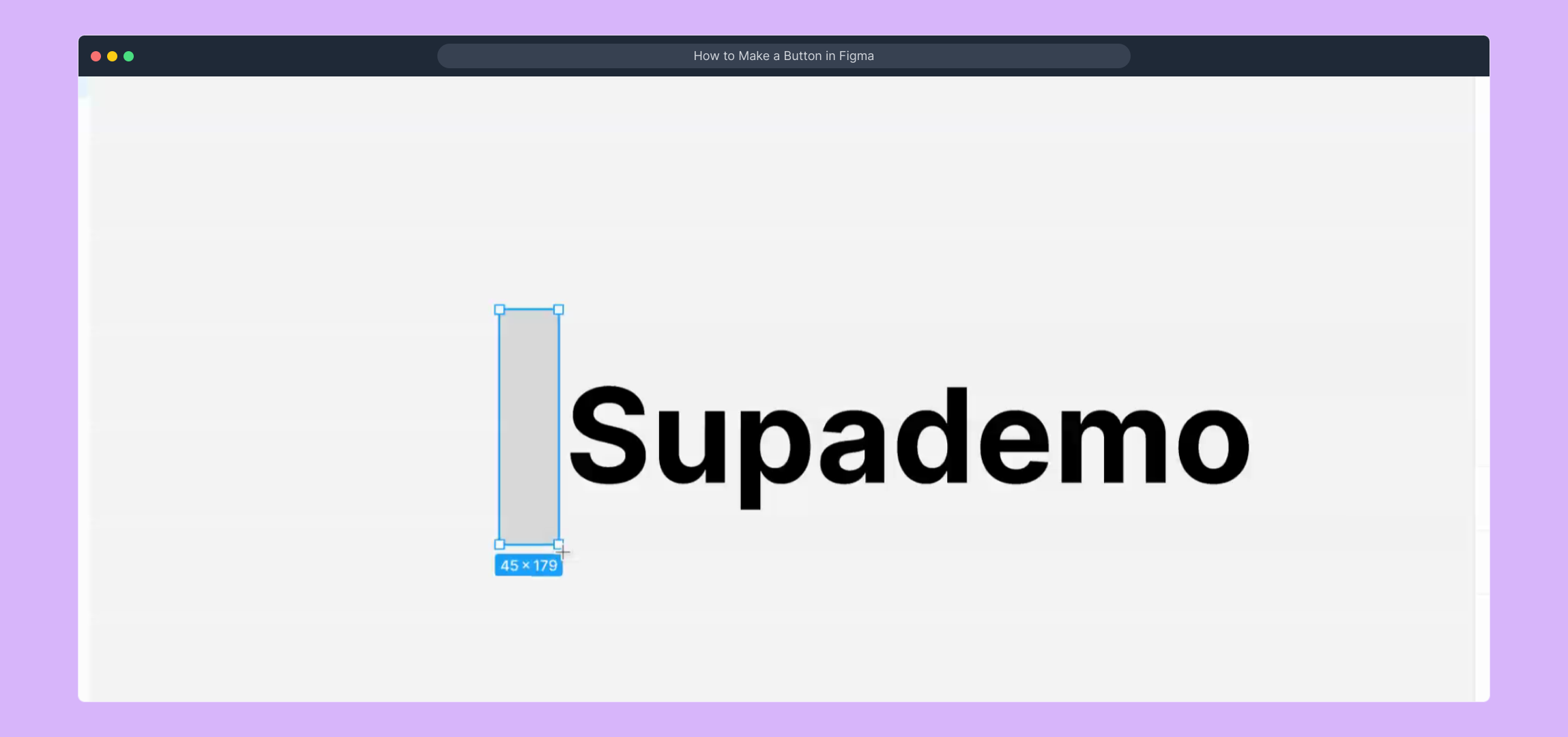
If you prefer a visual guide for this step, here’s a video to show you how to use the Rectangle tool effectively.
(
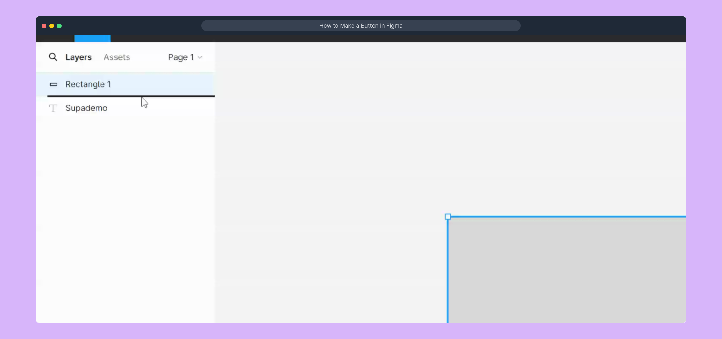
Another helpful video is available if you want to see the step in motion. This is especially useful for first-time users aiming to get comfortable with the tools.
(
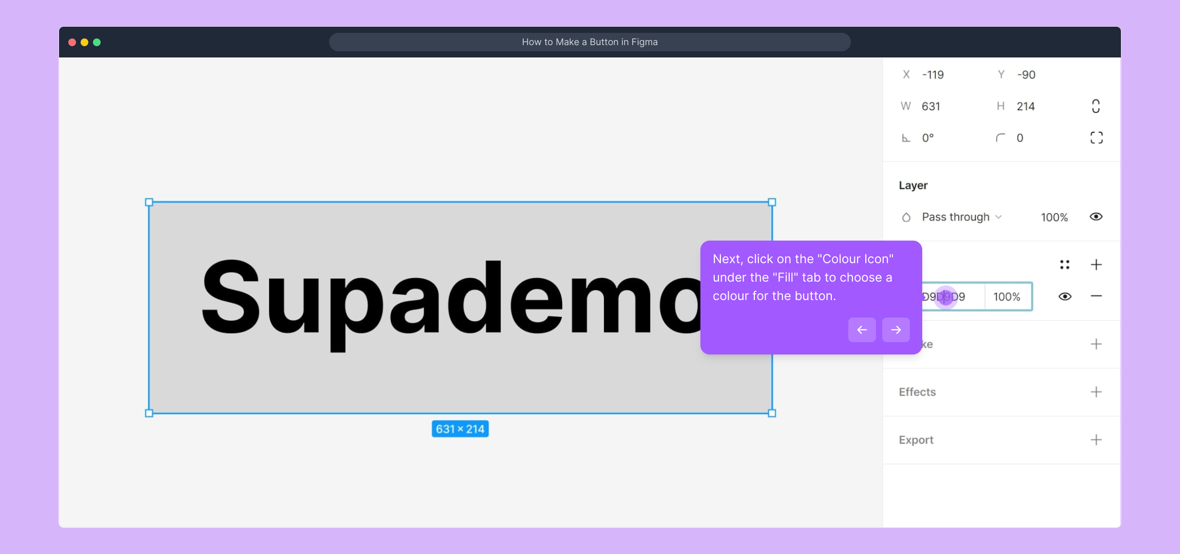
Now, navigate to the "Fill" section in the right-hand panel and click on the colour swatch icon. This lets you pick the colour that will define your button’s personality and visibility.
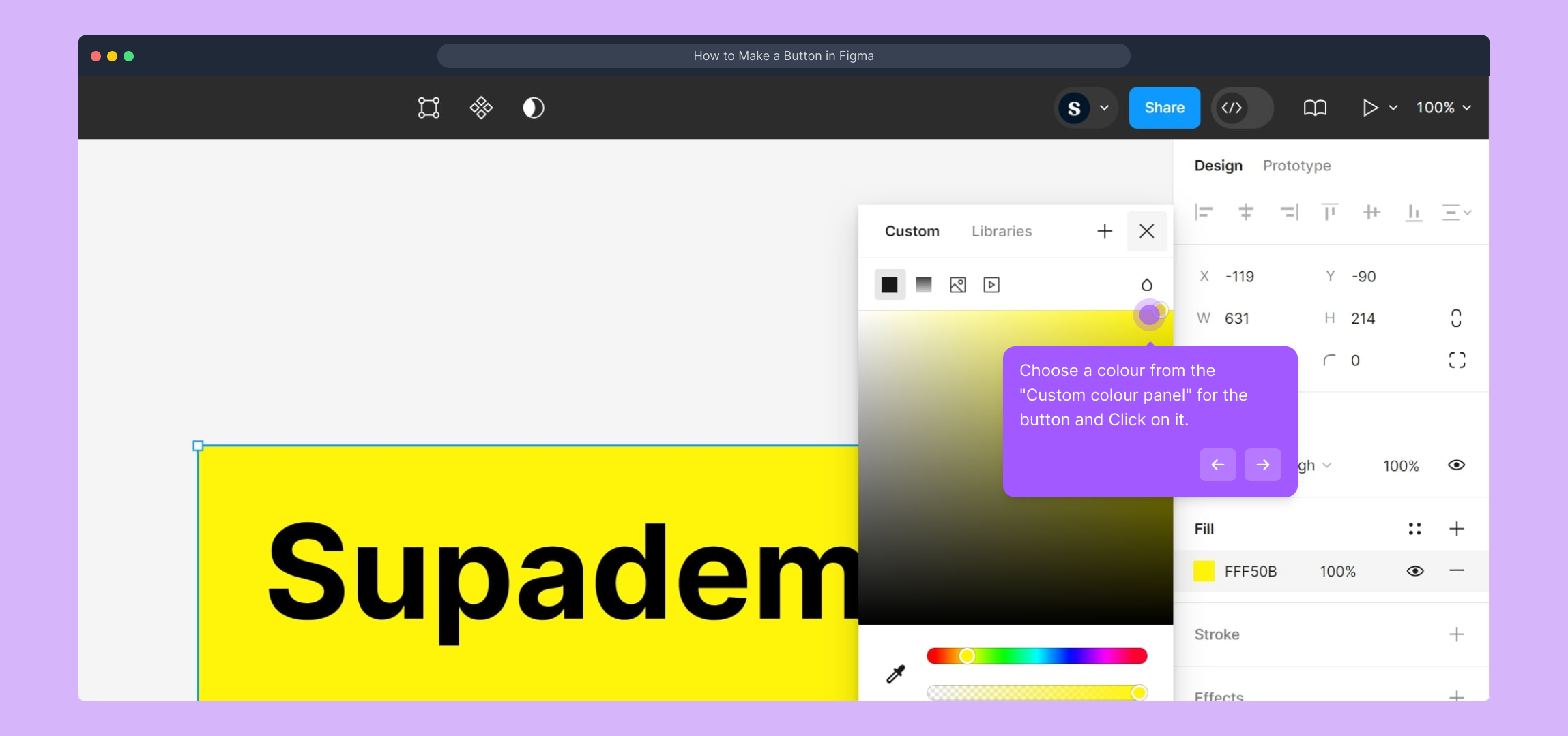
From the Custom colour panel, choose a shade that fits your design aesthetic. Click on the desired colour to apply it instantly to your button background.
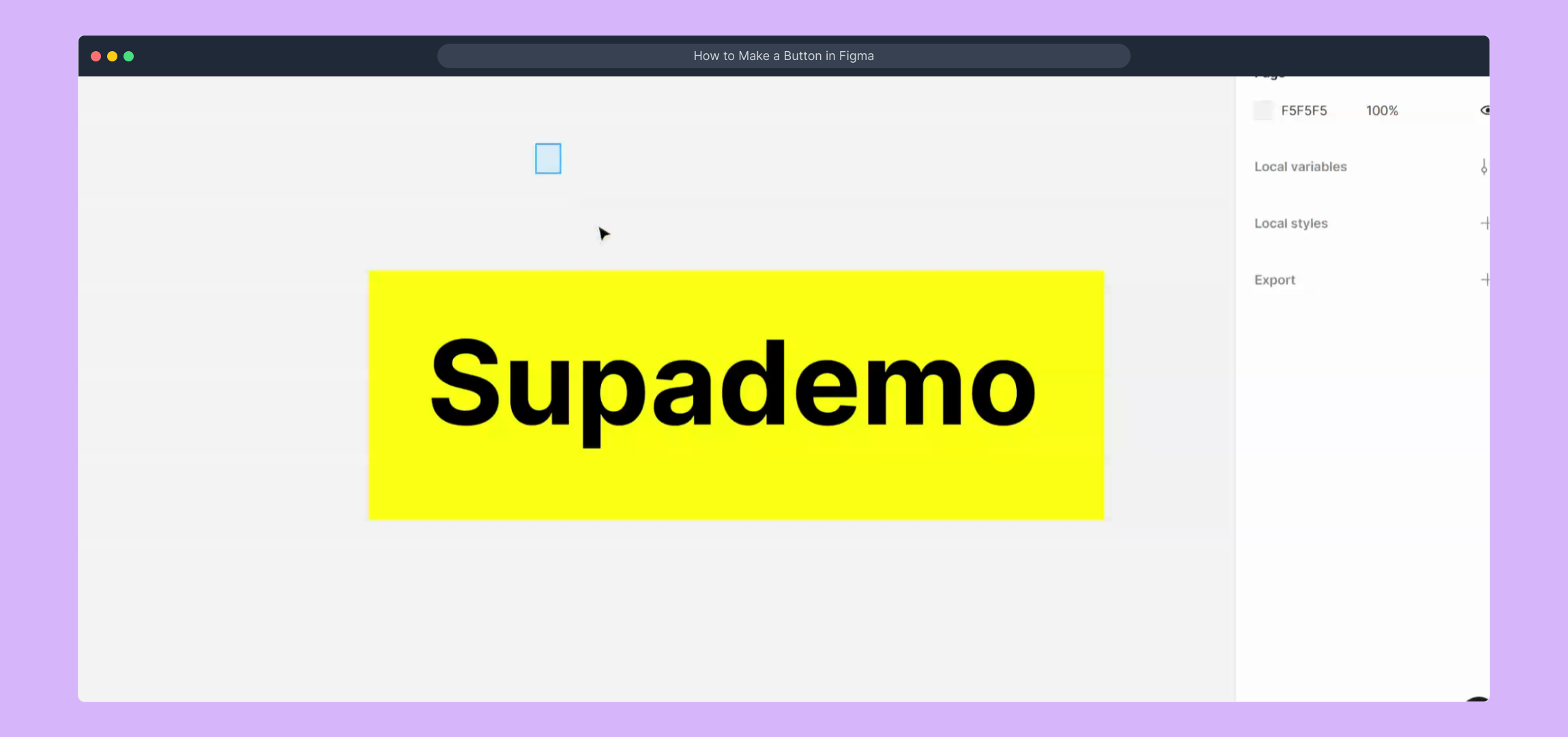
Need more guidance? This video demonstrates the colour selection process clearly, helping you refine your button’s look.
(
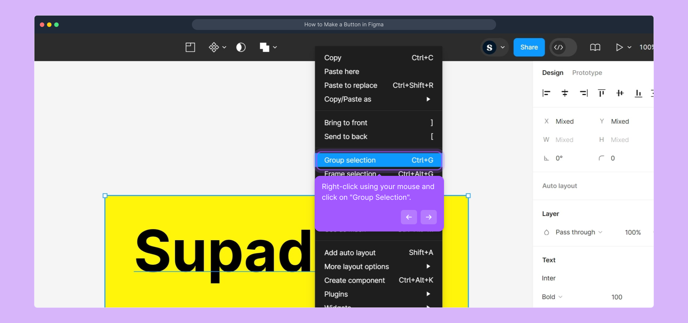
Once your text and shape are in place and styled to your liking, select both elements, right-click, and choose "Group Selection." Grouping helps keep your button elements organized and easy to move as one unit.
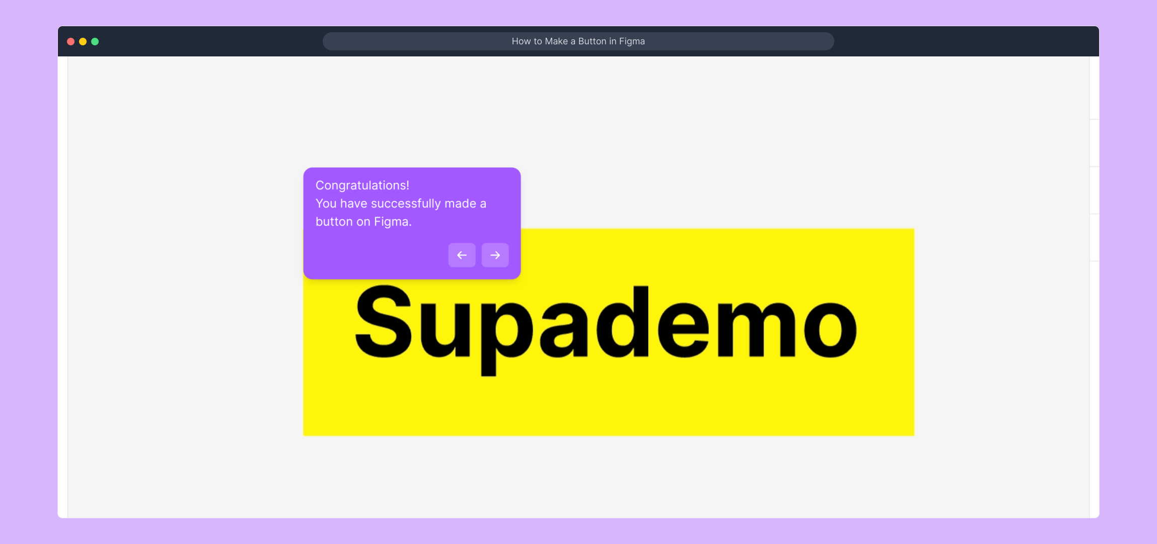
Well done! You’ve put together a fully functional button in Figma. This grouped component can now be reused or modified as needed in your designs.
Ready to create your own interactive demos? With Supademo, you can build engaging guides and tutorials like this in just a few seconds.
Create your own interactive demos in < 5 mins with Supademo
You can create your own interactive product demo in minutes using Supademo. Drive growth, scale enablement, and supercharge product-led onboarding with Supademo. Sign up for free here with no credit card required.
FAQs
Commonly asked questions about this topic.
What is Figma used for?
How do I start creating a button in Figma?
Can I customize the button color in Figma?
How do I group elements in Figma?
Is it possible to animate buttons in Figma?
Can I collaborate with others while designing a button in Figma?
What are the best practices for button design in Figma?
How do I export my button design from Figma?
Are there templates to create buttons faster in Figma?
What is Supademo and how does it relate to Figma button creation?

Vimal Kumar
Product Operations Associate
Vimal Kumar helps build and grow Supademo’s team and GTM efforts, with a focus on figuring out growth levers and improving product traction.

